Depot WPF agency rebranded the company "Arctica" - one of the leaders in the market of thermoses and isothermic products. Rebranding was caused by the desire to enter new consumer markets, to develop a fresh, bright concept of positioning and unify corporate style at the same time. And here is the result.
The problem:
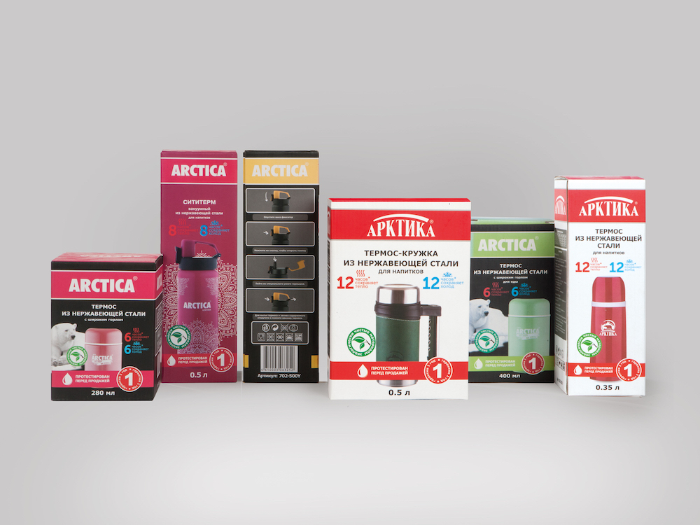
Since its foundation, the "Arсtiсa" company was the one of the leaders in the market of thermos and isothermic products. Over the years of its existence, the company has gained a reputation as a leading manufacturer of thermoses, whose products are not inferior, and sometimes even superior in quality to foreign counterparts. The existing target audience, mainly consisting of fishermen and hunters, gave preference to the company's products for years. But over time, the Arctic faced the inevitable problem of market growth, where, in the absence of the uniqueness of products of various brands, it became increasingly difficult to rebuild from competitors: thermos in bulk remained fairly monotonous in their design and was perceived by the consumer solely as an object for hikes only.
In this situation, the company decided to enter new consumer markets, to develop a fresh, bright concept of positioning and unify corporate style at the same time. This would allow the company both to attract a new target audience, and to stand out on the shelves.
The task:
The agency was tasked to re-position the brand "Arctica", to form various product lines and develop a corporate identity that would make the brand's products recognizable and stand out on the shelf, and on the other hand, differentiate the product lines.
The solution:
Raushan Sultanov, art director of the project: "We have developed a set of tools through which the team of the Arctic can easily create any brand communication without recourse to specialized agencies."
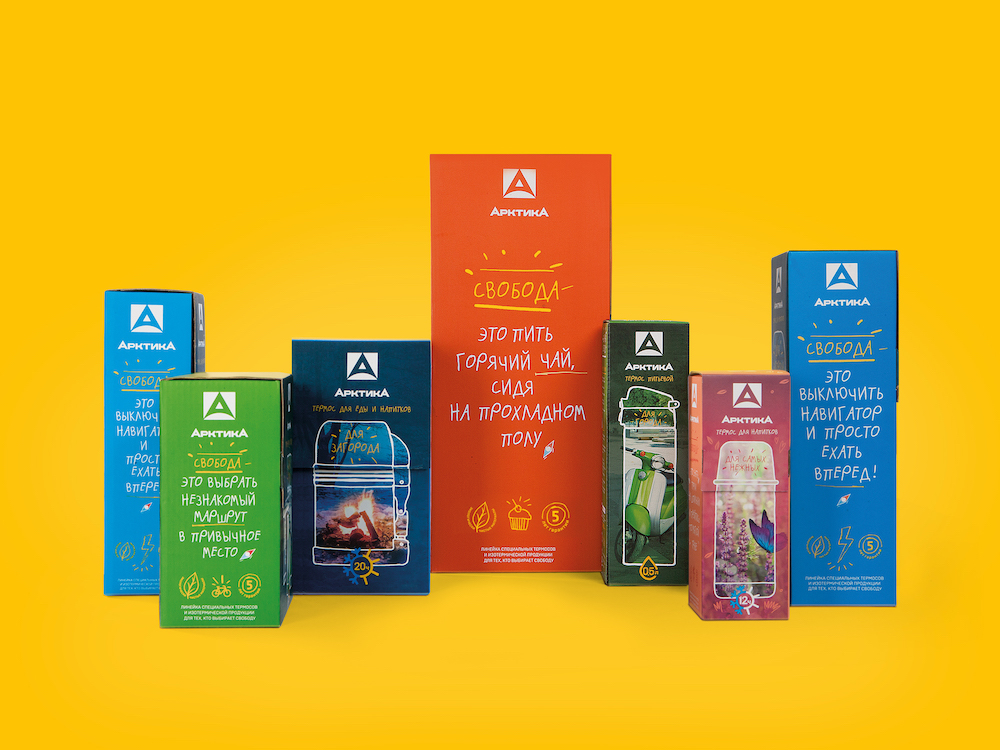
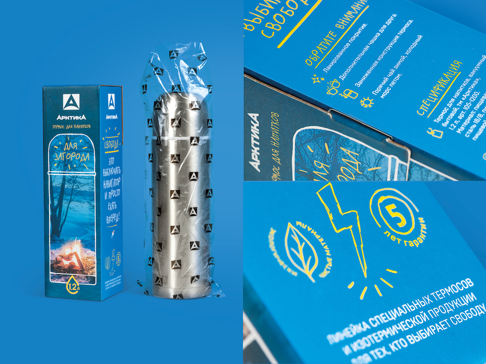
First of all, it was decided to expand the target use of the thermos in the eyes of the consumer, turning the conservative attribute of hikes or long trips into a stylish lifestyle element with a wide range of applications: from home decorating element to an indispensable device for preparing healthy food; from a customized cup for take - away coffee, to a container for the lunch. Within the framework of the new positioning, all the existing products were segmented into three key groups (for home, for the city, for the countryside) and supplemented with a special women's line - "for the most delicate". These steps have allowed both to create a clear navigation between products on the shelf, and to focus on the values of different target audiences, significantly expanding them.
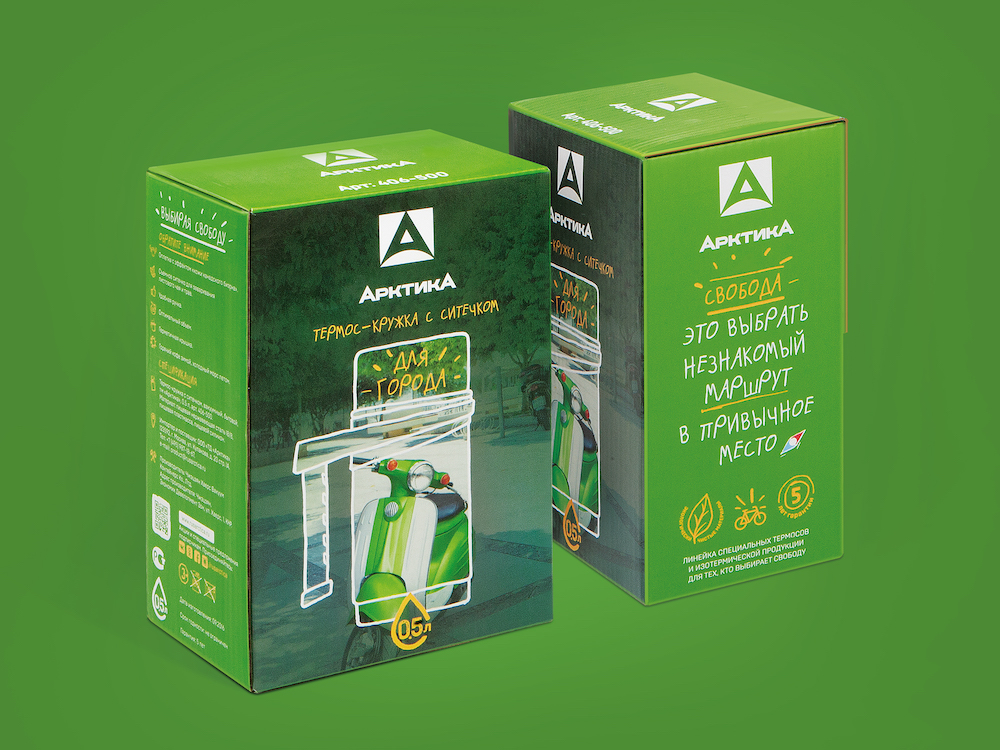
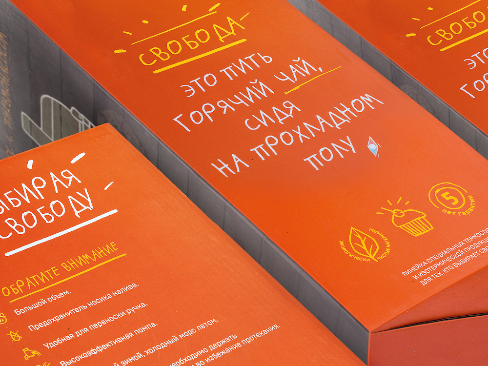
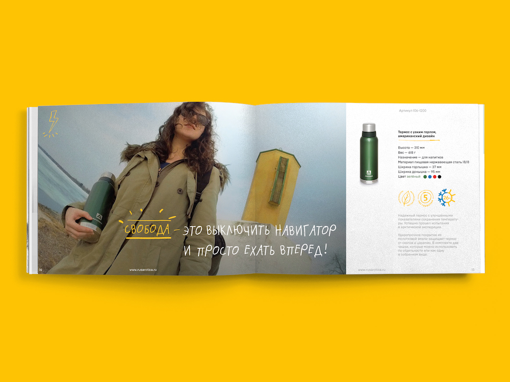
Within the chosen strategy, a key message was invented: "Arctica is your freedom!" This message broadcasted on different channels in a simple and understandable way about what freedom is for different people, positioning the "Arctic" as a true companion in such discussions.
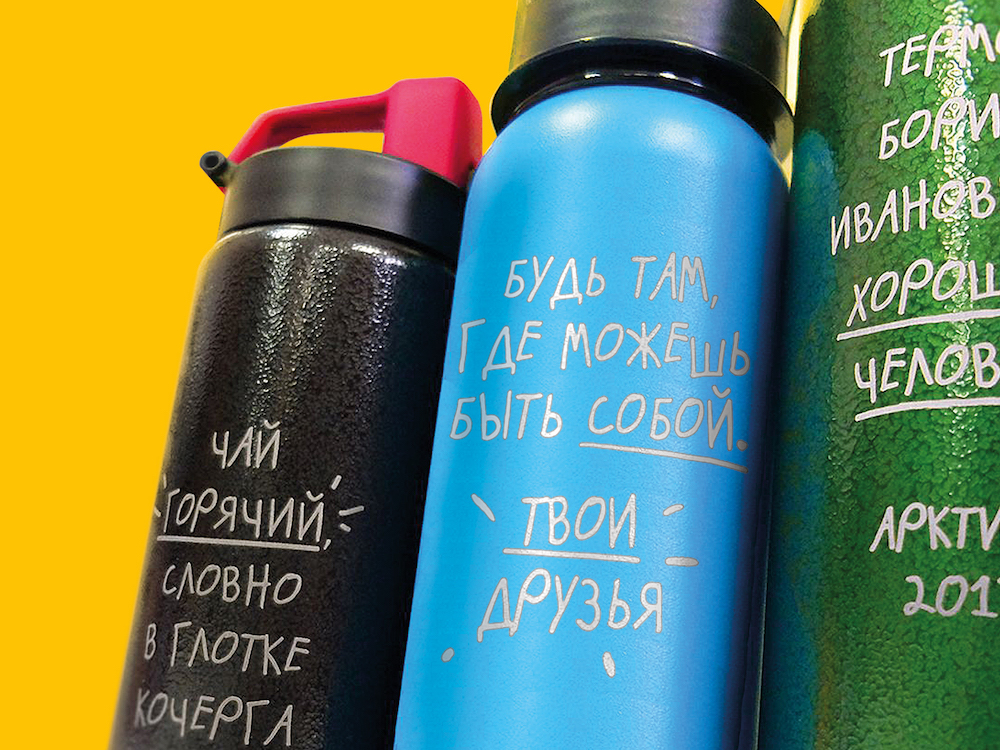
For the three key lines, visual differentiation was created, the packaging underwent radical changes in design, becoming more relevant, easy and simple to perceive, and on the other hand - more emotional, with an emphasis on the key indicators of quality and reliability of the respective products. In addition, it was important to "get away" slightly from the too-speaking name "Arctica" without changing it, because the isothermal products offered by the customer,not only to preserve heat, but also cold, freshness of products, etc. For this, there was developed an icon that attracts more attention, and later has the potential for independent use on products and in communications.
Fara Kuchkarov, Strategic Director of Depot WPF: "This project is interesting in every way. First, it is one of those markets, one of the categories that are usually called "boring" or conservative. Communications in the category were spontaneous, all the codes were aimed at fishermen and hunters, and most of the packages looked like standard goods. And absolutely identical external data of a product (all thermoses look almost the same) did not bound us in terms of brand attributes. The two largest world players (Thermos, Stanley) did not invest in communications and officially do not work in Russia ( all imported by retailers themselves), so the communication field in the category also remained unformed and all players worked in obvious ways - communicating rational product characteristics and complete lack of branding . In fact, we did not try to make a revolutionary project, but the result was appeared this way. Together with the client, we worked on the product design, and on the formation of rulers and assortments, did our best to make the choice of thermos easy and convenient so that the consumer could find the most important in the first place and make an informed choice. We created an image of an assistant, friend and advisor. Now the brand "Arctica" got free itself from its historical "artifacts", do not need to prove its product superiority or to confirm its "arctic" origin, now it is interesting for a very wide range of consumers, radically stands out on the shelf, attracting relevant customers, communicating relevant for the modern society values, interesting for buyers and retailers. "
Fedor Zakharov, Director of the Trade House "Arctica": "When two professionals join together, a really cool result is obtained. And the bright corporate style of the company "Arctica" confirms it. We are glad that we turned to Depot WPF - now we are ready to conquer new markets and conquer new peaks. We always knew ourselves that we are doing a cool, high-quality and useful product. But with a fresh design everyone will know about it. And more people, picking up the thermos "Arctica", will feel more freedom and happiness. And this is our main mission. "