


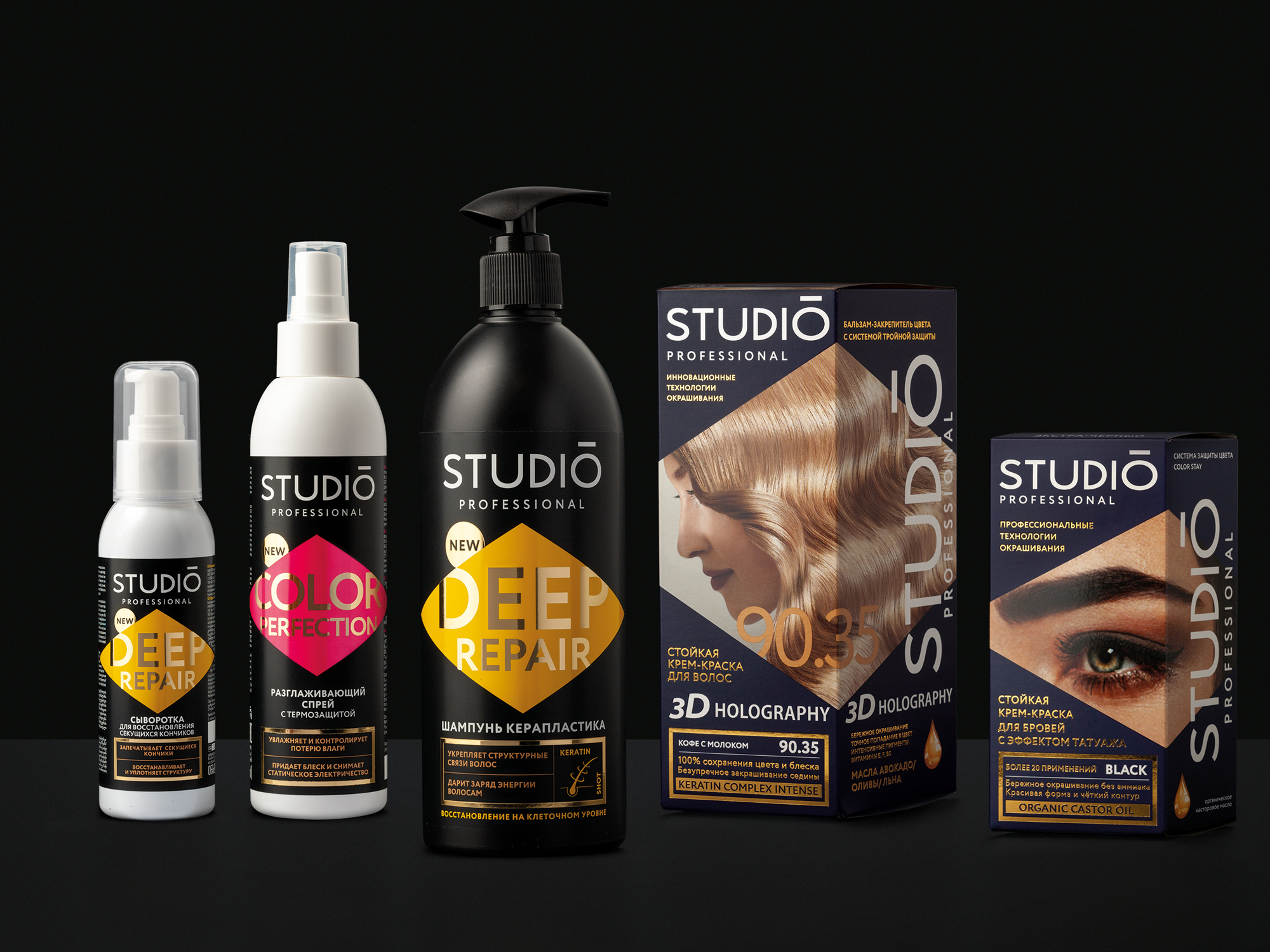
Depot WPF developed the concept of packaging design and packaging guide for new products of the STUDIO PROFESSIONAL brand.
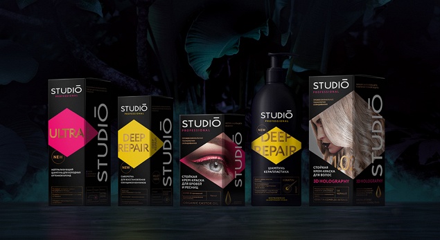
STUDIO brand has been introducing a rather extensive range of resistant hair dyes on the Russian market since 2011. Our task was develop a packaging design for five brand new products, which would increase the popularity and brand awareness, create the image of a professional brand.
In parallel with the withdrawal of new products, the client decided to restyle the existing range. Therefore, we have developed a packaging guide with a detailed description of the brand visual image use. It was necessary to develop a guide applicable to the entire product line of STUDIO PROFESSIONAL brand, which would allow to retain the existing target audience and attract new customers.
Products under STUDIO PROFESSIONAL brand are positioned in the middle segment of cosmetics for hair. New format and packaging design conveys the functional components of the brand - value for money, quality products at affordable prices. The design turned out bright and eye-catching, emphasizing the brand’s “expertise and professionalism”.
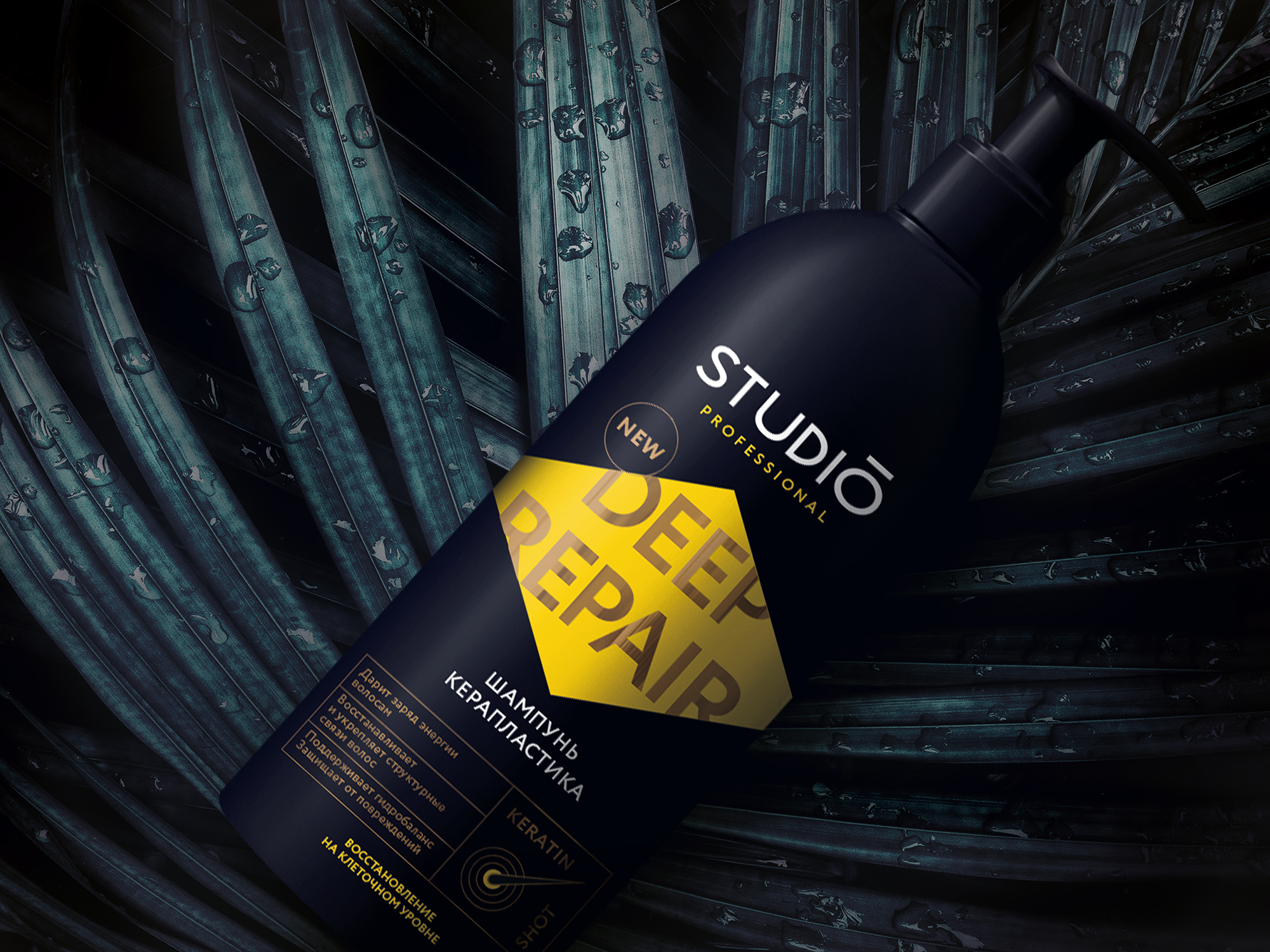
– We noticed that the main package is an unique rhombus-shaped design that is not on the market, – said Nikita Ivanov, the designer. –We assigned rhombus as a special element of the brand and moved it to the front of the package. The rhomb is functional: it changes color or serves as the location of the photo image in the line of hair, eyelash and eyebrow dyes in relation to the product line.

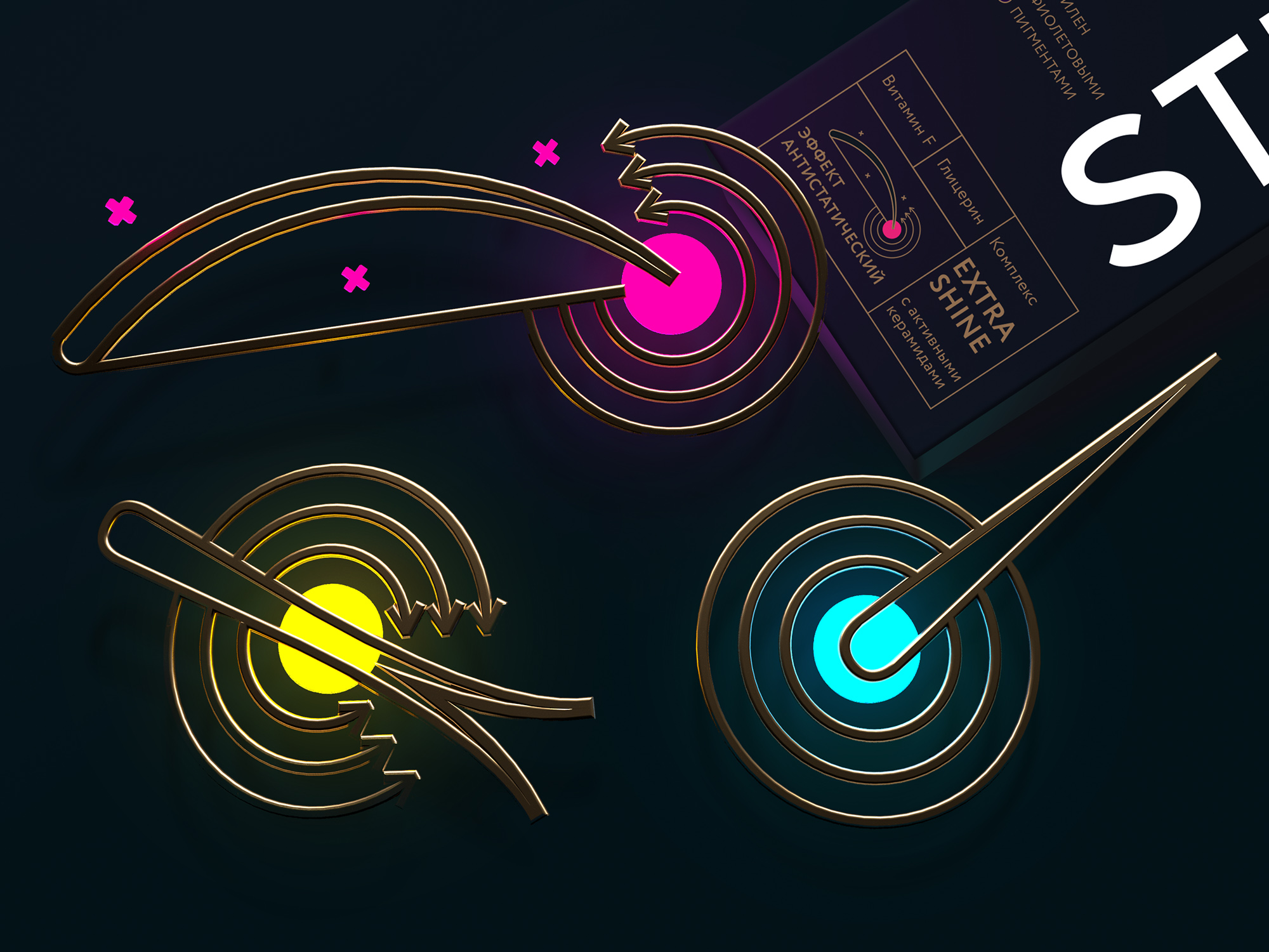
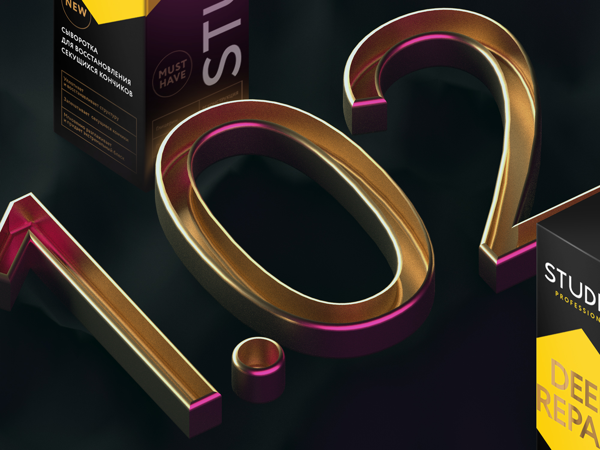
The packaging guide consists of a detailed description of the main visual components that we recommend using to maintain the visual integrity of the brand's product line. It describes the construction of the logo, options for its location on the package (with the designation of the security field and prohibited use cases), gives detailed instructions on the use of color range, corporate elements, graphics, font scheme, photo style and recommendations for printing.
– The design of the new series is undoubtedly professional,– shared his opinion Gleb Bobkov, co-owner of BIG. – For the second time in the history of the company,the presentation of the brand for employees, distributors and retailers caused great enthusiasm and interest. By the way, the first brand that caused the same emotions was “Princess”, which was also redesigned by Depot WPF.
The created design concepts are used by the client: the product (in a slightly modified design) is already presented in stores.
Earlier we developed the packaging design of the Princess brand (/upload/news/362/princess_brand_redesign/) and Lapochka(/upload/news/605/lapochka/)
Client Reference:
Cosmetic company BIG is among the five largest Russian manufacturing companies. It has successfully launched lots of products in perfumery and cosmetics market in Russia during the last 20 years.
The company develops its own top brands in following segments - children's cosmetics (Princess, Honey), tinting hair products (Tonics), hair dyes (Studio Professional), professional cosmetics (Concept). It is the largest licensed manufacturer (Disney, Marvel, Universal Studio).
The leading activity is the development, creation and launch of high-quality conceptual products, which are based on a creative approach to design and assortment. The company produces the whole range of hair care and coloring products, hygiene products, creams, deodorants, roll-ons, lotions, tonics and other products. The company's trademarks are repeated winners of the competitions for the title “The Best Cosmetic Product of the Year”, “Product of the Year”, “Brand of the Year”and “People's Brand No. 1 in Russia”.
