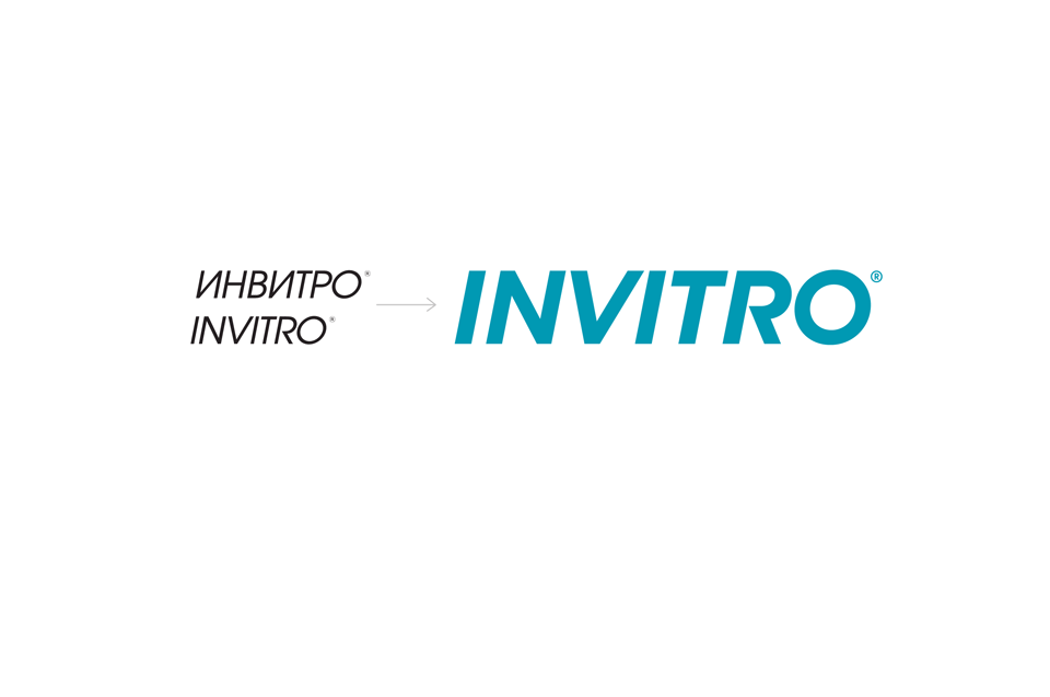
Depot WPF branding agency developed the brand INVITRO and created the new visual style for the largest privat medecine company in Russia. The new identity reflects the main features of the company: its leadership position and a special medical ethitcs.
INVITRO brand was created in 1998 and now presents a huge privat medicine company in our country spreaded in Russian, Ukrainian, Kazakh and Belarusian markets. Today the company has 9 modern laboratory complexes and 900 medical offices all over eastern Europe.
24 000 patients visit INVITRO specialist every day — medical centers offers more than 200 000 different kinds of tests. Moreover INVITRO company also trains the medical staff, publishes extensively and developes information technologies in medicine and processes big data. Thereby INVITRO services have regular updates.
Task
Depot WPF branding agency was tasked to refresh INVITRO identity but saving the continuity of the previous visual style because of its high brand awareness.
It was impotant to take into account short-range plans of the company. INVITRO currently plans to increase the amount of contact points with its target audience including not only medical centers but also different media.
Solution
An upgraded INVITRO brand reflects all the qualitative changes that were introduced in the company. All kinds of advertisement-carriers with new brand design should remind the customers that INVITRO is a ‘modern medicine with a human face’.

Depot WPF art director Anna Bolshakova: ‘The main task was to create a system that would reflect professional competences of the company. In this case the new identity should be rather complicated but clear at the same time to transform it for different media without any difficulties.’
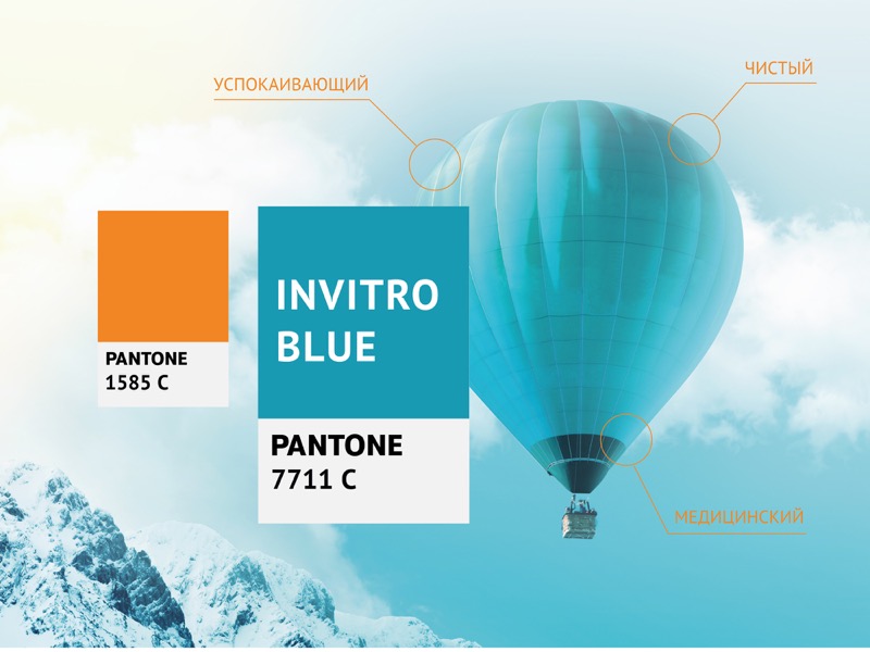
The new INVITRO visual style strengthens trust, emphasizes a modernity combined with growth dynamics and the attainment of the highest international standards. The identity became stricter, more laconic and more clean.
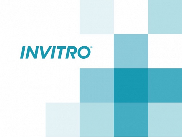
Key elements of the new corporate identity includes a special color called INVITRO BLUE and a typical medical cross used as a pattern.