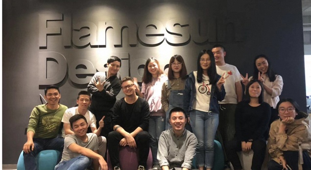
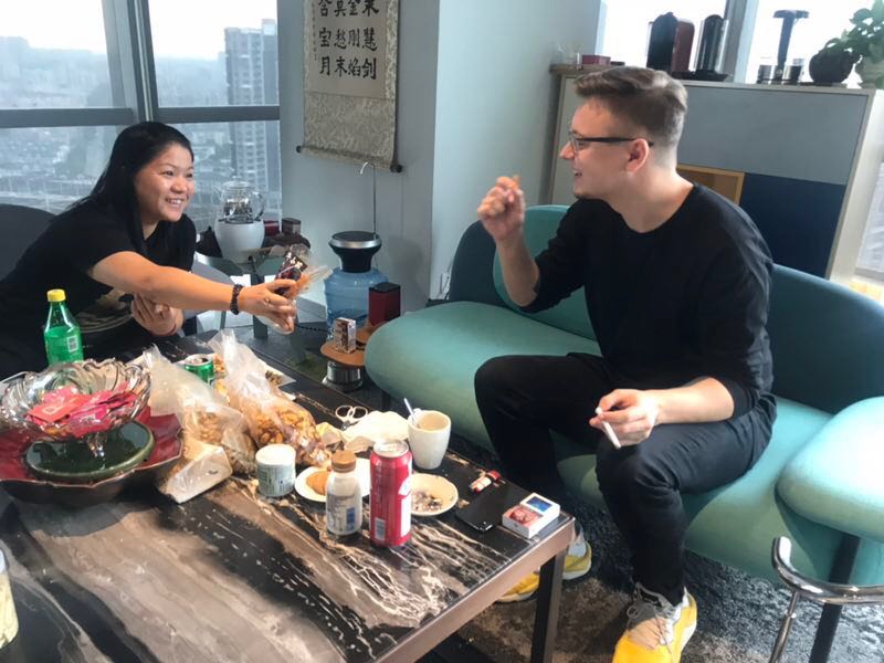
Nikita Ivanov, Depot WPF design director, described his trip to China and shared his coworking experience with our colleagues from Flamesun branding agency, the Shanghai representative of GLBA.
Interview with Depot WPF design director, Nikita Ivanov: about work features of branding agency in Shanghai, specifics of Chinese product design and its differences from the Russian market, about digital technologies and places filled with inspiration.
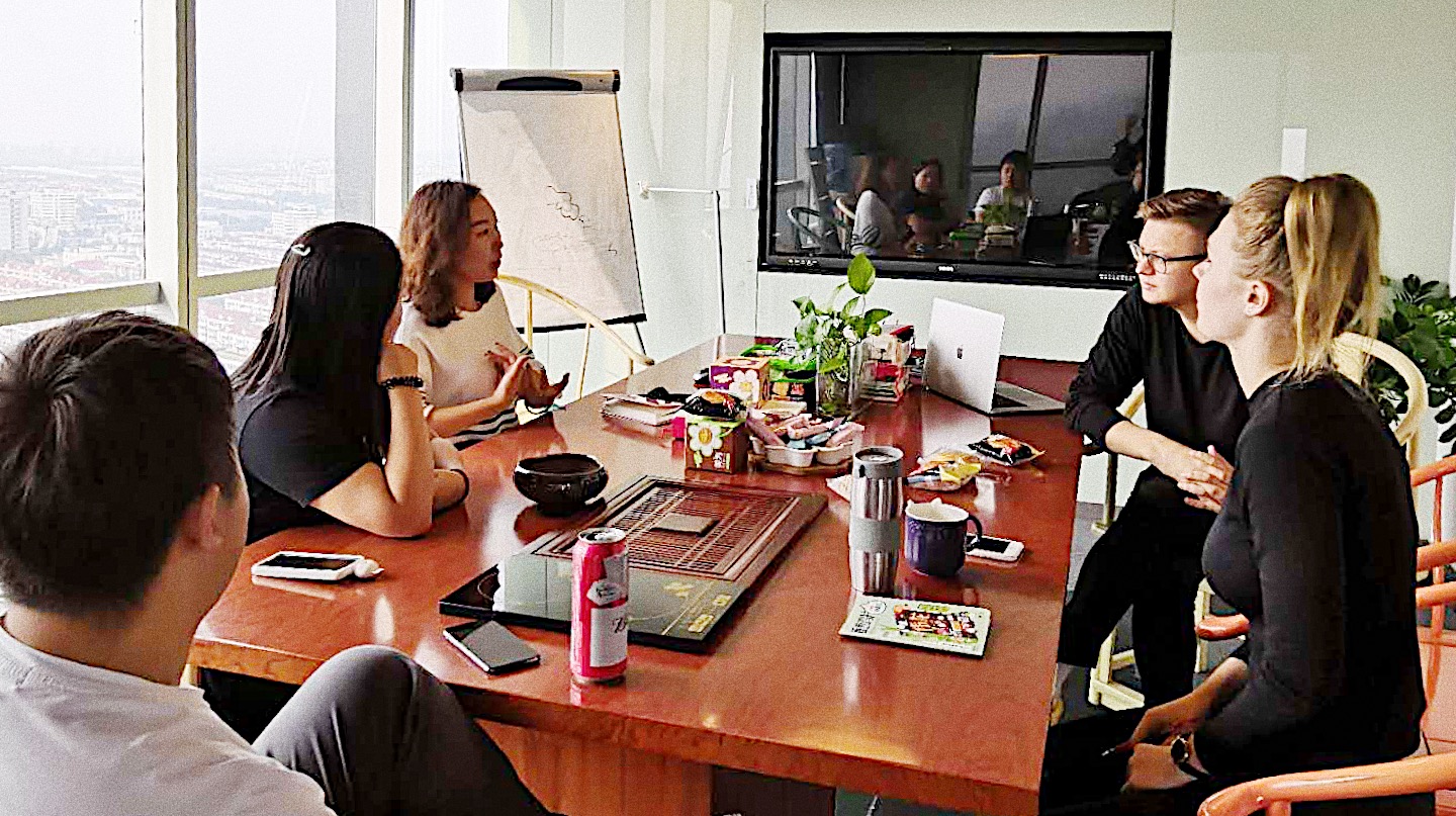
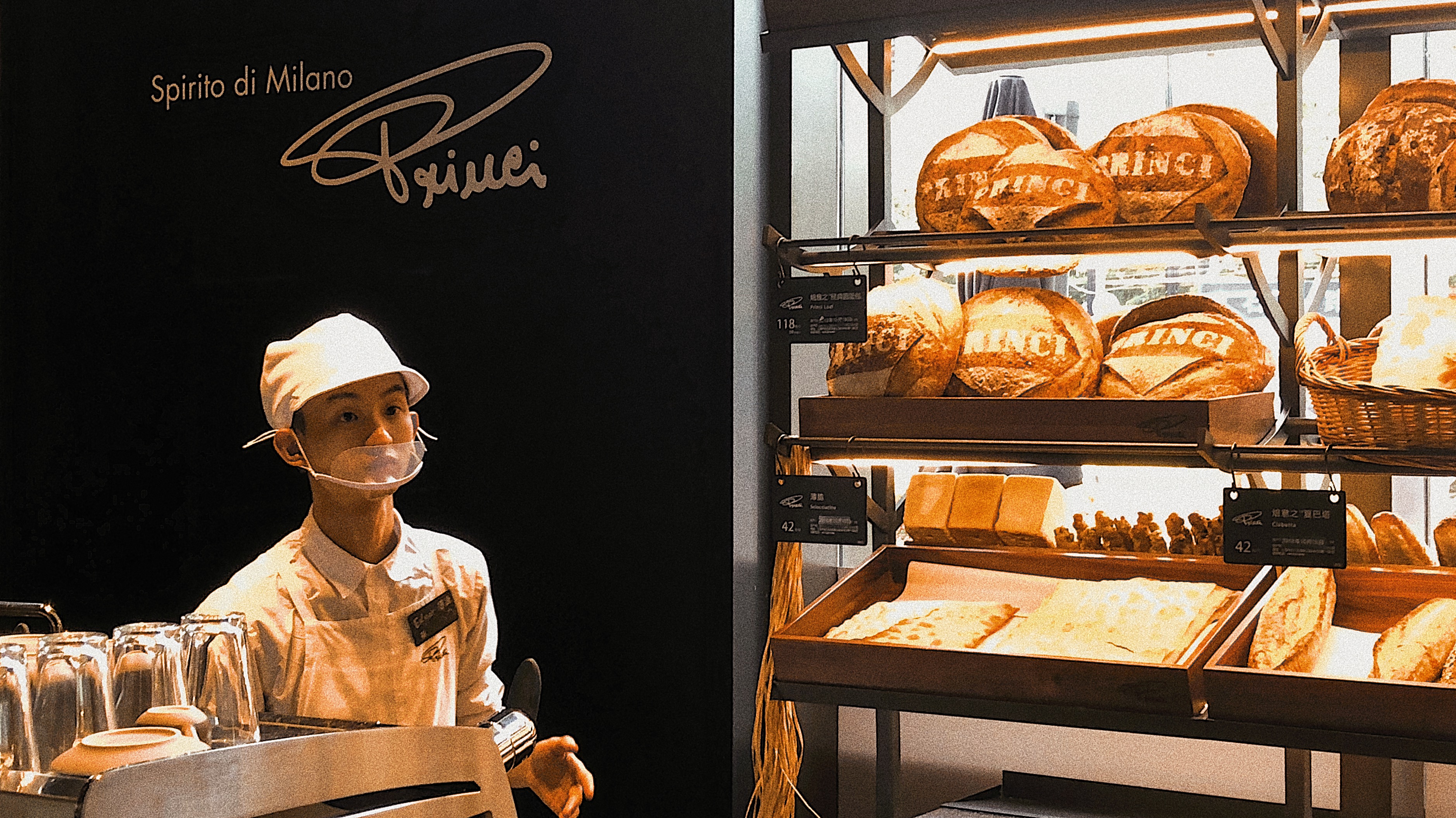
Nikita, you have worked at Flamesun agency in Shanghai during a week. Tell us, please, what are distinguishing work format features and specifics of the branding agency in China?
Colleagues from Flamesun have kinesthetic and gustative approach to design. Before they begin working on a project, they gather all together, arrange products on the table, open the packages – and taste the content. First step is a tasting session, only after it they start decision-making process about design. Our clients often deliver us some product samples, but we take into account mainly shape and design components.
Flamesun agency has a highly developed industrial approach to design. They spend fifty percent of time on working with the packaging form. Materials for printing are selected for almost every project. Therefore, many materials are kinesthetic: they use polish, stamping with foil, variety of different paper, stamping, etc. They have a well-organized production, but, to my surprise, there is no access to shutterstock. The rest of the work differs little from ours, and responsibilities are divided between designers, creative and creative directors as well.
What are the features of design in China and what differences from the Russian market did you notice? Share, please, some interesting Chinese packaging insights.
Chinese design is emotional with expressed composition. It is truly Asian. Packaging consists of characters’illustrations in their own Asian graphics. And beside that a literary approach to the illustration is noticeable. On the packaging there are many “embedded”stories with short Chinese novels that can be well understood by locals. Some communications go through famous personalities: pop stars, musicians and entertainers. Either their photos or recognizable illustrations are used.
All packaging is filled with information - logos, names, copyrights, large and small illustrations. And every font must convey mood. They strive for European minimalism, but from the point of compositionview, and not communication, asit is in Russia. We just find a simple solution with a highlight element and use it. In the Chinese food market they are looking for ways to convey briefly long stories.
What kind of stories do you mean? Could you, please, share?
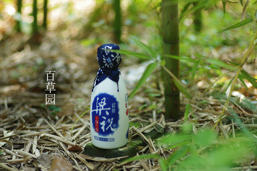
For example, a love story, which is embodied in the design of rice wine Liang Zhu. This is an ancient Chinese tale about a boy and a girl who loved each other, but they were not allowed to meet. Therefore, they turned into butterflies, could fly away from everyone and soar over Chinese fields and meadows. The design of the bottle consists of a communication that fully reveals this story. Chinese people who know this tale are able to understand the packaging. This is a real literary approach.
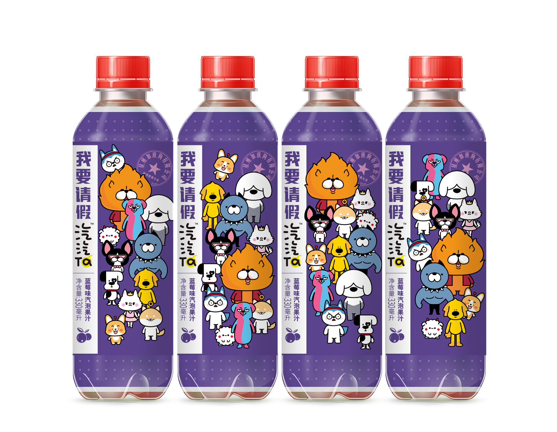
In cooperation with the HP digital team, the Flamesun agency is developing new methods for printing on bottles and heat shrinkable sheaths. Recently, for example, a limited collection of carbonated Qiqita juices with a new method of printing labels has come into the market. The line is called “Overtime working dogs”and consists of 12 dog breeds, 12 months and 12 zodiac signs. The target audience - young people who constantly linger at work and look like dogs with hanging down tongues. On the packaging are gathered the most ridiculous reasons of asking for a day off. For example, "My cat has a birthday tomorrow, so I won't be able to come to work." In just 2 months after the start of sales in the online store, the product received more than 2 million comments.
The use of various digital technologies for marketing purposes is very popular in China. Can you share some of the latest developments that you managed to observe?
Absolutely all transactions are carried out with QR code via WeChat. It really inspires when you see that using the same application you can call and pay for a taxi, reserve a table in a restaurant and order food, choose a gift and pay for it. You can pay for any purchase, as the card is attached to the application, scan any QR code and receive guaranteed information. This is very cool, since in Russia every activity can be done via different applicationsonly, and not through one source.
Moreover, Flamesun in conjunction with AR developer created an application for scanning packages. Now even the QR code is not needed: you just need to take a picture of the package, and the system will redirect you to a game or video with animated character. You can take a picture of yourself and also become an animation hero. For example, brand of potato chips “Don’t speak” is a great applicable example.
Nikita, it’s most likely that you have studied the entire product assortment of Shanghai supermarkets in details. Are there any obvious differences in the range of products offered compared to Russian stores?
Yes, of course, there is a great difference. First of all, I was surprised that they do not have pure dairy products. A large number of milk-containing products are offered: water with milk or juices with milk. But there is no such milk as we have. And I’m not even taking into consideration out kefir and ryazhenka. Also in Chinese supermarkets, shelves are filled with a varied assortment of snacks, chips, and jerky. And, of course, I was struck by rice wine with a story that I told you before. It tastes like alcoholic soy sauce, that warms up Chinese people in winter. Rice wine for them is considered like Russian vodka for us.
Tell us, please, about your impressions about Shanghai in general: what other places did you visit, where did you find inspiration and what did you remember most of all.
I’ve noticed that the Chinese are enjoying gigantomania. The enormous size showrooms of expensive brands stand out in particular: huge Starbucks; Gucci store similar to the palace; Salon Mazeratti looks more like a museum. Many Chinese people adore brands and create cross-branded collaborations. Sometimes they do it in very unexpected formats.
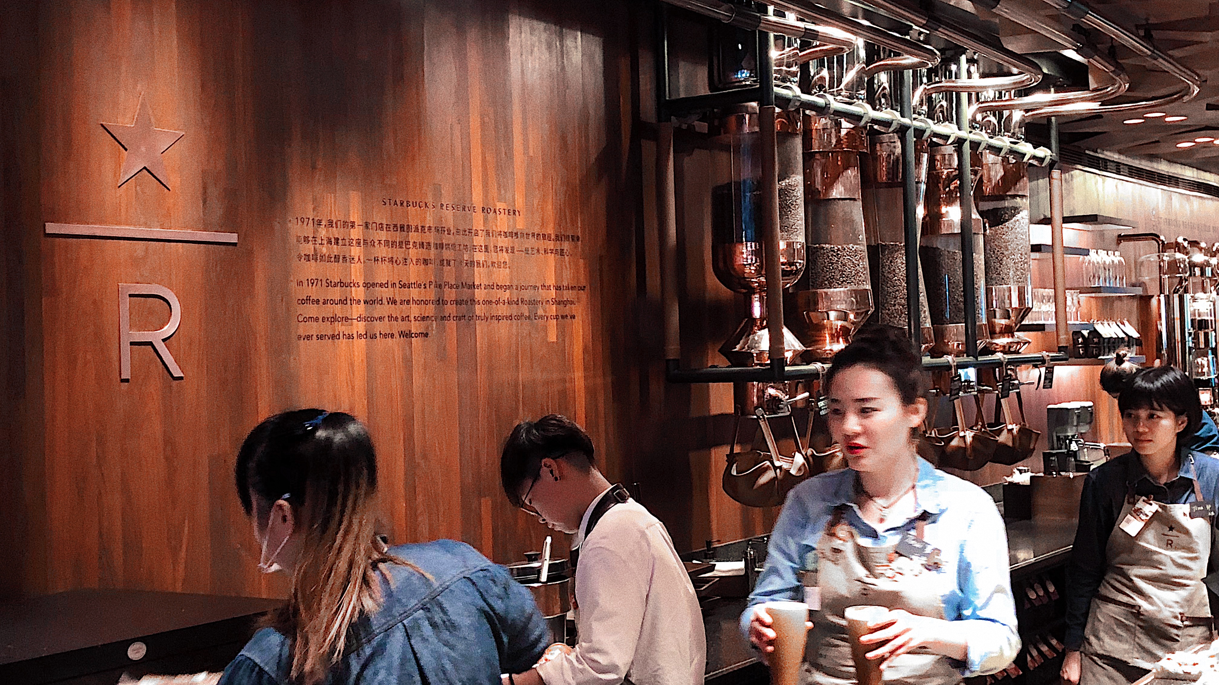
Starbucks' largest coffee store in the world is the Starbucks Reserve Roastery in Shanghai. A huge area with different types of fresh pastries, teas and coffees from around the world. The grains are roasted right in front of the visitors: a mechanism passes through the entire hall and you can see how the grains spin during roasting and fall onto the belt. This is a whole coffee factory with bar counters and cool design. The interior uses wood, different textures, copper, steel, engravings on barrels and very suitable lighting. Everything is “ringing”, with the correct “fine tuning”and its own aesthetics.
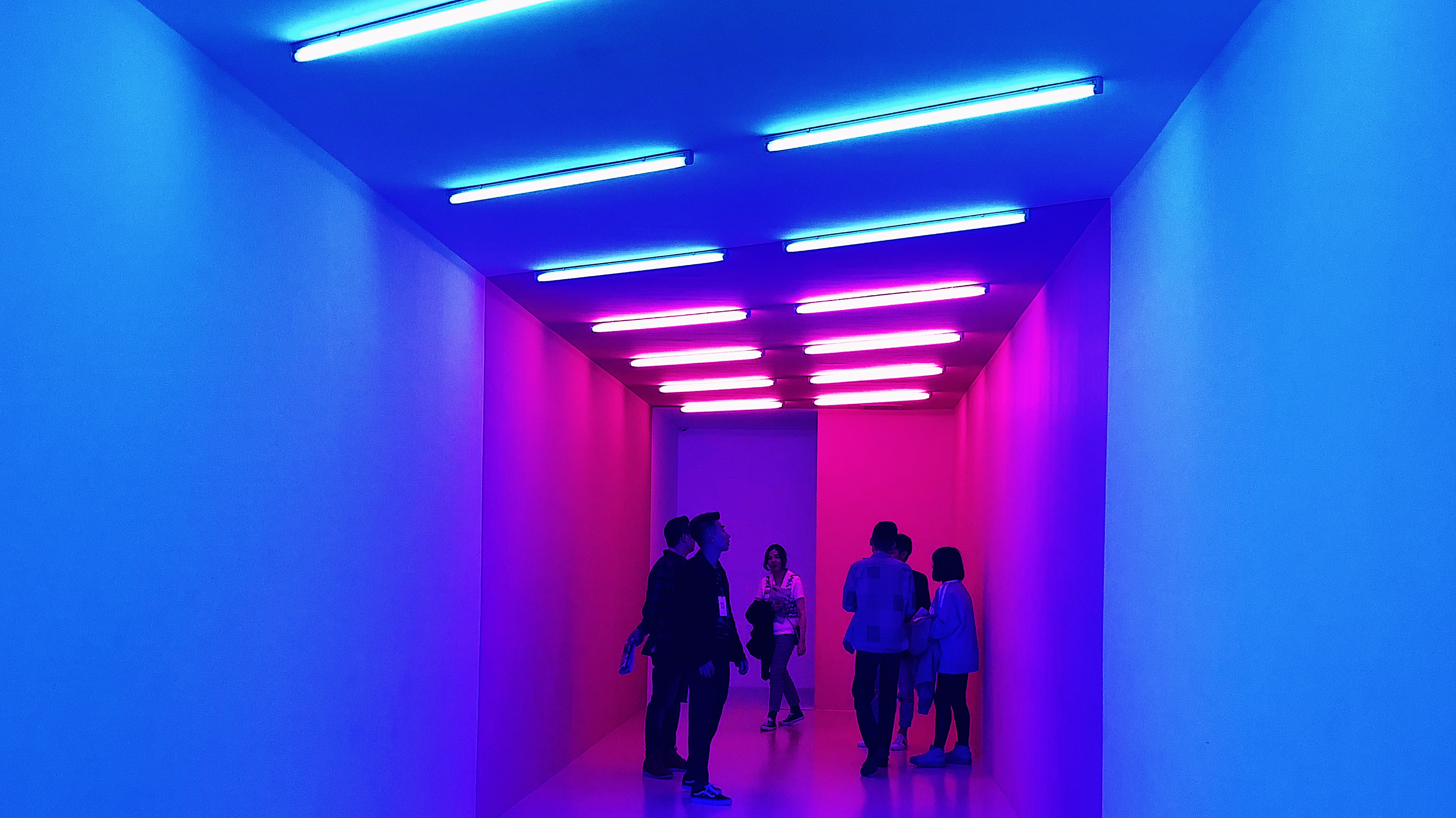
I was impressed by the exhibition “The artist is present”at the Yuz Museum of Contemporary Art. I was struck not even by the work, but by the approach to the space usage and event organization. Infinitely changing rooms: white walls go into a neon room - a dark basement - toilets, with the entrance to a luxurious garden - installations of Chinese districts. A green, black, dark gray room, which shows how Chinese culture influences American and vice versa. The whole exhibition is trying to convey how, through repetition, we can come to originality, how to preserve the originals with the help of copies and imitations.

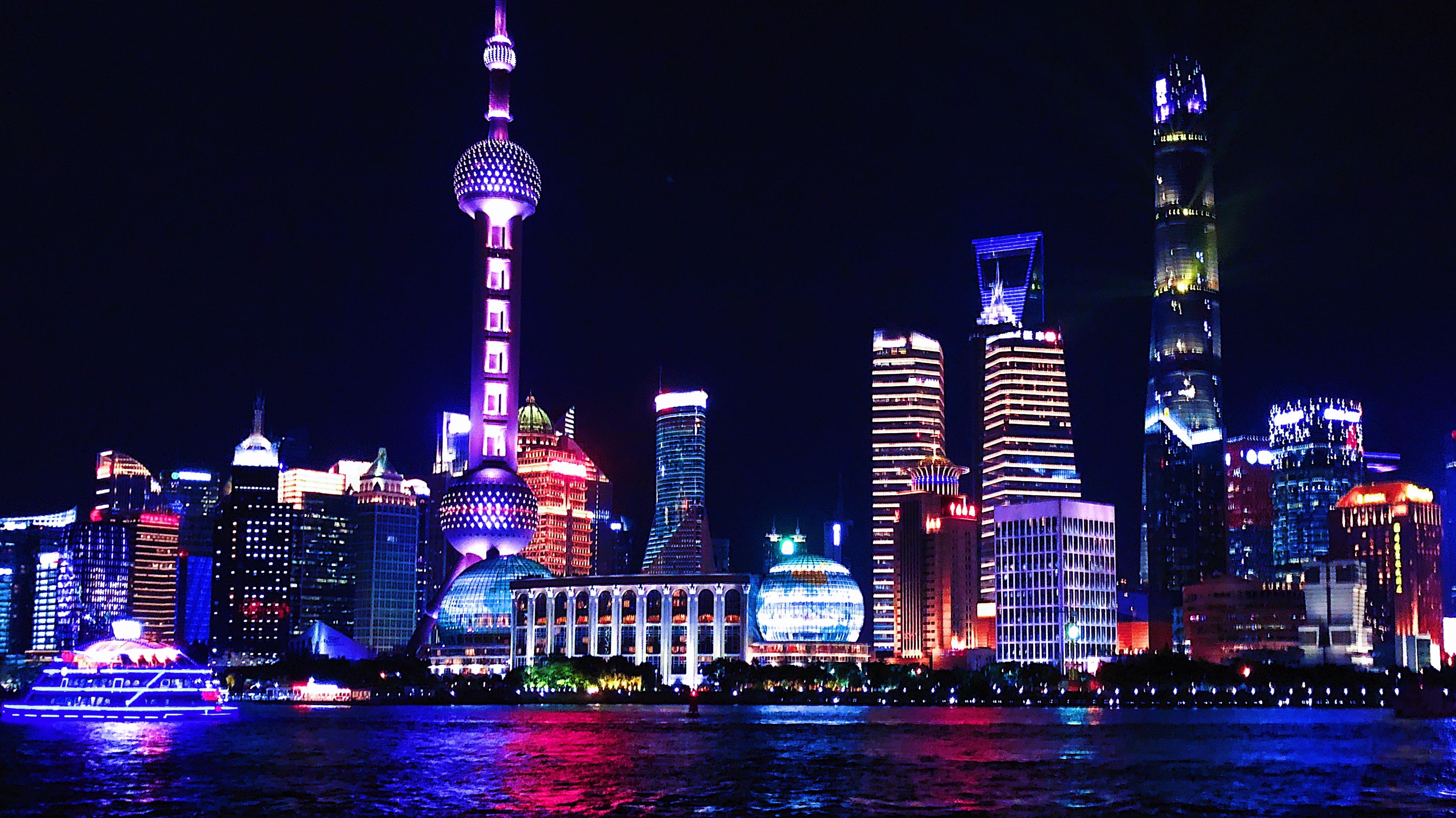
On the one hand, skyscrapers, the financial capital of China, an interesting approach to design and megalomania, on the other, people and conditions that are different from the usual European perception. These things all together create an incredible and unique atmosphere of the city.