


The Dieline published the new concept by Depot WPF — the mix of traditional Chinese culture and modern technology in one package of soy sauce Jia Jia.
The Dieline published the new concept by Depot WPF — the mix of traditional Chinese culture and modern technology in one package of soy sauce Jia Jia.
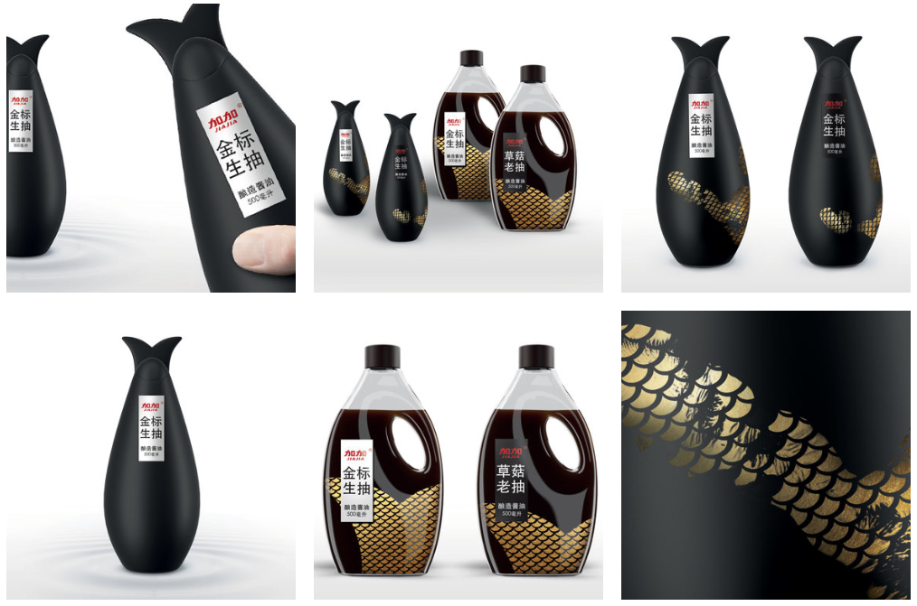
JIA JIA SOY SAUCE
You’ll only discover Jia Jia Soy Sauce’s secret when you use it yourself. These fish-shaped bottles are activated by touch, heating up the thermo paint which then reveals a beautiful, golden fish scale pattern underneath. This concept from Depot WPF takes a traditional product and gives it a fun, modern twist.
“The mix of traditional Chinese culture and modern technology in one package of soy sauce? Why not! Soy sauce is a very traditional product for China, which can be found on the table in any home. This feature imposes certain requirements on its packaging design. At the same time it opens up huge opportunities for functional creativity. Finally we have reached such a solution that combines both respect for traditions and modern technologies. The creative concept is based on several characteristics of Chinese culture. People in China are quite modest. They do not boast their wealth or show their emotions too much to strangers but only to close people, their family and friends around the table sharing the meal. All these ideas are reflected on the bottle: ergonomic shape, modest cover, laconic label on a black background... and the golden underneath that are hiding as long as the bottle stays on the table.”
At first glance, the soy sauce bottle is classic and beautiful with a simple, straightforward approach. The shape is unique, while the color and minimal text and graphics make it a condiment that can easily blend in on any dining room table. Once consumers interact with the bottle, the golden scales appear, making it a more memorable experience. The scales are gold, adding a layer of elegance and luxury.
“The cap is designed in the shape of a fish tail so that the whole bottle looks like a black carp. But it is covered with the thermo paint which becomes transparent from the human’s touch (30-40 degrees temperature) and under this modest cover a rich golden pattern reveals which reminds the carp’s scales. Before our eyes the bottle turns into a golden carp — a symbol of wealthy life and prosperity in China. Thus, we use a modern printing technology while respecting the cultural particularities of the country and create interactivity between the consumer and the product. This package follows the global trend of interaction between the brand and consumer.”