48 COPEECK
Client:
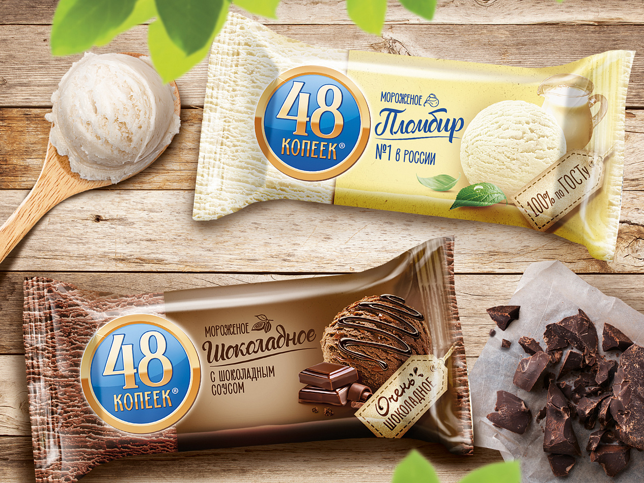
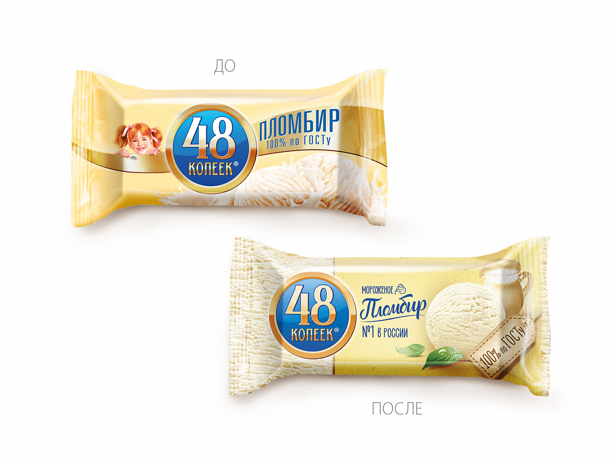
The aim of the classic line’s redesign was to make the package visually easier, more natural and even premium by emphasizing invariably high product quality. The sober, but at the same time attractive typographic design solution enhances the impression of lightness, handmade look and also highlights the main features of ice cream 48 COPEECK: «100% conformity to the GOST», «№1 in Russia», «consistency of the high quality and good taste».
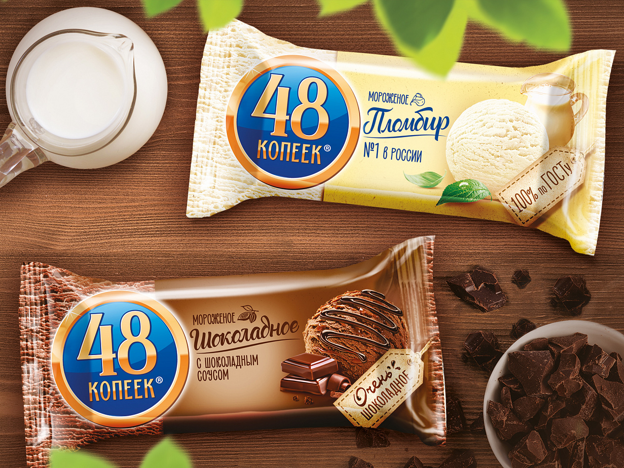
Alina Kozeeva, Art Director of the project: «We have worked through all the packaging design elements: appetizing product group, typography and texture background. There are only the necessary elements that consumers really wants to see.»