


Brite
Client:
Activity:
A tribute to wood
Every DIY store offers a tremendous range of all types of wood coatings. As a rule the packaging design illustrates either their use and effect or the benefits of the brand. In many cases the type of product is not obvious for the consumer until the label is read thoroughly.
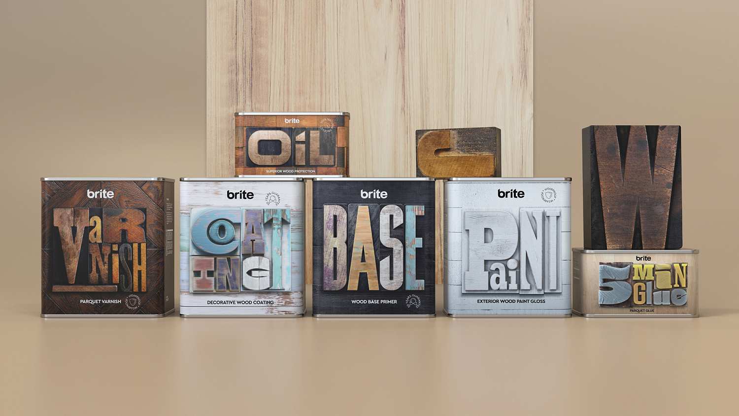
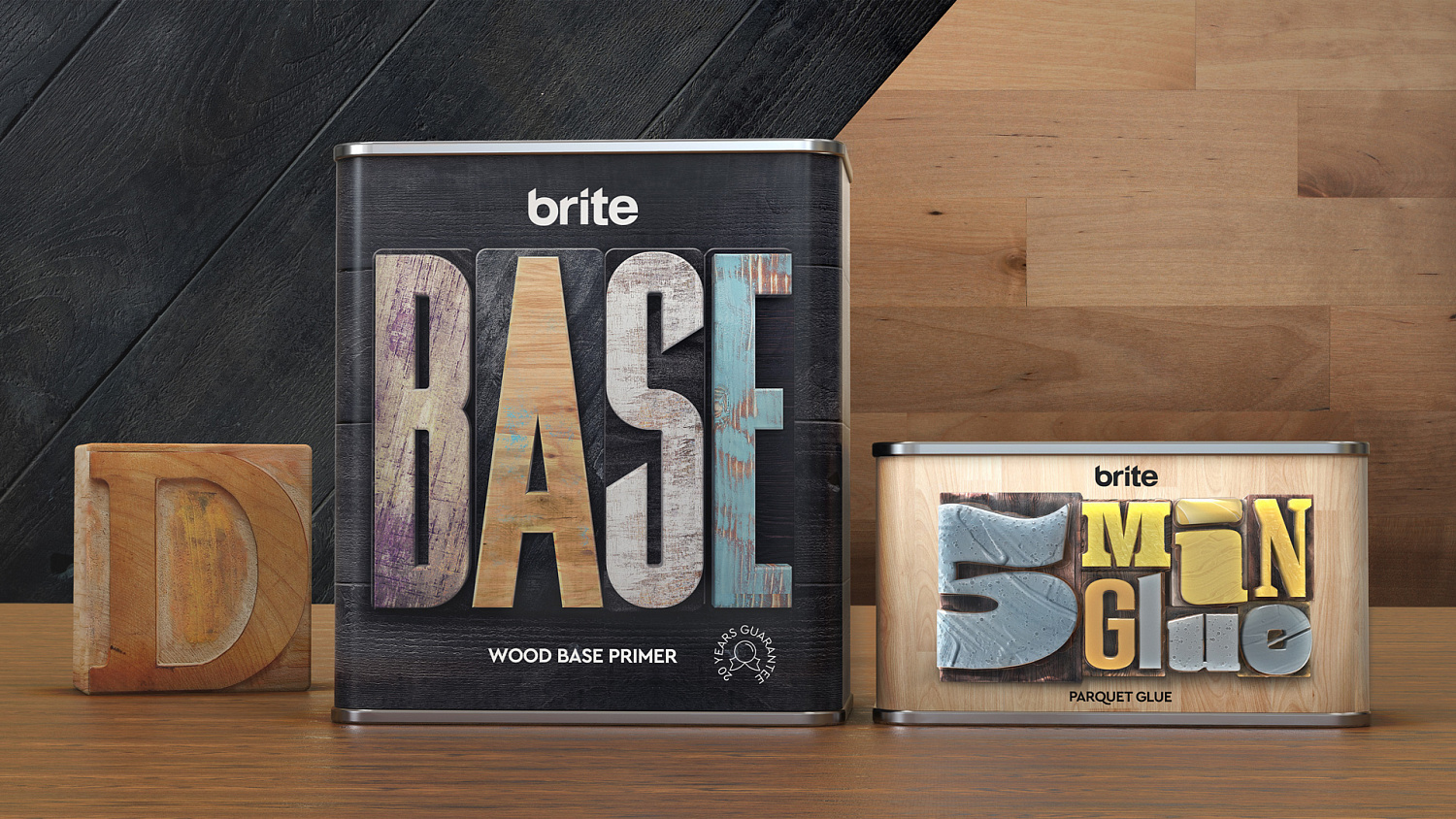
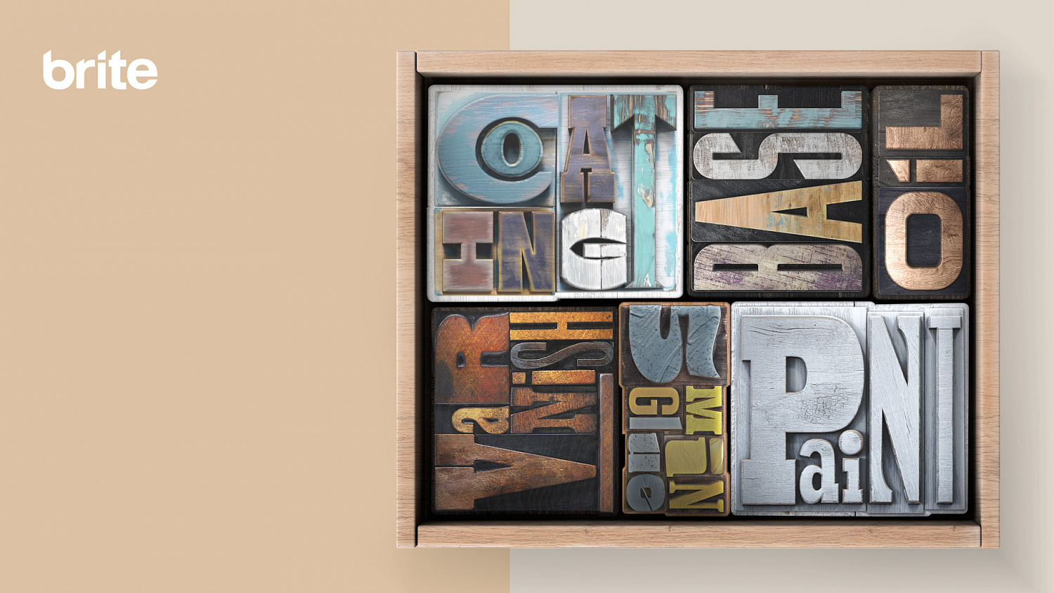
Brite is an exclusive brand of coating materials for wooden surfaces. It offers a wide selection of original coatings with organic ingredients including paints, lacquers, varnishes, oils, bases and even glues. And every item is a tribute to wood with its natural warmth and unique textures.
Our aim was to create a distinctive packaging design that will not only help the consumer choose the right product, but also highlight the brand’s passion for wood.
We combined these two tasks into one challenge and answered it with a creative idea to carve the types of products from wood and give them the main role in the packaging design. Every SKU has its unique memorable typefaces that become an expression of a product’s identity. Hyper-decorative style typography illustrates the effect that different type of coatings can provide. Thus every packaging is a pin to the consumer and a tribute to the beauty of wood.
Every DIY store offers a tremendous range of all types of wood coatings. As a rule the packaging design illustrates either their use and effect or the benefits of the brand. In many cases the type of product is not obvious for the consumer until the label is read thoroughly.
Brite is an exclusive brand of coating materials for wooden surfaces. It offers a wide selection of original coatings with organic ingredients including paints, lacquers, varnishes, oils, bases and even glues. And every item is a tribute to wood with its natural warmth and unique textures.
Our aim was to create a distinctive packaging design that will not only help the consumer choose the right product, but also highlight the brand’s passion for wood.
We combined these two tasks into one challenge and answered it with a creative idea to carve the types of products from wood and give them the main role in the packaging design. Every SKU has its unique memorable typefaces that become an expression of a product’s identity. Hyper-decorative style typography illustrates the effect that different type of coatings can provide. Thus every packaging is a pin to the consumer and a tribute to the beauty of wood.


Awards:


Gold on Dieline festival 2020
Gold on White Square festival 2020
Gold on Pentawards festival 2020
Bronze on ADCR festival 2020
Bronze on Epica festival 2020
Dot on Red Dot festival 2020
End Date:
02/21/2020


