Nesquik
Client:
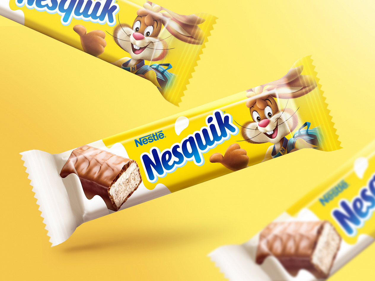
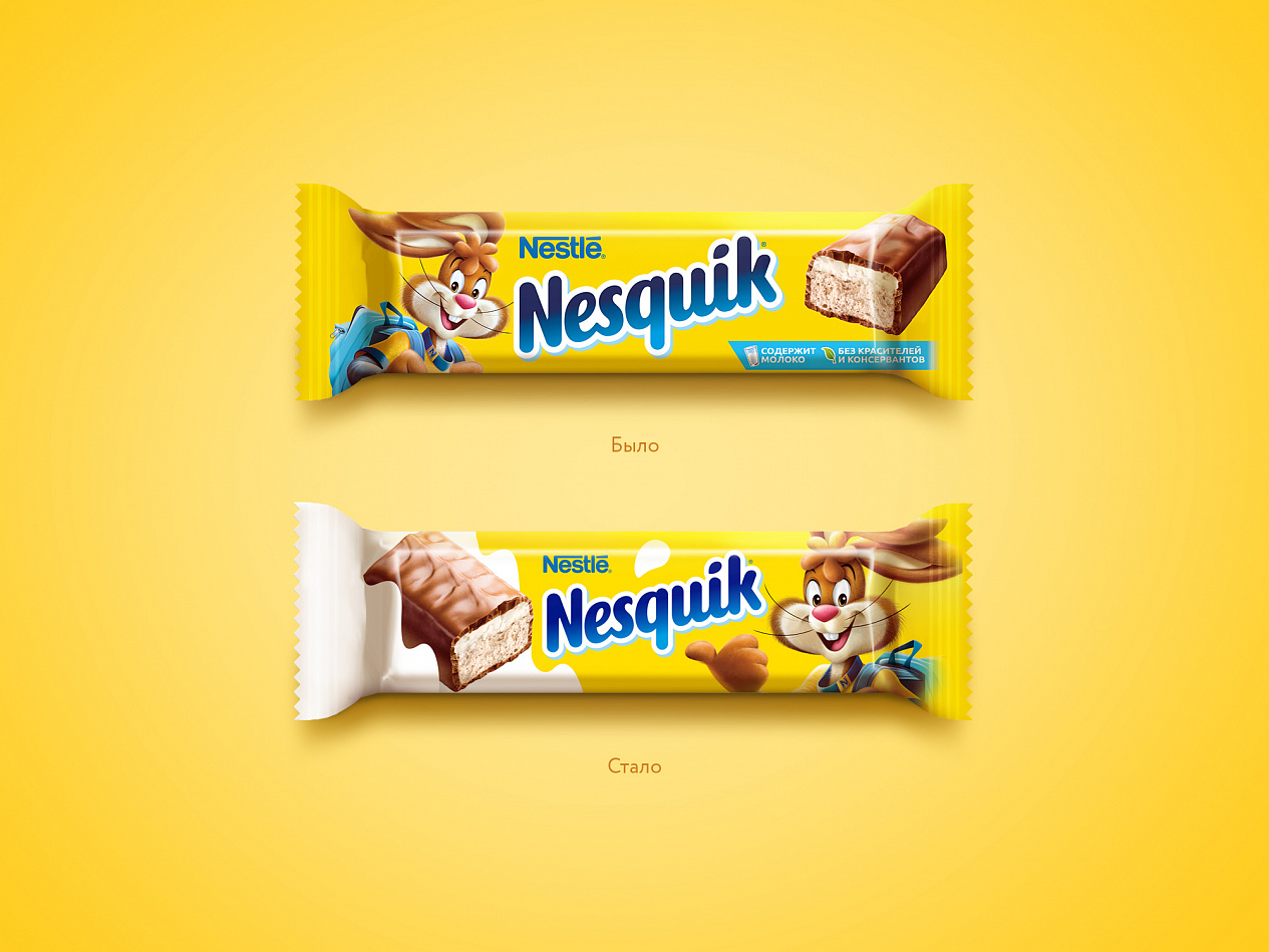
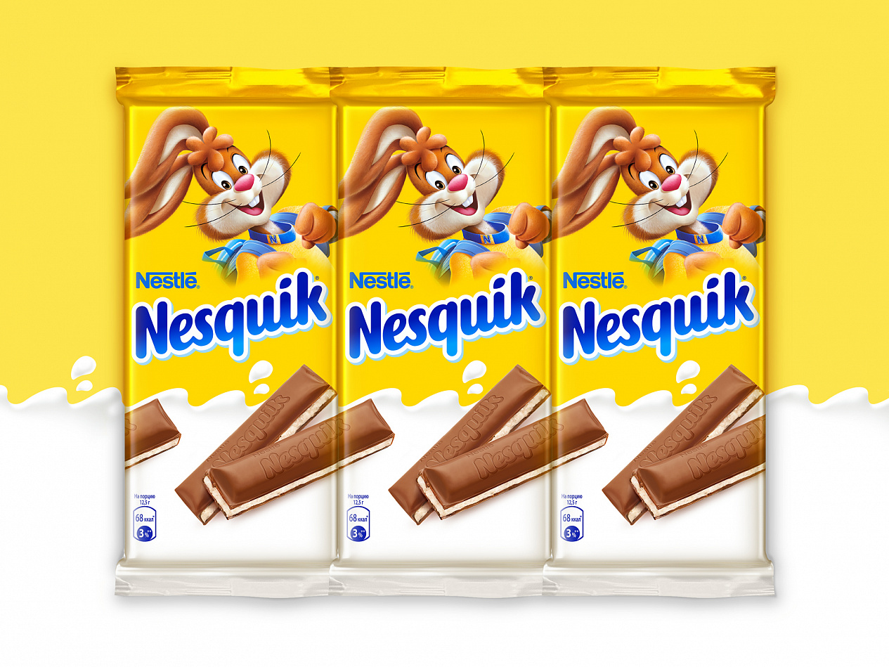
However, for Depot, impossible tasks in branding, perhaps, do not exist. We were able to modernize the design qualitatively, while carefully preserving the style of the recognizable brand without resorting to radical changes. We changed the image of the «classic» milk flow, making it visually more modern. The change in the look of the product itself was reflected in the food zone — in addition, we made it more vivid and expressive. Also the designers worked on how Nesquik will look on the shelf and in the checkout area: chocolate slices on the packaging are intentionally placed so that the pattern of one packaging is a continuation of the other.
Tatyana Bednova, Nesquik junior brand manager: «We were faced with the task of improving the visibility of our brand on the shelf and building a clear brand block. In addition, we changed not only the packaging design, but also the structure of the material, as well as the shape of the bars! All these changes had to be implemented in the design. The new packaging helped to solve all our problems, you can see it yourself by going to any store in our country.»