


Azbuka Morya
Activity:
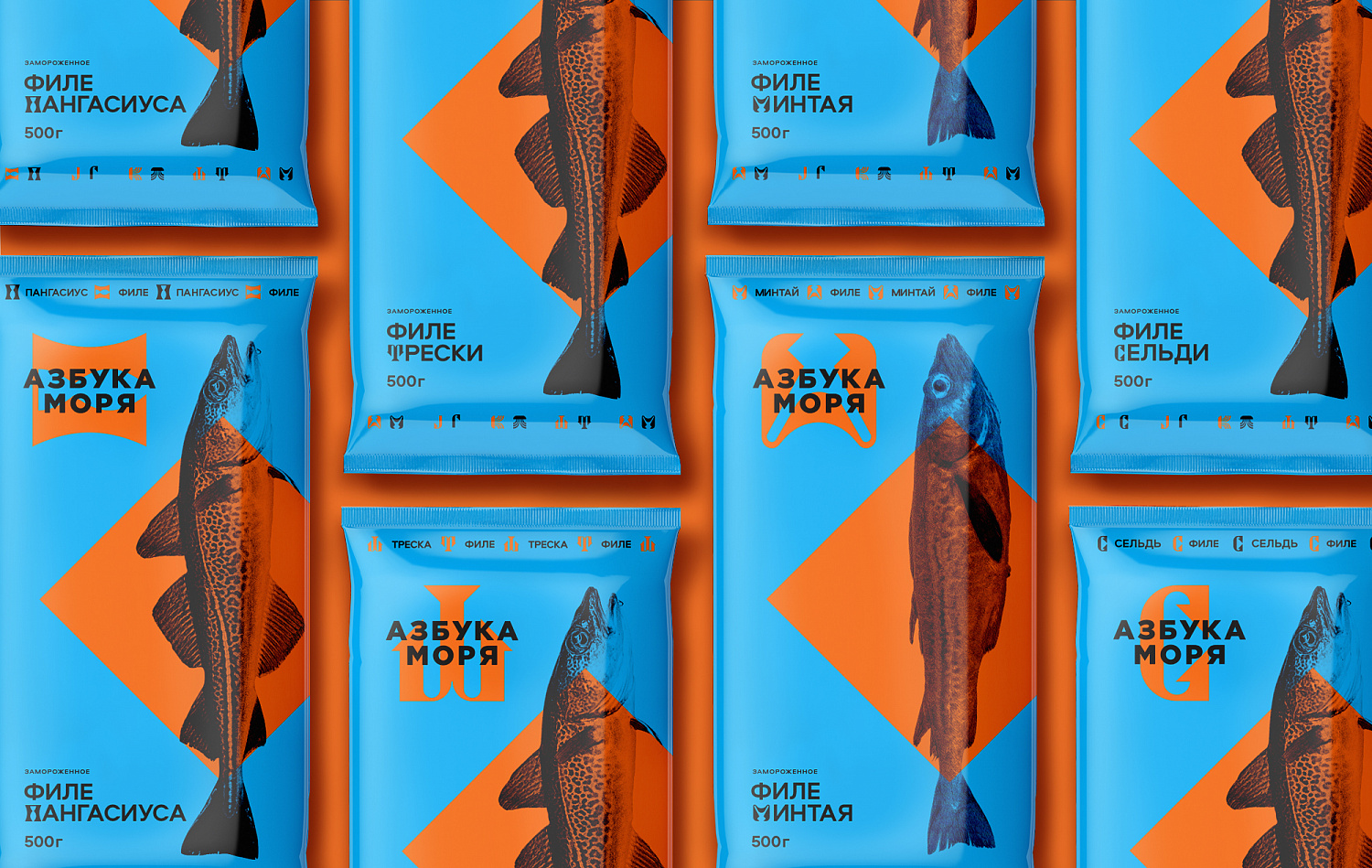
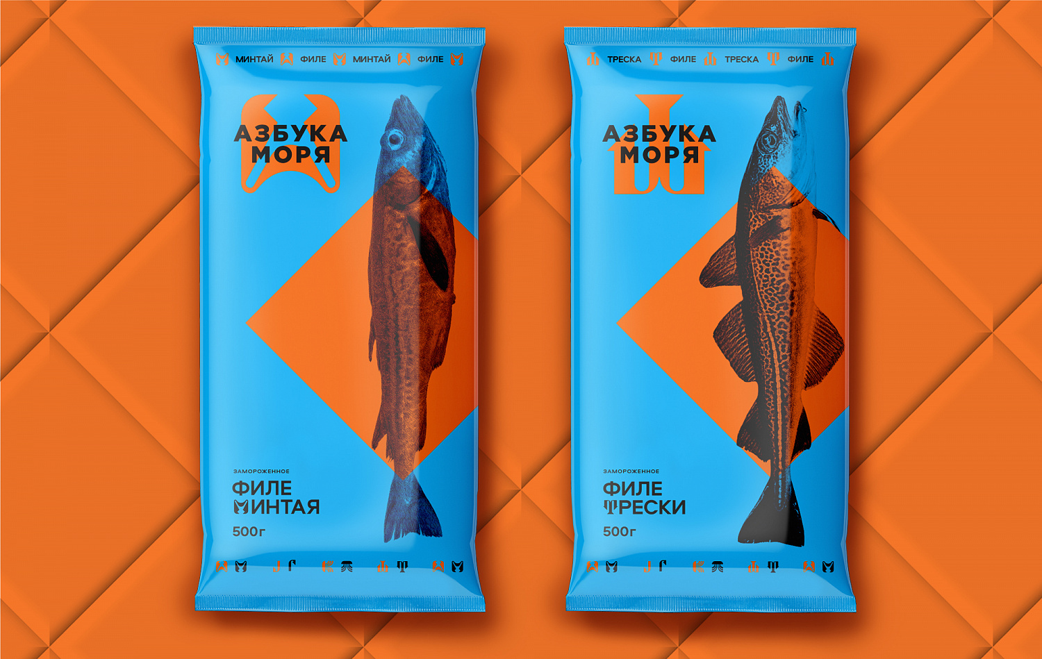
The Dobroflot group of companies have contacted us for the development of packaging design for frozen fish products under the Azbuka Morya brand. The task was to create a bright, memorable design that will be noticeable in the refrigerator at first sight.
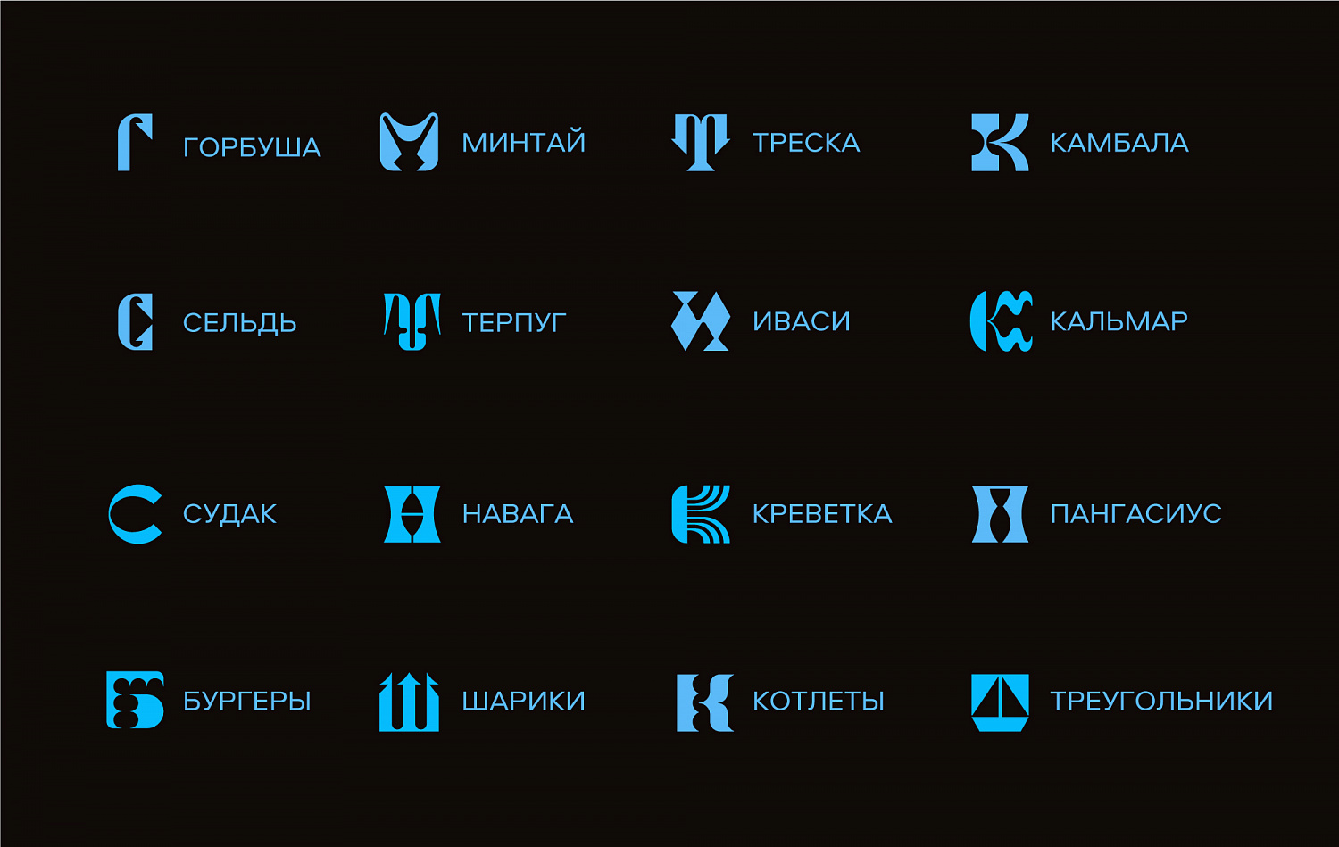
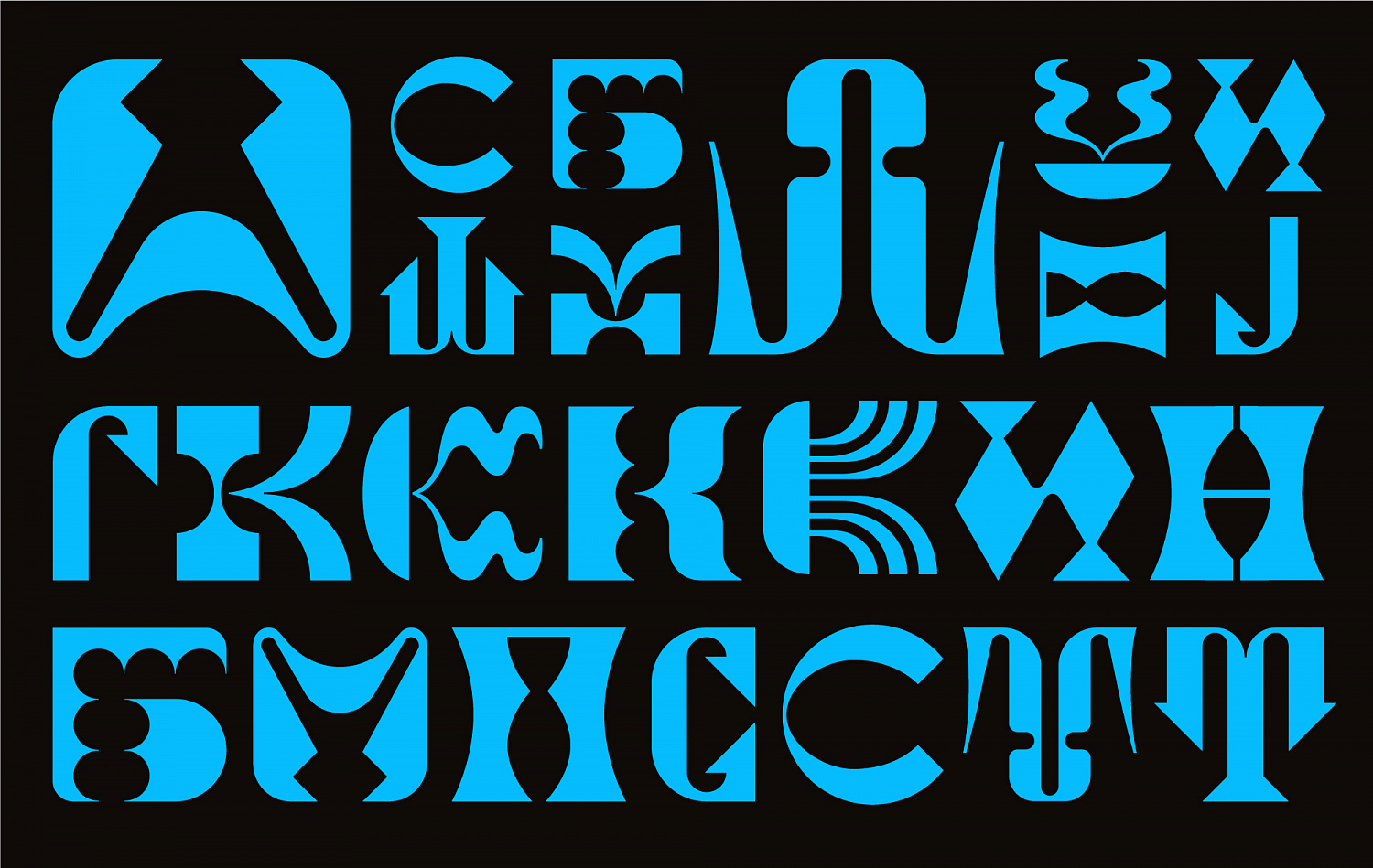
“It is not the first year that we are presenting a line of canned fish under the Azbuka Morya brand, which has already gained market share and consumer recognition. In the company, we adhere to a single style, therefore, we initially came to the agency with the task of adapting the existing design of canned fish to frozen fish products. At the same time, we were ready to consider other options. Azbuka Morya is a brand with which we want to cover the mid-price segment of the market. The design, adapted from our canning group, has not solved the problem - it was getting lost on the shelves among competitors and even was a clone of some of them. The opposite version, on the contrary, was bright, daring, catchy and revealed the core meaning of the Azbuka Morya brand - each unit has its own letter, a real marine alphabet!” says Marina Zavyalova, head of the marketing department of Dobroflot Group.
So, it was decided to develop a fundamentally new design for the Azbuka Morya brand in the direction of frozen fish products.
The history of this company begun in 1911.
Since the end of 2019, two new production complexes for the production of fish fillets and fish cooking have been launched. In 2020, a factory for processing pollock fillets and other fish species was built in Primorye on the territory of the priority development "Bolshoy Kamen". In winter 2020, the manufactory began to produce fish products by weight, and in the near future it will produce packaged products under the Azbuka Morya brand in a new design.


