


SPAR
Client:
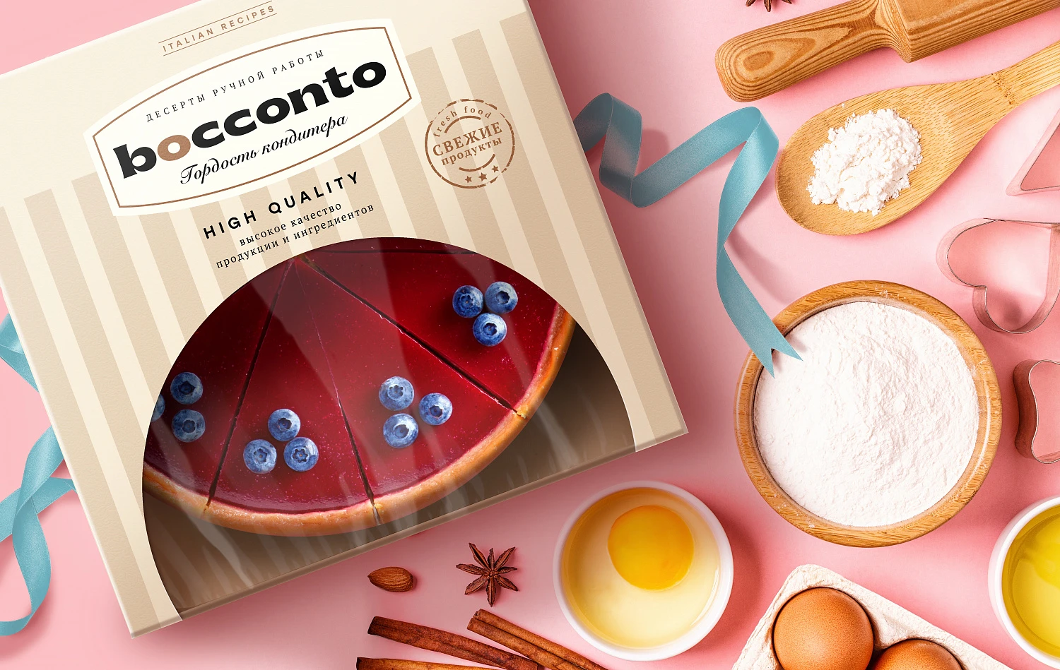
Our task was to create a confectionery category name that would convey the spirit of Italy. We settled on the name Bocconto, which means "the best piece".
The brand design reflects the exquisite desserts aesthetics and tells about the Italian master. Striped packaging refers to the awnings of Italian cafes, and the logo with the name enhances the feeling of Italian origin. The "Fresh products" claim works as a quality guarantee.
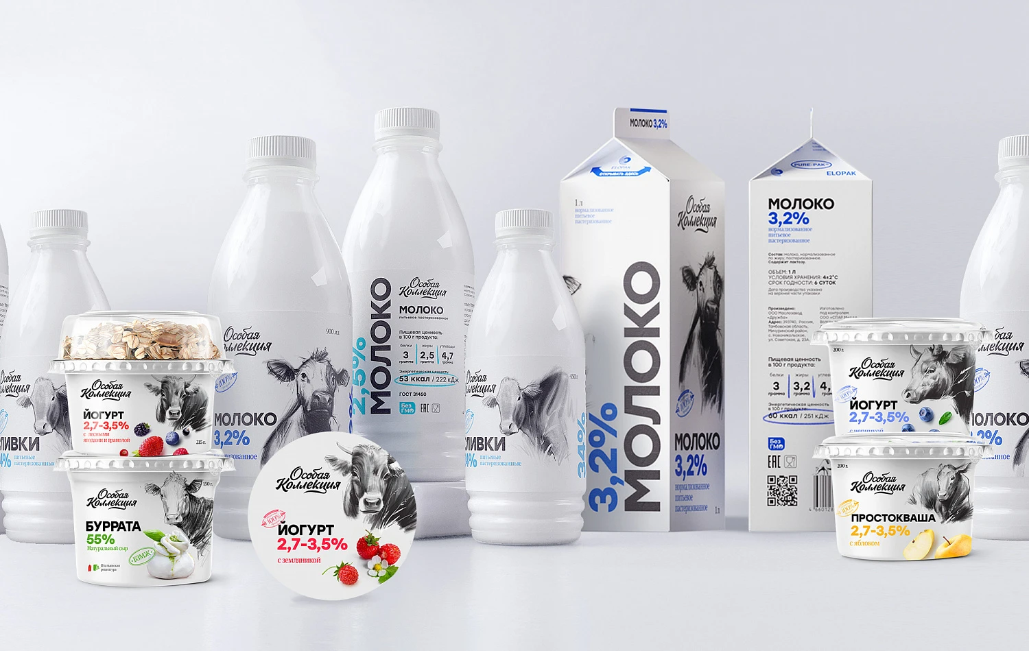
It was important to reflect the cleanliness and the freshness of the product in the design. The design color scheme is natural colors, they are dominated by a delicate white color, additional shades: green, yellow, blue, purple.
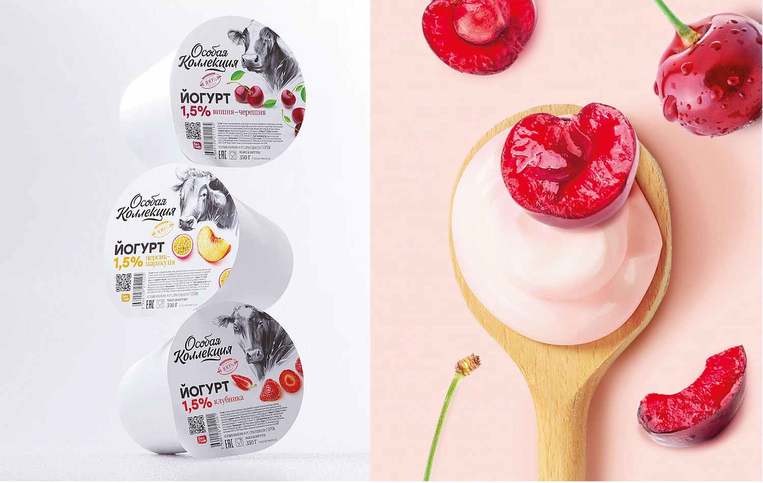
Careful attitude to the outside world is conveyed by the author's illustrations with cows, bulls and calves. This causes an emotional response, creating the feeling that the product hit the shelves right from the fields.
The color coding helps with the product differentiation. The conciseness of the collection design matches the brand philosophy.

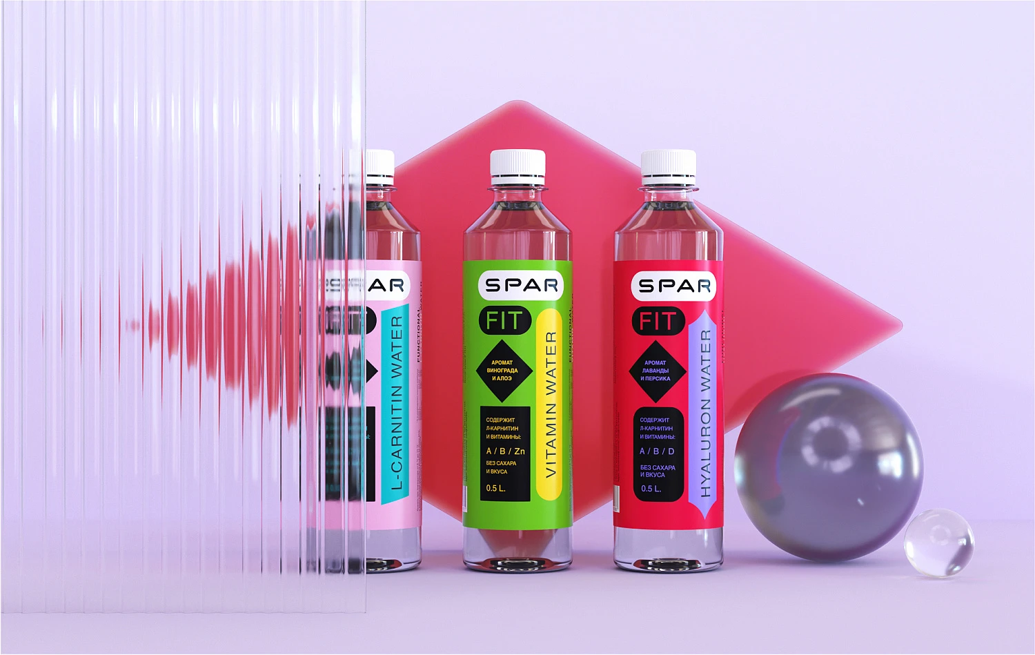
Our team developed the design of the natural protein sport bars and the drinking water line for SPAR.
The conciseness and freshness of the design reflect the products’ naturalness.
The context of modern consumer life is another important theme that is shown on the packaging. The design is built on the visual images of the buttons, dies and notifications.
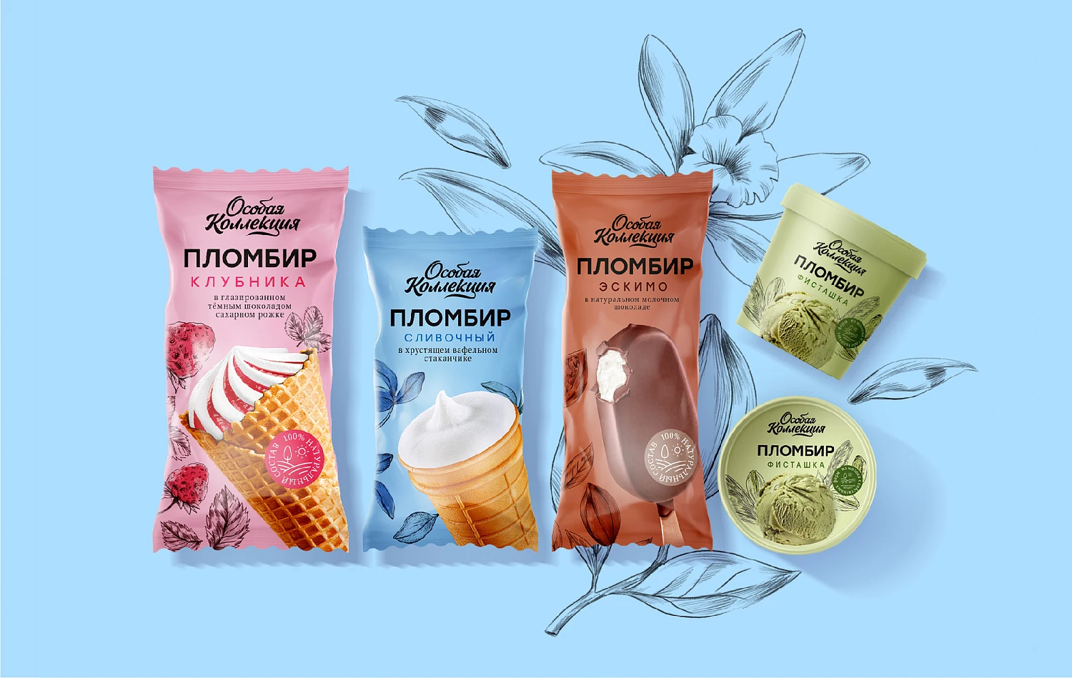
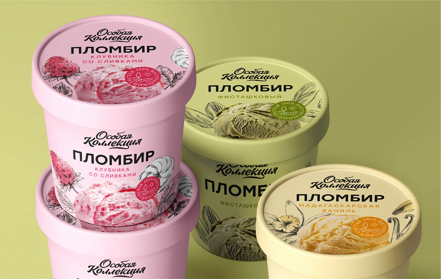
It was important to save the continuity with the dairy line but to highlight the ice-cream category with the emotional packaging.
We have saved the key elements of the brand: a handwritten logo, a typographic block and pencil graphics, but we have placed all this on colored backgrounds, which are also responsible for the tastes layout.
The graphics have been placed as a pattern that makes an accent, framing the ice-cream.
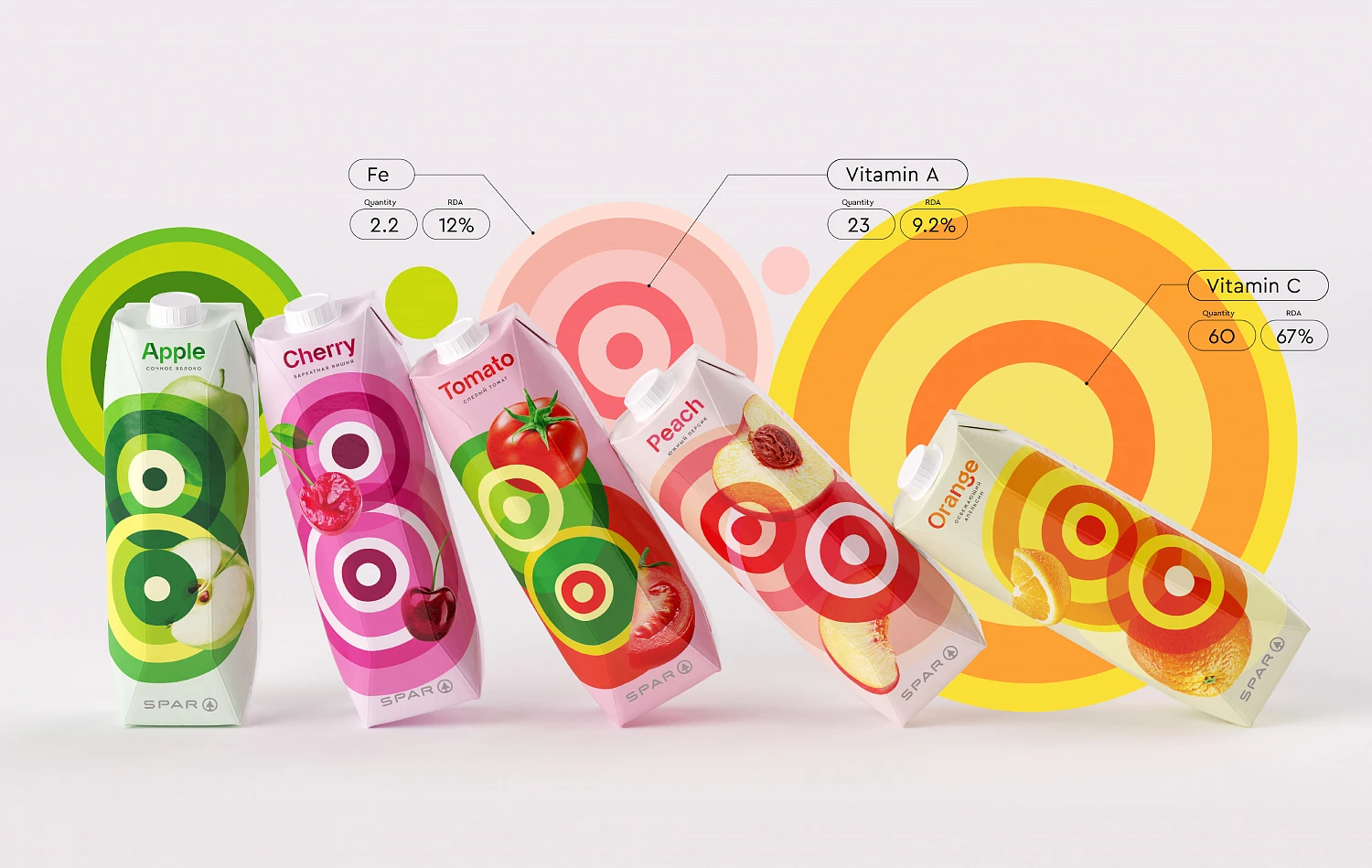


The key moment was to show that the main aim is to create a positive reminder of the importance of health.
The thing is that people often forget about the importance of the vitamins that should be included in the daily diet for the health and the good mood. We are surrounded by digital charts, complex graphs, tables and diagrams every day.
We put “Nutriographics” on the SPAR juice packaging for people to see its nutritional value. The radial diagrams become the main design element. It simply shows the real nutritional value of juices and acts as an eye trigger.
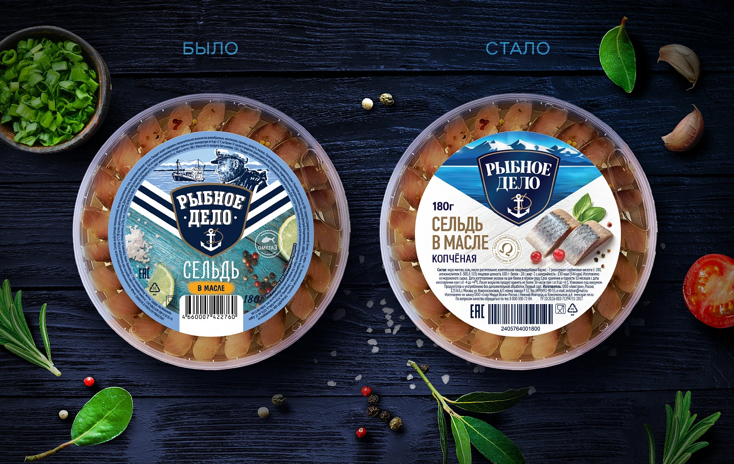
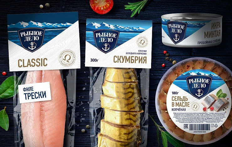
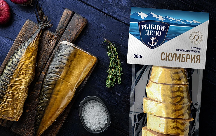
The Depot team had to update the packaging design and the brand logo. It was important to save the “Ribnoye Delo” recognition and to make the packaging more modern, “clean” and minimalistic.
Our illustration became less loaded but more atmospheric. The glare and the serif font in the logo give it volume. The fonts on the packaging became more concise, we have reduced the number of its typefaces, as well as the dies. The updated food zone became more naturalistic and appetizing. We have placed the technical information in an accessible block at the bottom of the packaging for easy reading.
The Depot team has also developed the packaging design of the other SPAR own trademarks Klern and Fanshi.
Our team:
Vera Zvereva — creative director,
Raushan Sultanov — creative director,
Anastasia Tretyakova — executive creative director,
Olga Prokhorova — art director,
Rustam Usmanov — designer,
Anna Bondareva — designer,
Jane Kudrinskaya — designer,
Anastasia Plotnikova — designer,
Evgeniy Nikitin — motion designer,
Vyacheslav Sheiko — CG spetialist,
Irina Kukartseva — head of project,
Alexey Andreev — CEO,
Anna Lukanina — CEO,
Ksenia Parkhomenko — executive director,
Daria Vlasova — PR manager,
Anna Kalinicheva — business development director,
Daria Vedernikova — head of communications.


