
Strobar: packaging redesign for N'Medov chocolate bars (Uzbekistan)
Client:
Customer: ТМ Strobar
Context: The ТМ Strobar brand by N'Medov Holding (Uzbekistan) was valued and highly appreciated by loyal customers, but the packaging stopped “selling like before” or attracting new audiences. So the Strobar team came to Depot for an update.
The client ran a comprehensive study of their target audience and found out that Strobar products are mainly purchased by students or young professionals at the start of their careers. The brand platform review was built on that insight.
The new brand positioning is focused on the concept of “living fully in the moment.” That metaphor has become the strategic reference point for our design and communication.
Context: The ТМ Strobar brand by N'Medov Holding (Uzbekistan) was valued and highly appreciated by loyal customers, but the packaging stopped “selling like before” or attracting new audiences. So the Strobar team came to Depot for an update.
The client ran a comprehensive study of their target audience and found out that Strobar products are mainly purchased by students or young professionals at the start of their careers. The brand platform review was built on that insight.
The new brand positioning is focused on the concept of “living fully in the moment.” That metaphor has become the strategic reference point for our design and communication.
Redesign objectives:
- Update the brand in accordance with the new brand platform
- Create an emotional bond between the brand's region of origin through identity elements while keeping the brand relevant and attractive for young audiences
- Make the logo more visible on the shelf
- Develop a claim system to improve product trust
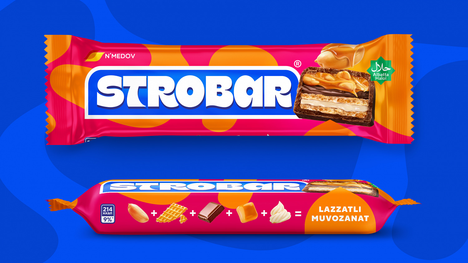
Using the studies and the new brand platforms as our touchstones, we structured the new packaging design around the key idea: the balance of taste and ingredients, multi-layered product and traditions. That principle has become the foundation for the entire visual language of the product.
Implementation details:
- Appetizing food zone: We focused on the bar cross-section that demonstrated its layers and the rich texture.
- Images of ingredients: Placed on the sides of the packaging, they visualize a perfect combination of tastes and enhancing the natural feel.
- Ethnic pattern: An unobtrusive ethnic motif against the background as a careful reference to the bar's place of origin.
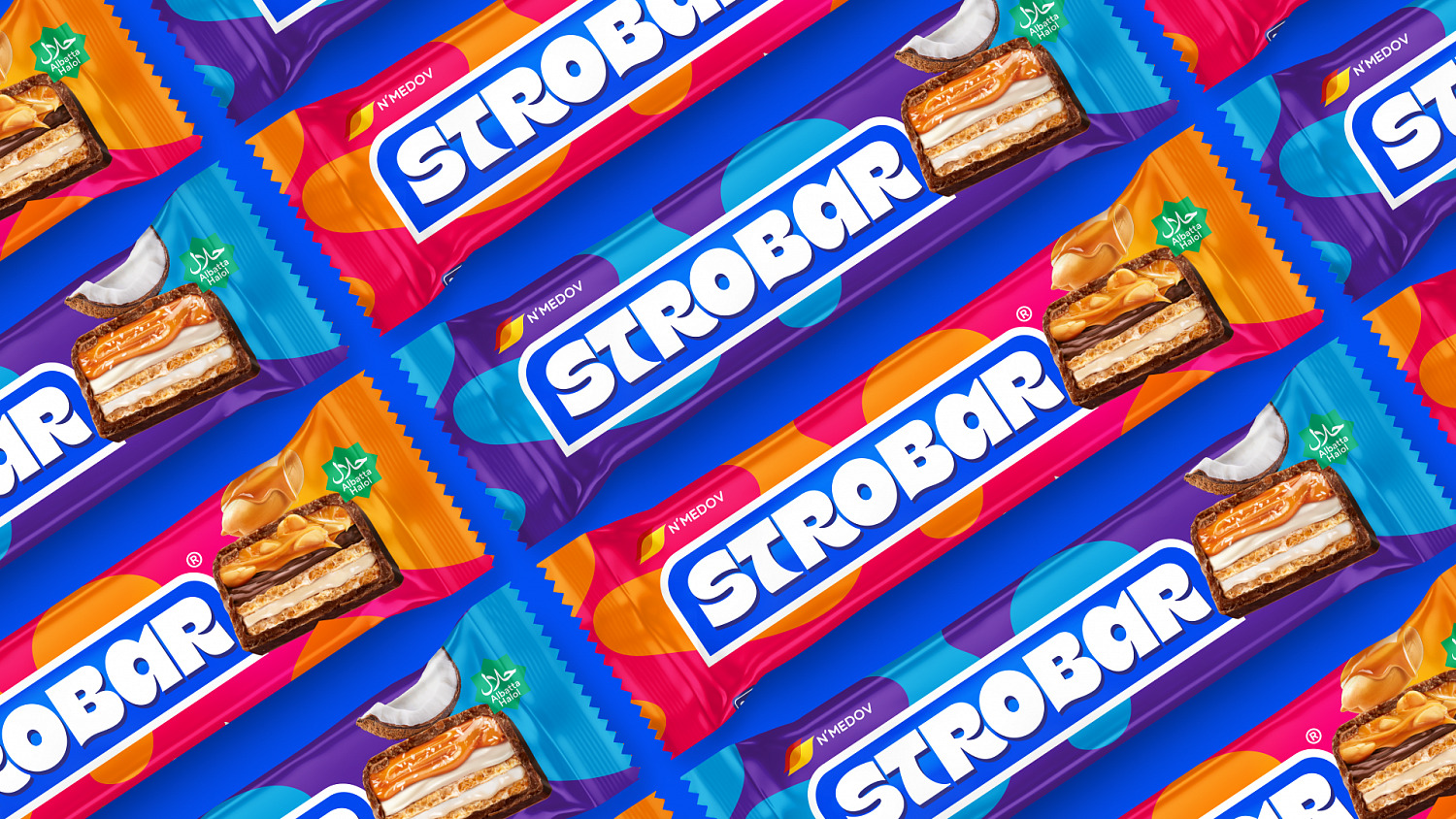
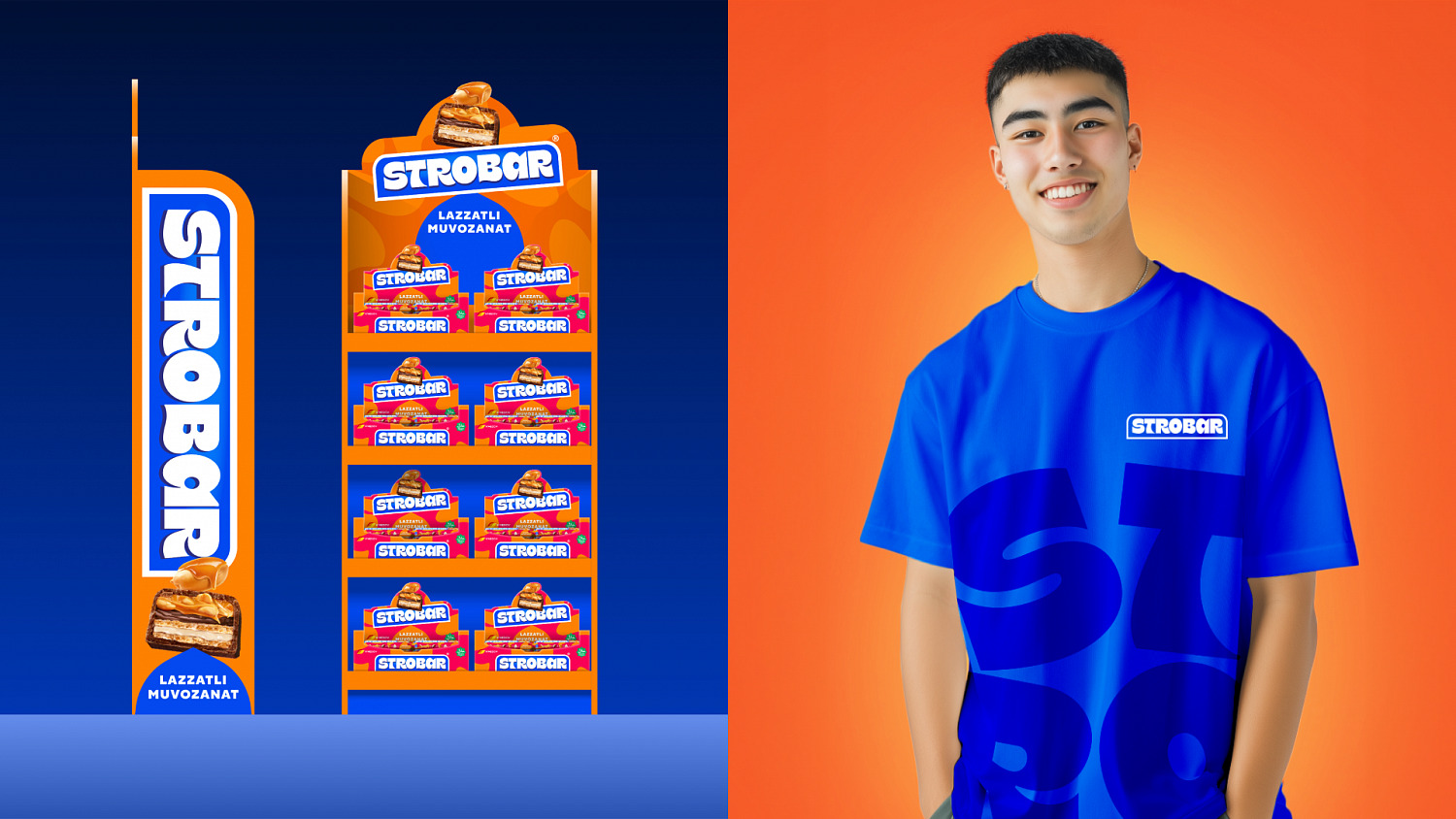
- Dominating logo: The brand name, Strobar, takes up a lot of space on the packaging, improving its visibility and strengthening the shelf impact.
- Claim system: Those elements add functional value to the packaging, broadcasting the product's key advantages and guaranteed quality.
The updated brand became more visible and cohesive for customers, which led to growing sales. The packaging is represented in retail stores and marketplaces.
Agency team:
Maria Kuzmina, development manager
Irma Zueva, Senior Project Manager
Aleksandra Ivanova, Director, Account Management Team
Farkhad Kuchkarov, Strategy & Development Director
Milena Apaeva, Strategist
Anastasia Plotnikova, Art Director
Andrey Anisimov, Designer
Dmitry Penkov, Designer
Ksenia Mirokhina, Designer Aleksandra Rumanova, PR Manager
Stasya Vasilenko, PR Manager
Maria Kuzmina, development manager
Irma Zueva, Senior Project Manager
Aleksandra Ivanova, Director, Account Management Team
Farkhad Kuchkarov, Strategy & Development Director
Milena Apaeva, Strategist
Anastasia Plotnikova, Art Director
Andrey Anisimov, Designer
Dmitry Penkov, Designer
Ksenia Mirokhina, Designer Aleksandra Rumanova, PR Manager
Stasya Vasilenko, PR Manager
End Date:
10/14/2024