


The redesign of NESCAFÉ Classic
Add to Favorites
Since 1938 NESCAFÉ Classic has been a revolutionary brand with an innovative spirit. This year the NESCAFÉ Classic has been has significantly changed
The flavor of coffee got even better after the addition of ground coffee beans of Arabica. New microbeads reveal aroma and taste better.
Depot team designed the new Nescafé Classic. We remained committed to the visual conception but demonstrated product innovation.
The intention was to convey the product innovation and maintain a consistent style.
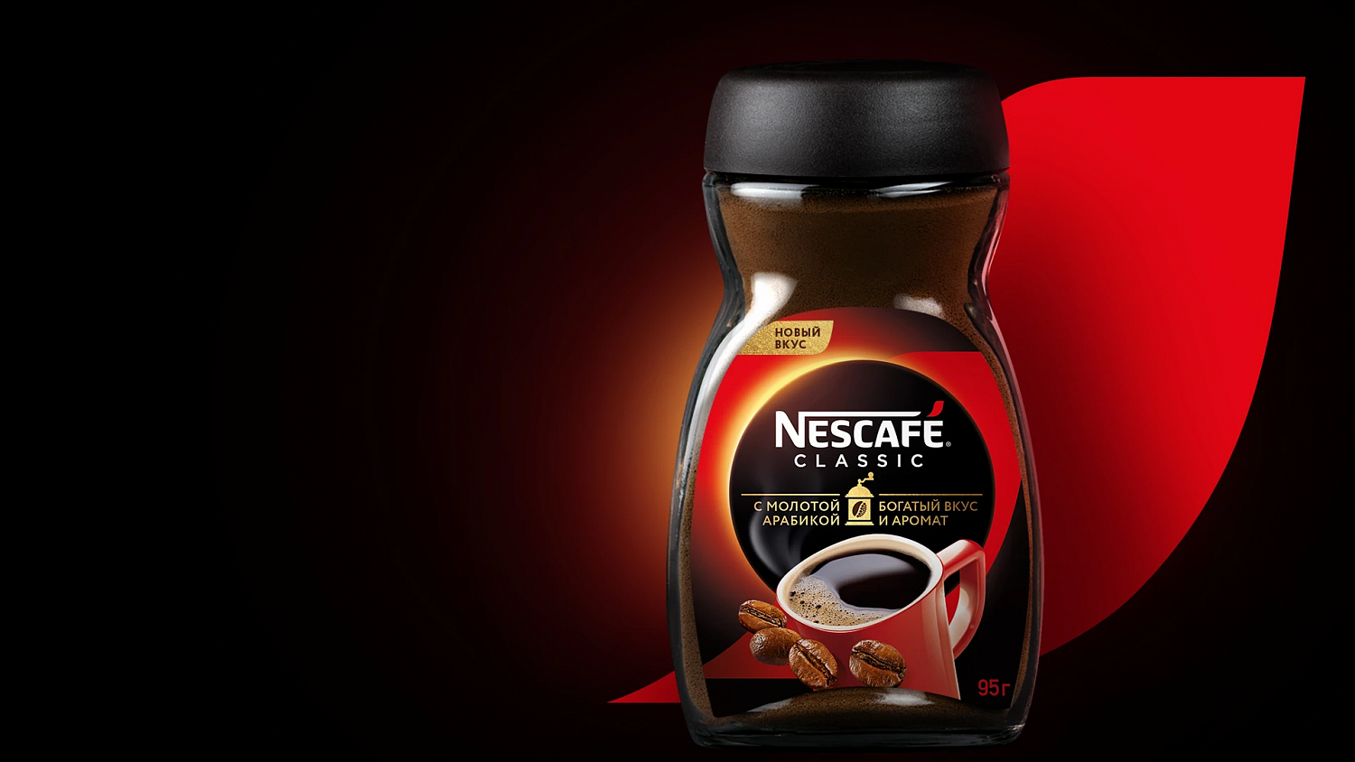
A symbol in the form of a coffee grinder with grain is arranged in the middle of the scene. It emphasizes the new taste and the addition of ground coffee beans of Arabica.
A big red mug and the coffee beans have always been associated with the taste and aroma of the NESCAFÉ Classic. We placed these elements on the background of the dawn, it makes the package more modern. The dynamic of the composition is complemented by a bright red band. One can see the Red Accent sign of the NESCAFÉ logo. We showed the innovative spirit of NESCAFÉ Classic through specific elements. One look at the packaging makes you want to taste and smell the content.
The flavor of coffee got even better after the addition of ground coffee beans of Arabica. New microbeads reveal aroma and taste better.
Depot team designed the new Nescafé Classic. We remained committed to the visual conception but demonstrated product innovation.
The intention was to convey the product innovation and maintain a consistent style.
A symbol in the form of a coffee grinder with grain is arranged in the middle of the scene. It emphasizes the new taste and the addition of ground coffee beans of Arabica.
A big red mug and the coffee beans have always been associated with the taste and aroma of the NESCAFÉ Classic. We placed these elements on the background of the dawn, it makes the package more modern. The dynamic of the composition is complemented by a bright red band. One can see the Red Accent sign of the NESCAFÉ logo. We showed the innovative spirit of NESCAFÉ Classic through specific elements. One look at the packaging makes you want to taste and smell the content.
End Date:
03/02/2020


