The research company Mediascope had rebranding and now present a new logo and corporate identity to their employees, customers and partners.
![]()
Updates support the major changes in the company over the past year, as well as actual plans for the development of Mediascope research projects in the nearest future. The rebranding project was implemented by Mediascope in partnership with Depot WPF.
![]()
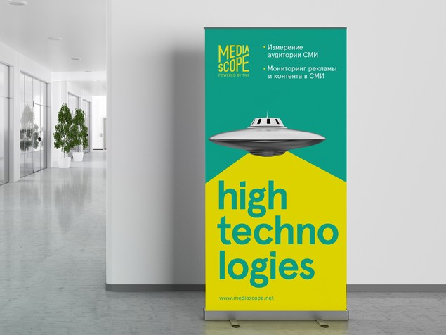
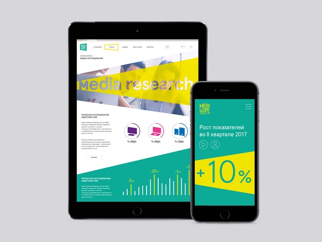
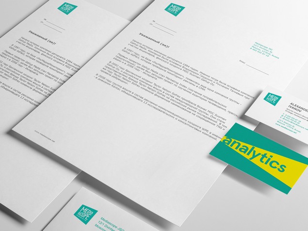
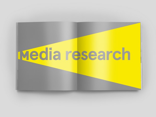
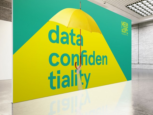
According to Anna Prishchepova, Director of Corporate Communications at Mediascope, "at the heart of the new corporate identity of Mediascope is a metaphor that reflects the basic principles of our company's activities - transparency, objectivity and leadership. Graphic expression of this metaphor metaphor "shed light" was a light beam. This visual element is presented in all materials. "
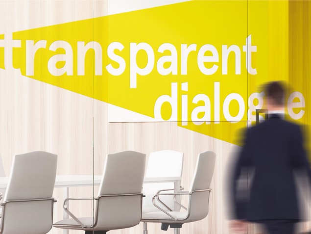
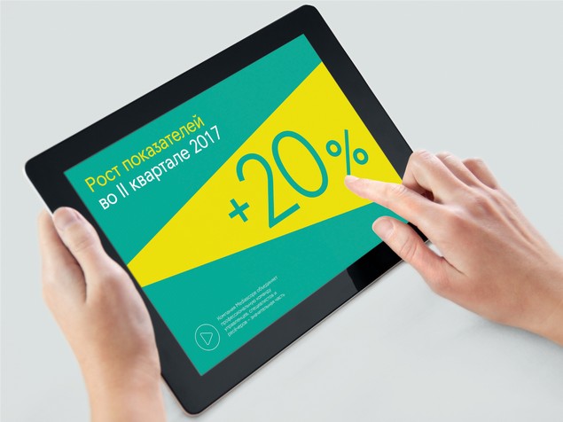
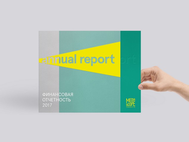
The perspective and dynamics pass through all the elements of the corporate style, including the logo. According to the idea of Depot WPF specialists, the new company logo is a combination of two beams, leaving in prospect and another font writing the name of the company Mediascope. Also changed the color palette of the brand, becoming more vivid and saturated. Thus, the main background color is now turquoise, and a bright lemon colour is selected as the emphasis.
"Mediascope is a brand of high technologies, wide coverage, meeting the current needs of the entire market. And this brand requires the accepted communications: high-quality, targeted and fashionable. In our opinion, in a new corporate style, this new one is absolutely usable for all users, "comments Alexey Andreev, managing partner of Depot WPF, co-president of the Association of Branding Companies of Russia.