Blanc Bleu
Activity:
Uzbekistan is a small country with hot climate. It consumes a lot of drinking water which is mostly imported.
Atlas Group is a producer of mineral water in Uzbekistan with an ambition not only to bring new water brands to the local market, but also to export them to Russia and Europe.
The brief was to create a new water brand in premium segment having a potential to be successful in Central Asia, Russia and Europe.
The objectives were to find a strong creative idea and develop a brandname, a unique shape for the bottle and a the label design so that people in countries so different in people’s mentalities would love it.
The project had a large scale including several stages of ideation, modeling, prototyping and testing. The project term exceeded a year.
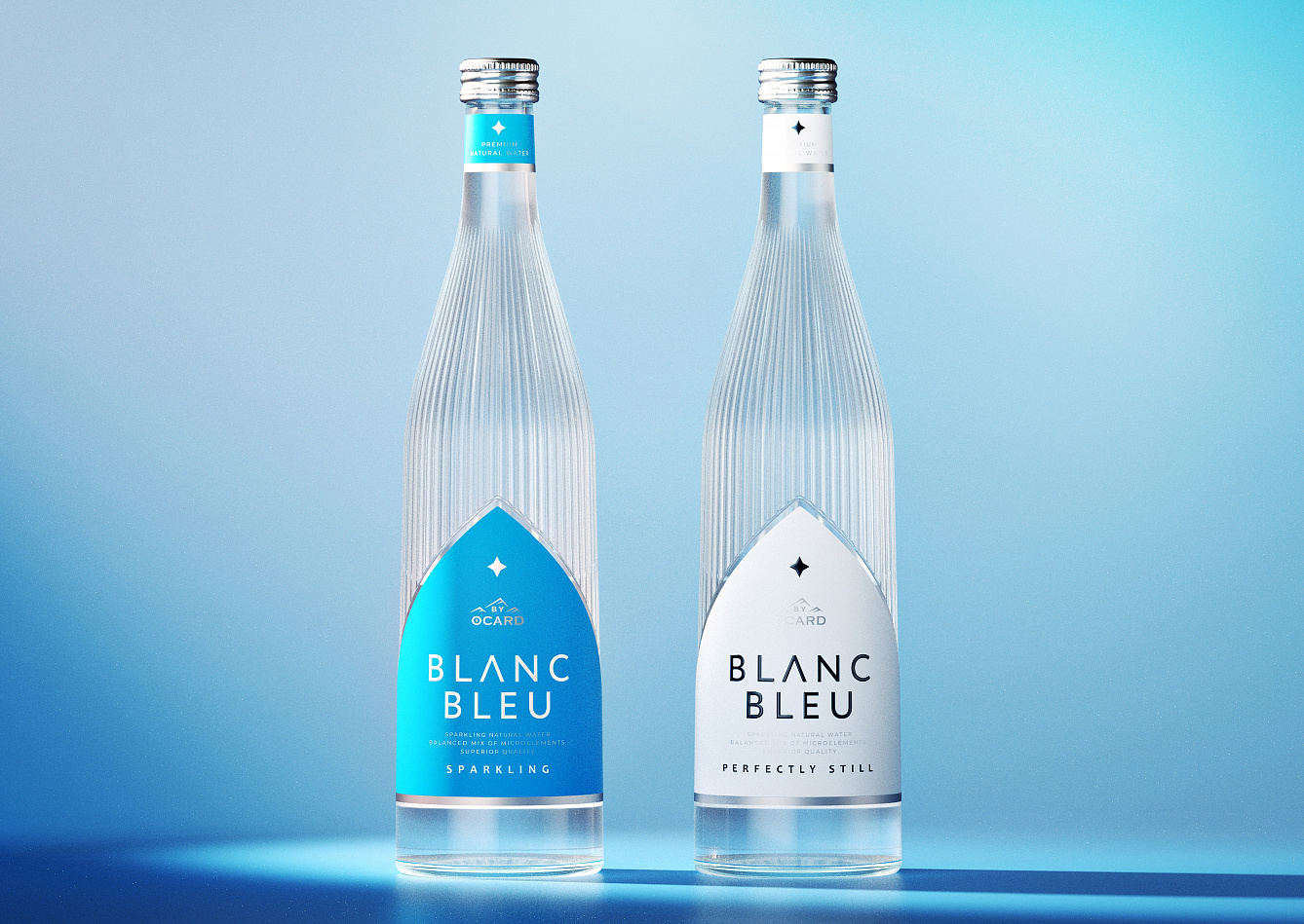
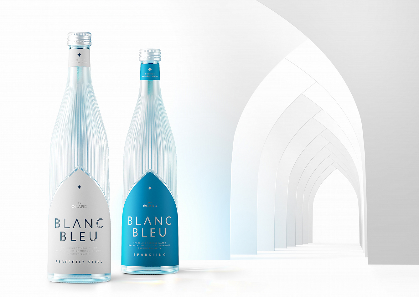
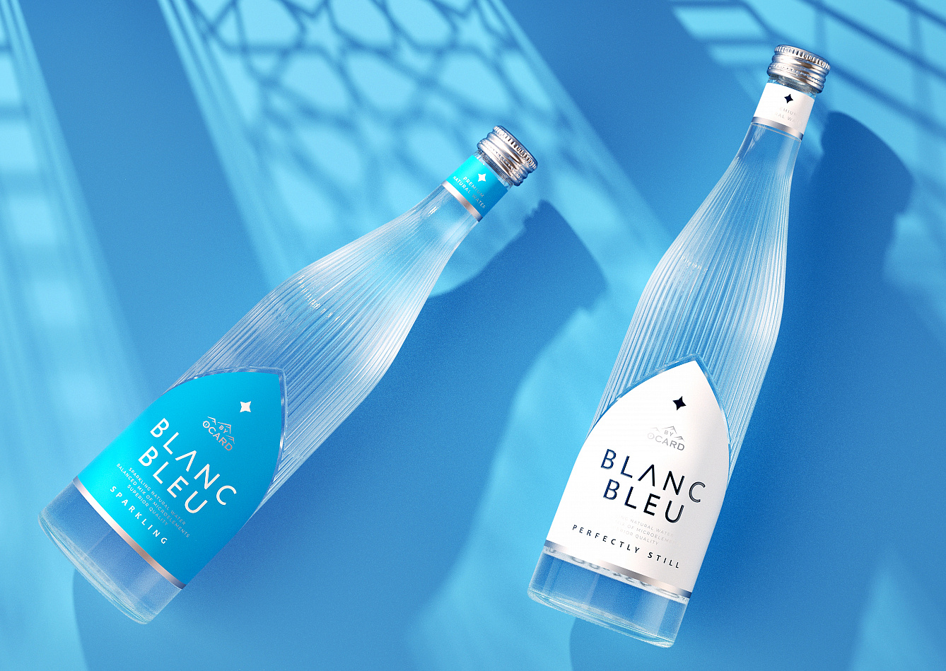
«Blanc - Bleu» is a drinking water brand produced in Uzbekistan, sold in Russia and planned to be further exported to Europe. Therefore the target audience is wide, multinational and multiconfessional.
The name means «white-blue» and reflects integration of two worlds of purity – water and light.
Light usually comes through a door or a window. We were surprised to learn that in temples, cathedrals and mosques they have a very similar arch shape. So we took this shape as a basis for the label. By doing so we united the purity of water with the purity of thoughts.
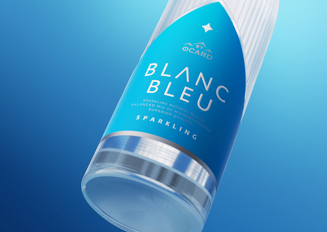
When light comes through water we can see the rays and evaluate the purity. So we added vertical riffles reminding light rays to the upper part of the bottle.
Thus we created an ultimately laconic yet meaningful design conveying purity to people of all nations and confessions.
To convey light and purity a minimum of design elements with a strong meaning was used.
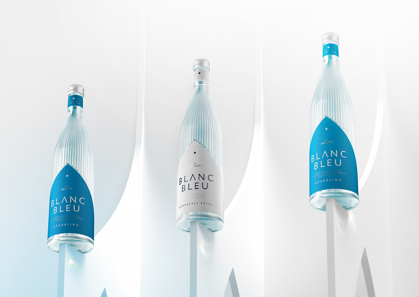
The brand is presented in two positions: still water and sparkling water. For both of them we used a glass bottle with vertical riffles reminding light rays and a paper label placed in an arch window form. To differentiate still water from sparkling the labels are colored white and bleu thus making another link with the brand name.
The matte texture pf the label makes the visible contrast to the shiny riffles reflecting light. The metallic lid together with the subtle touch of silver on the label add a little shimmer, just like the specks of light on the water.
The reach perfection the design process started from hand sketches on paper and continued in 3D models printed and tested in real size.
The brand just started to be sold in Uzbekistan. But we can already see its success in the local market as well as a huge potential for sales in Russia. Several Russian retail chains became interested in having Blanc Bleu on their shelves. In business conversations with possible European partners the brand was marked as an elegant premium solution. This already shows that the brief objective was reached.
However the greatest value of Blanc Bleu is in emphasizing an eternal value of purity in all its senses and showing a common side in all confessions. Thus the brand creates a good basis for peace and tolerance between people all over the world.