Excelsior
Add to Favorites
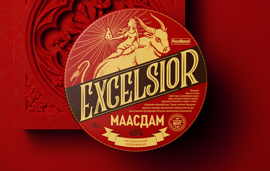
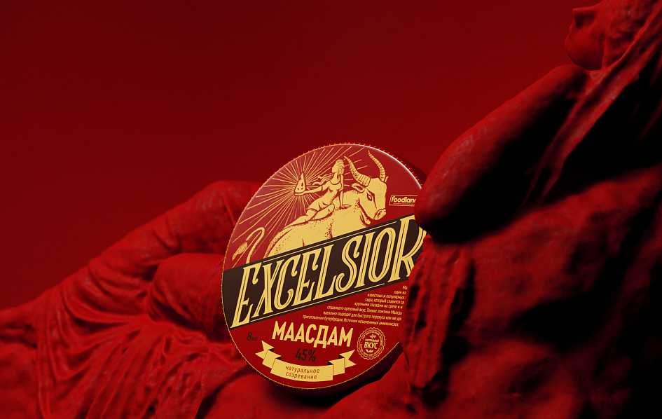
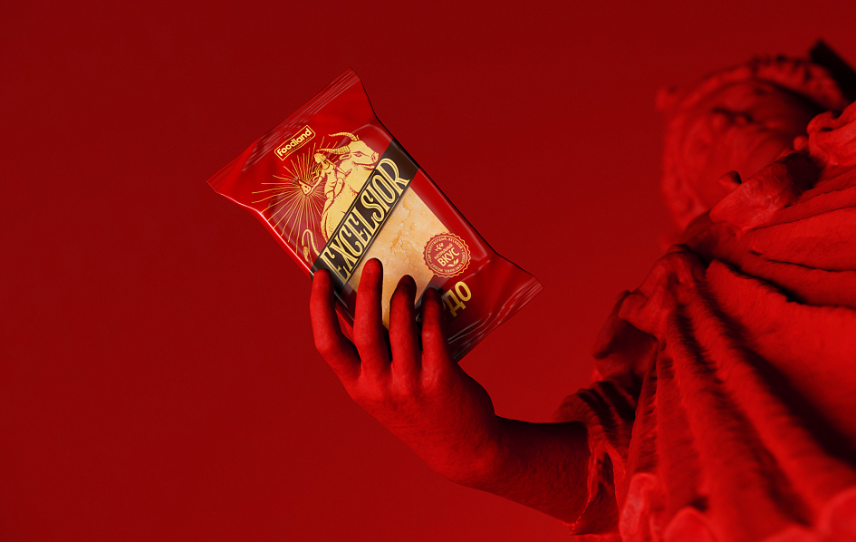
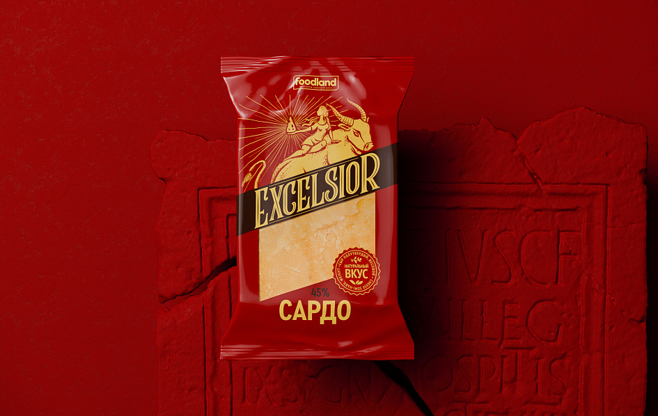
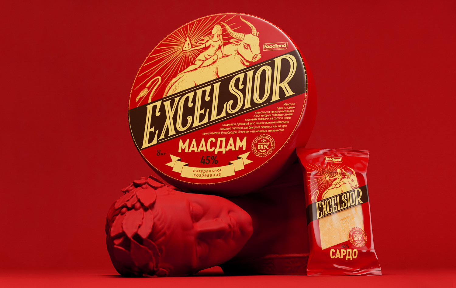
Excelsior is a new premium brand from the well-known manufacturer of cheese products Foodland. The parent brand guarantees true European quality and the use of traditional production technologies. The Depot team developed a package design for 2 SKUs: Maasdam and Sardo cheese varieties.
Reinterpretation of the legend of the abduction of Europe formed the basis of the packaging design concept. In the ancient Greek myth Zeus, in the guise of a Golden bull, takes a girl to Crete, and in our story they go on a journey together. Having taken possession of the coveted piece of cheese, sitting on the back of the bull, she carries it carefully and proudly, as if the most precious treasure. The combination of warm colors harmoniously complements the design image of the reinterpreted legend. The main color of the package is made in terracotta-red, which will allow the product to stand out on the category shelf. Moderate composition, illustration focused on the product.
Reinterpretation of the legend of the abduction of Europe formed the basis of the packaging design concept. In the ancient Greek myth Zeus, in the guise of a Golden bull, takes a girl to Crete, and in our story they go on a journey together. Having taken possession of the coveted piece of cheese, sitting on the back of the bull, she carries it carefully and proudly, as if the most precious treasure. The combination of warm colors harmoniously complements the design image of the reinterpreted legend. The main color of the package is made in terracotta-red, which will allow the product to stand out on the category shelf. Moderate composition, illustration focused on the product.


Graphic dominant — a spectacular font composition, made in a vintage style, attracts attention and this is a bright eye-stopper. The diagonal position adds dynamics and associated with naming. The name is derived from the Latin word, which means "higher and higher". Naming emphasizes the unsurpassed quality of the product, its pursuit of the ideal. The inscription is based on a reinterpretation of historical typography: exquisite lines and mysterious patterns of the Victorian style.
Hallmarks "natural maturation" and "natural taste" only confirm the overall impression of the story illustration. The concise design of the new Foodland corporate logo corresponds to the positioning of a major brand manufacturer and emphasizes the product's place in the brand architecture.
Hallmarks "natural maturation" and "natural taste" only confirm the overall impression of the story illustration. The concise design of the new Foodland corporate logo corresponds to the positioning of a major brand manufacturer and emphasizes the product's place in the brand architecture.


End Date:
02/06/2020

