Sovcombank
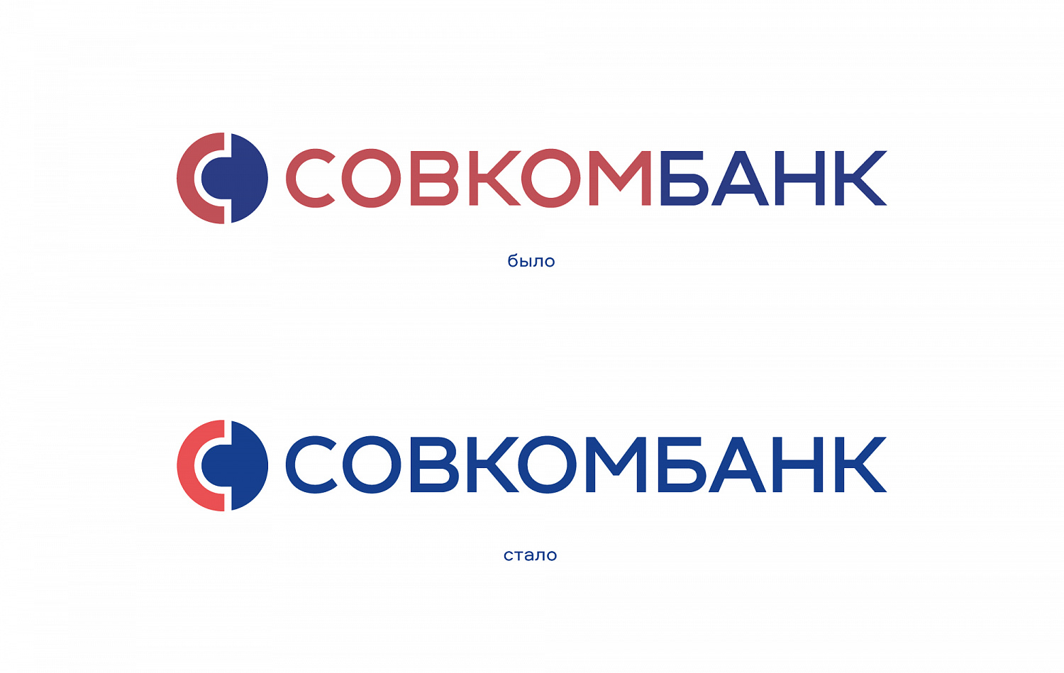
The team of our agency had a task to update the corporate identity of the bank, to develop a set of laconic visual elements for branding, which will be perceived more modern and "fresh», simplify communication and allow to build a unified perception of the brand.
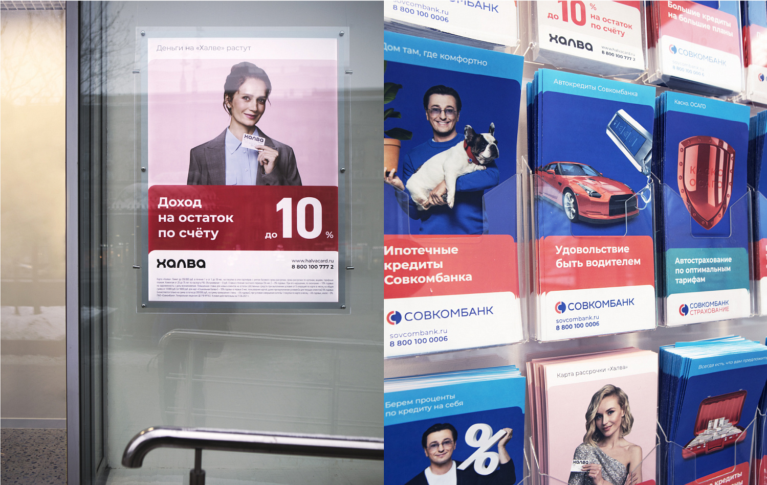
Basing on the unique logo font, we have developed a new svcmbnk logotype font for individual units of Sovcombank: Sovcombank Insurance, Sovcombank Leasing, Sovcombank Factoring, etc. This step will help to further develop the new directions and update the existing ones.
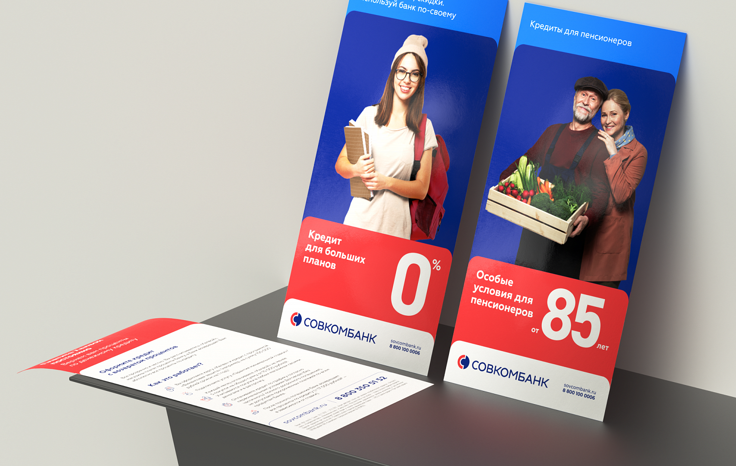
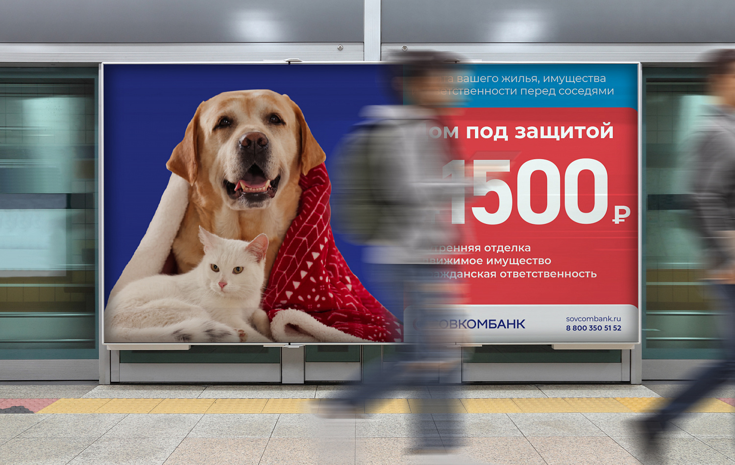
A modern bank is an aggregator of various services that we have visualized using a tab system. The style of these tabs is a reference both to offline cards and to a new form of interaction with the bank - cards in the application and on the website.
The proposed tab system can be adapted to any media.
The updated colors form a single pattern of dies on the carriers: red is used for the main message in the parent brand, blue is used for an additional message or a rubricator, and dark blue is used for KV. The set is complemented by icons in corporate colors.
In addition to a single color scheme for the parent brand of Sovcombank, we have offered additional colors for individual directions. Each of them has its own corporate color, its own logo with an inscription, which distinguishes the direction from others. For example, green-blue is the new corporate color for the direction of Sovcombank Insurance.
The corporate identity system we have proposed consists of specific tools, but it is flexible and can be adapted to different directions with their own logos and colors.