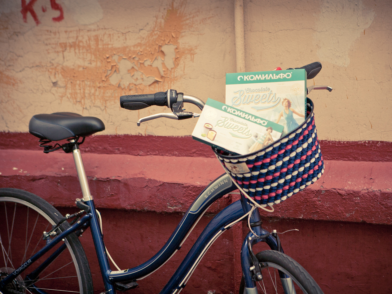
Comilfo's Redesign
Add to Favorites


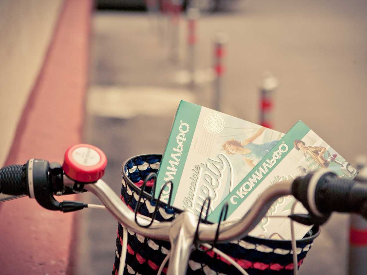
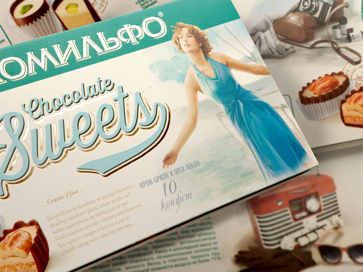
Cosmopolitan younger women in Russia's major cities are spending more and more time seeking new thrills: travelling, finding new hobbies and doing things with their friends. The new Comilfo's girl is the same socially active, eye-catching and refined girl-about-town that we know and love: she is as free-spirited and creative as ever, but at the same time she has also become more open-minded and «up-with-the-times».


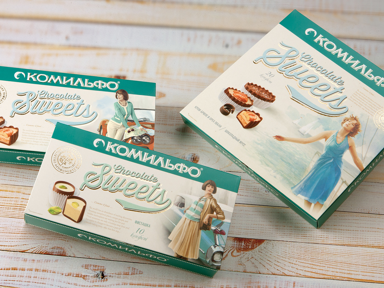
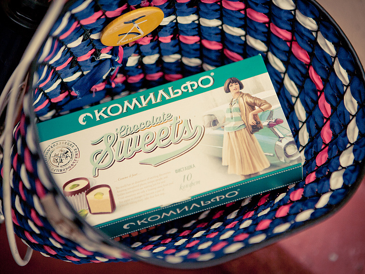
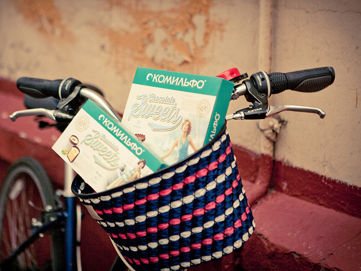
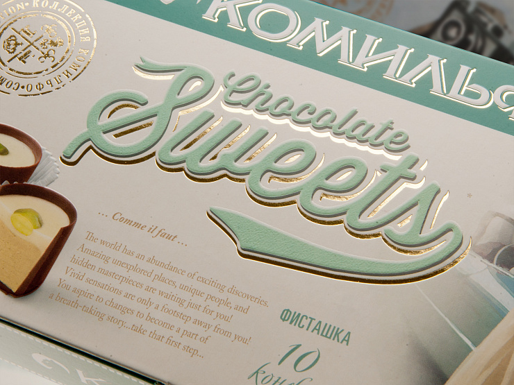
The new packaging is not supposed to suggest a particular era, but the vintage style and a special love of detail can easily be read into it. An American convertible, a pair of binoculars to be used when travelling between cities, a retro radio, a traditional camera, stylish accessories. The story does not end on the frontispiece of the packaging: it continues on the inside of the lid and on the back of the packaging. The box of Comilfo chocolates is interesting to look at and study, and this makes it an object of art in its own right.
Services rendered:
Design strategy
Creative idea and promotion concept
Creative texts
Brand audit
Label and packaging graphic design
Rebranding
Activity:
Grocery
Confectionary & Snacks
Client:
Nestle
End Date:
10/31/2013