Logika Moloka: Health&Nutrition (formerly Danone Russia) rebranding


The ad campaign was implemented by Affect.
Following the exit of major foreign corporations from Russia, rushed localizations, driven by technical necessity and compressed timelines, flooded the market. Instead of rethinking global corporate values and coming up with their own, they relied on a superficial, copycat approach.
After facing these new realities, the Danone office in Russia renamed itself H&N (Health&Nutrition): a decision that made it possible to stabilize business processes.
But neither its name nor design adequately reflected the company's nature and values.
Even back then, the Russian office of the global company gained full independence; today, it takes another step toward solidifying its position as a dairy industry leader.
H&N is now becoming Logika Moloka (Milk Logic): a strong and sustainable brand created here and for us.
Depot created a new national brand for one of the Russian dairy industry leaders.
We designed its strategy, positioning, naming and visual identity, opening a new chapter in the company's history and the industry as a whole.
Positioning
Extensive research and close team interactions helped us identify the key factors that became the foundation for the future positioning:
Although the global Danone brand has left the Russian market, the heart of the company: the people who have long developed the local dairy industry, cared for consumers, and made substantial contributions to ESG and national projects, remained.
The new leadership and team are driven by their commitments and an ambition to not only preserve the best of the corporate legacy, but also to multiply it, innovate and create something new. The team is full of ideas that were impossible to implement before. Now, free from the constraints imposed by the global management, the team has every opportunity to make their own, new achievements a reality.
The company's portfolio is full of true and honest brands, already beloved by local consumers Now, they have an opportunity to bring them even closer, make them more exclusive, developing new product lines and SKUs tailored to the modern needs and lifestyles of Russian consumers.
Exploring the company's history, we went back to the very beginning: to the origins of the global business. And that was where we made a discovery that had gone unnoticed before: The Danone founder, pharmacist Isaac Carasso, took inspiration from the studies by Russian scientist Ilya Mechnikov, who was the first to prove that the lactic acid bacteria were beneficial for human health. That was how the global history of yoghurt started. The global dairy leader's first steps were rooted in Russian science.
All of these suppositions and other factors led us to believe that everything Logika Moloka is doing today is, in fact, a homecoming. A return to its origins, to itself and to the place where it all started.
As a result, the new positioning we have formulated sounds like, “Back to the Source. Back to Yourself.”
It reveals multiple semantic layers at once, emphasizing the brand's historical, human, national, product-based and philosophical foundations.
A clear positioning helped us focus on what matters most and convey the brand's core values: authenticity, self-sufficiency, nurture, a systemic approach and high standards.
Everything else, from positioning and naming to the visual system, is built around those concepts.
Logika Moloka is a brand that combines reason and nature, science and nurture, scale and humanism.
Name
The name had to compress all the meanings native to the positioning, so our immediate decision was to do away with English loanwords and artificial word structures.
The new name communicates both the scale of the business and its human warmth, fusing the rational and the emotional.
That's how the Logika Moloka name was born to bring together all of the brand's key values.
«Moloko» (milk) means nature, origins and nurture, symbolizing the brand's emotional source, its connection to the environment and the home where we belong.
Logika Moloka grew out of a global legacy, but now it decides for itself what's important and speaks about it in its own language.
Identity
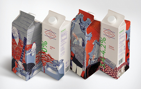
Depot created a visual system for a large business to speak in a human voice, accurately broadcasting its true values.
We chose a unique color combination with a two-fold function: green and the color of baked milk helped the brand differentiate itself from other players in a competitive environment and convey the idea of authenticity and unity with nature.
The clear and understandable logo became a logical visualization of those ideas. The letters “L” and “M,” framed within a milk drop traditional for the category, are highly recognizable and play on themes of naturalness, authenticity and nurture.
The sturdy slab serif Antiqua typeface speaks of technological expertise and scale. The font is narrow, reaching up, but solid and free of any coyness or ornateness: perfect for a large and progressive Russian business.
The identity reflects the company's new role as the leader of the modern Russian dairy industry.


On October 8, 2025, Logika Moloka officially announced its rebranding at the Golden Autumn Russian agricultural exhibition.
The company's stand was decked in a new branding, communicating its key idea through design.
The news made main pages in leading Russian media.


Agency team:
Anastasia Tretyakova, Executive Creative Director,
Farkhad Kuchkarov, Strategy & Development Director,
Semyon Shatylo, Creative Director,
Galina Evdokimova, Verbal Communications Director,
Anastasia Kharuk, Executive Director for Strategy,
Alina Dolgova, Senior Strategist,
Hanna Khmelyova, Copywriter,
Aleksandra Shchit, Art Director,
Aleksandr Petukhov, Art Director,
Polina Sergeeva, Art Director,
Anna Komleva, Designer,
Alina Vasilyeva, Designer,
Ksenia Titova, Designer,
Viktor Glagolev, Designer,
Denis Kasyanenko, Designer,
Nikita Gavrilov, Designer,
Maria Kadysheva, Designer,
Evgeny Nikitin, Motion Designer,
Elena Kuzmina, Project Manager,
Svetlana Malinskaya, Director, Account Management Team
Aleksandra Rumanova, PR Director.
Client team:
Vera Kurochkina, VP for Public Relations,
Yulia Gordonova, Line of Business Manager,
Elena Muminova, Project Manager,
Darya Marfina, Project Manager.