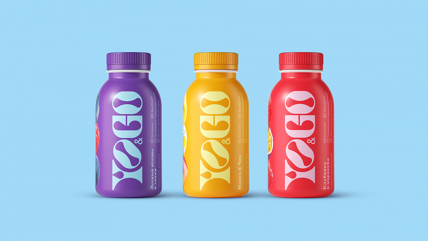
It’s a given that fruit yogurts are supposed to be delicious, natural and healthy. Packaging follows several tried and tested tenets: a logo stating the brand, a fruit photo to show the taste, additional advantages and inspiration according to taste. Yo&Go is a functional yogurt containing A2 milk and Beta Glucan. It’s targeted towards young, active go-getters whose lifestyle is dynamic and spontaneous. Our task was to create a packaging design that is relevant to both the product and its audience.
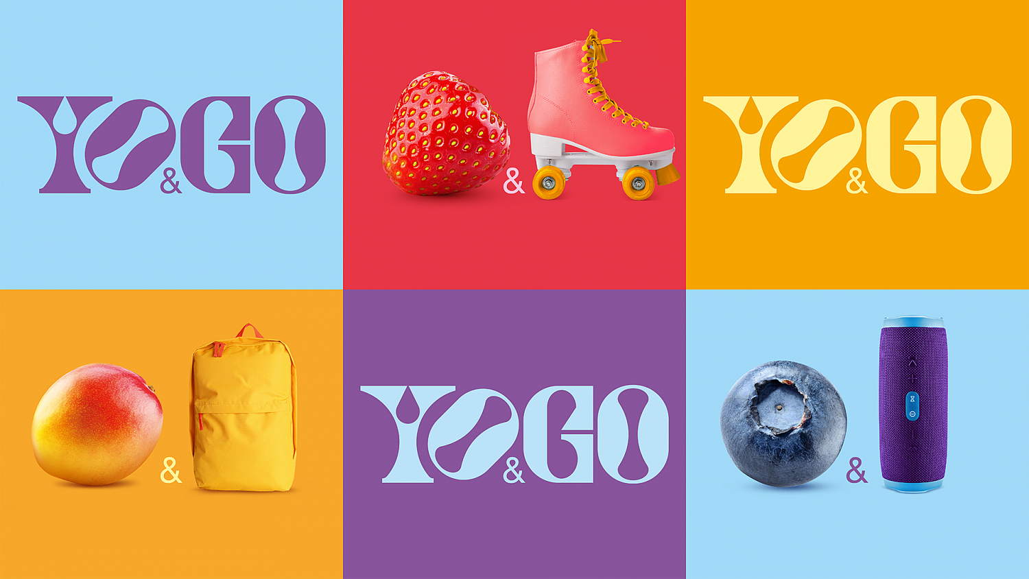
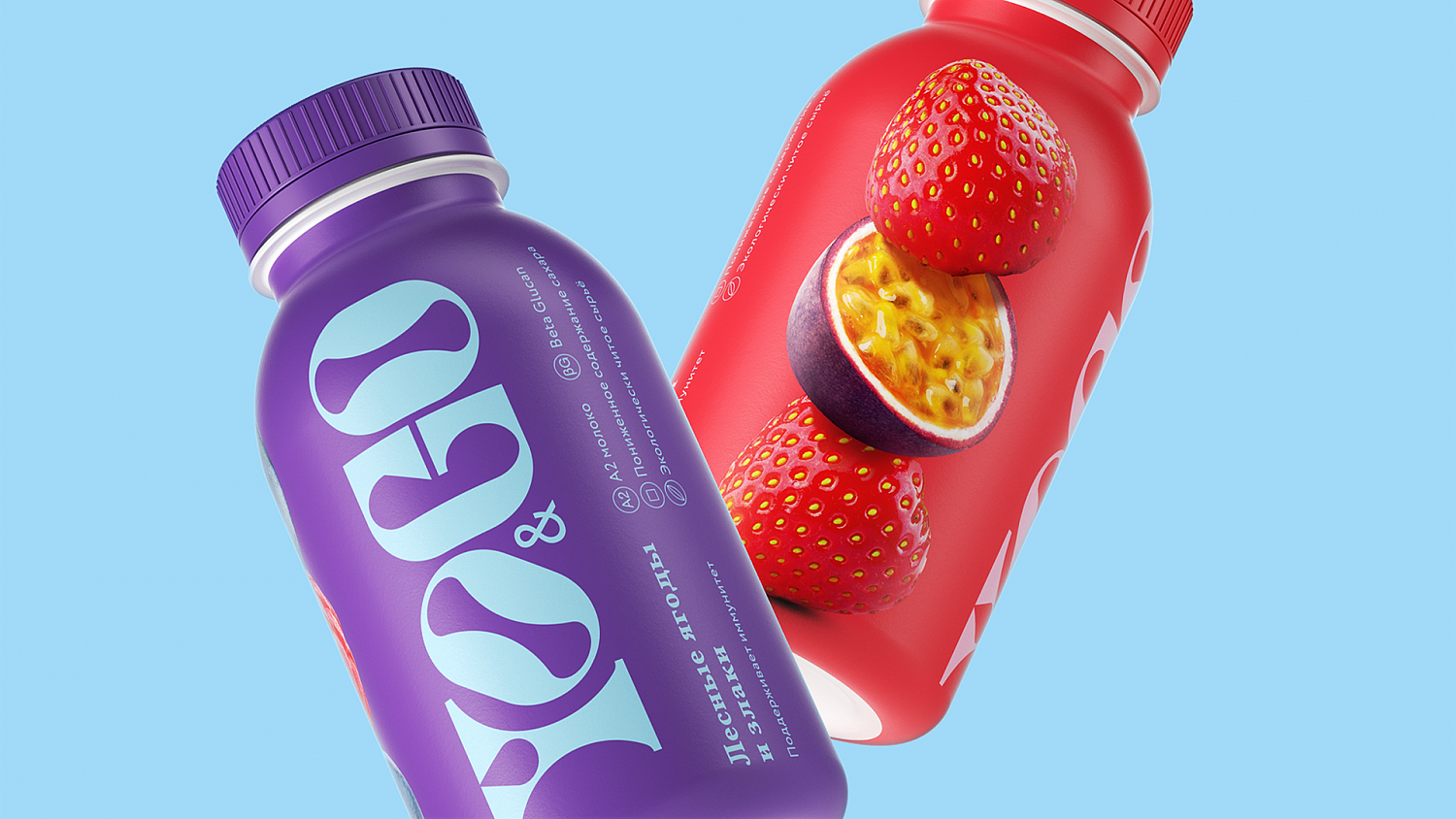
We began with an ergonomic, easy-to-hold packaging shape, pleasant to the eye and easy to grab and go. We broke with convention and placed an over-sized logo on one side and a bold fruit composition on the other. The logo typography reflects the contrasts and vibes of modern life. The fruit composition is light and dynamic yet balanced. The packaging is light on words, but is eye-catching and appeals to the hearts of the audience.