Chizik

Add to Favorites

Chizik - Портфолио Depot

X5 RetailGroup, the leading multi-format retail company in Russia, which manages the «Pyatorochka», «Perekrestok», «Karusel», has contacted our agency to develop the corporate distinctiveness of the new stores in the «hard discount» format. The price policy of the new structure assumes a lower cost of the average food basket on the market, the pricing approach is based on the principle «low prices every day».

Chizik - Портфолио Depot

The Dutch agency JosDeVries Russia has been working on the brand strategy which we have embodied into the name of the retail chain, logo, character, tagline copyrights and other style-forming elements. A brand website and POS materials for stores have been also created.  

The chosen brand name «Chizhik» is based on the previously approved color scheme, in which the central colors are black and yellow.

Chizik - Портфолио Depot

«Chizh is an acronym, another nuance is that chizh is a little bird, and the store is also small, it will change as quickly as fast bird chizh», - said Igor Shehterman, Chief Executive Officer of X5 RetailGroup.

Ilia Yakubson, director of the hard discount project adds: «This word is positive, and once we heard this word for the first time, we realized that it would give us what we need – a positive emotion».
Chizik - Портфолио Depot

Chizik - Портфолио Depot

The character of chizhik became the main element of the corporate identity and recognizable sign in the logo. The chizh from the logo became «the leader» of a flock of other chizhs, which later appeared on the different graphic materials.  

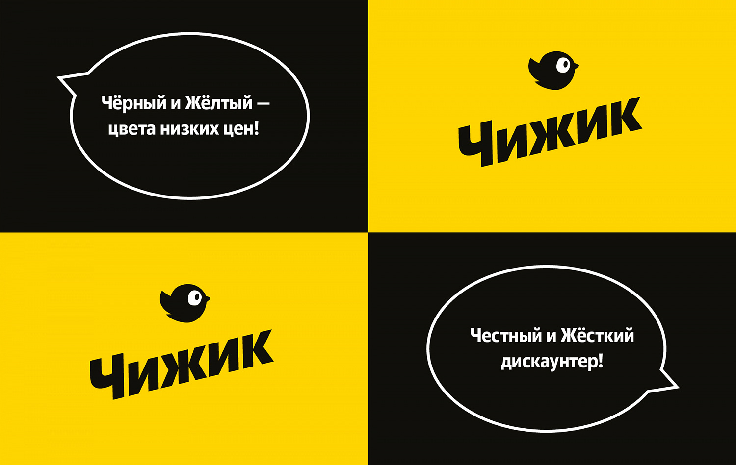
«The key feature of these characters is their talkativeness, that’s why the second most important style-forming is a bubble, which appears every time when chizh is willing to tell us something important about the brand», - narrates Semyon Shatylo, an art director of our agency.

Chizik - Портфолио Depot

We have developed communications not only for the store’s customers, but also for the employees to motivate them and charge them in a positive way.

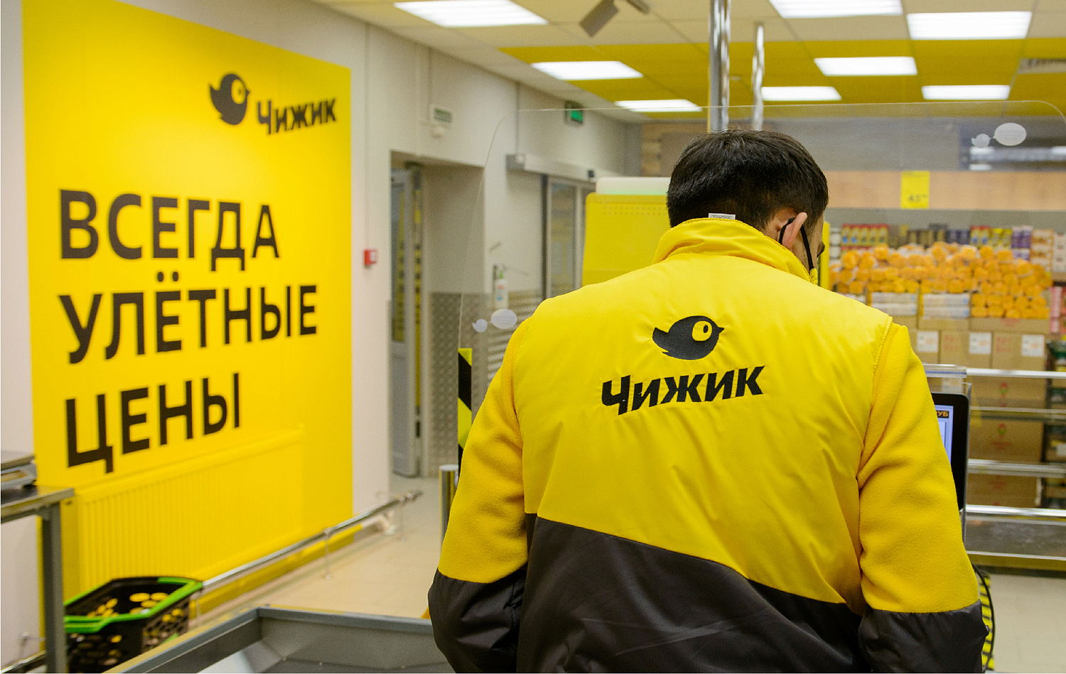
A separate quality mark in the style was a «basket-like», which reflects the high quality of goods and clear principles of its control.

Anastasia Tretyakova, managing creative director of Depot, told that the agency’s team was inspired by the current concept of «less is more» while creating the store’s brand-slogan. Depot has suggested the slogan «more of the necessary, less of the superfluous».

Chizik - Портфолио Depot

The corporate style was developed on the brand’s business card-website, which projects the company’s mission and crucial quality principles. On the website, one can find the nearest store and find out about the key product groups that can be found in it.

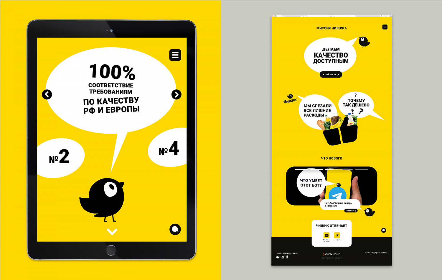
For «Chizhik», it is extremely important to always be in touch, therefore the site has a feedback form and a link to a chatbot, through which the customers can leave responses, ask questions or send suggestions to improve the store.
One can also log in into the chatbot by using the QR-code placed in the trading floor.

Chizik - Портфолио Depot

«For the agency’s team, this project has been an endless amazement! The goal of branding a new retail format is our size, but we’re experienced, we’ve been realizing that X5 is not a joke at all. But this time the client simply won us over with his professionalism, clarity, loyalty and infinite trust in the partner agency!», - comments Alexey Andreev, managing partner of Depot.

The retail area of the first stores is about 250 sq. m. The range includes about 800 items that are most in demand among customers. The emphasis of the new format is based on their own brands. In the target model their share will be 60%. The STM will be introduced gradually. The first batches of private labels will appear in Chizhik in February 2021, and their share will grow up to 30% by the end of the year.
Activity: Retail & HoReCa
Client: X5 Retail Group
End Date: 10/01/2020

These projects will interest you: