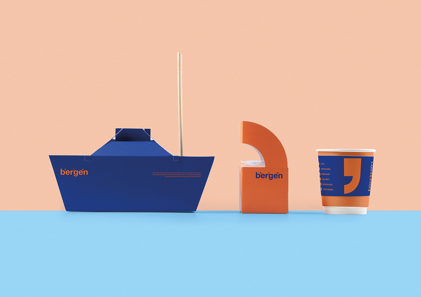
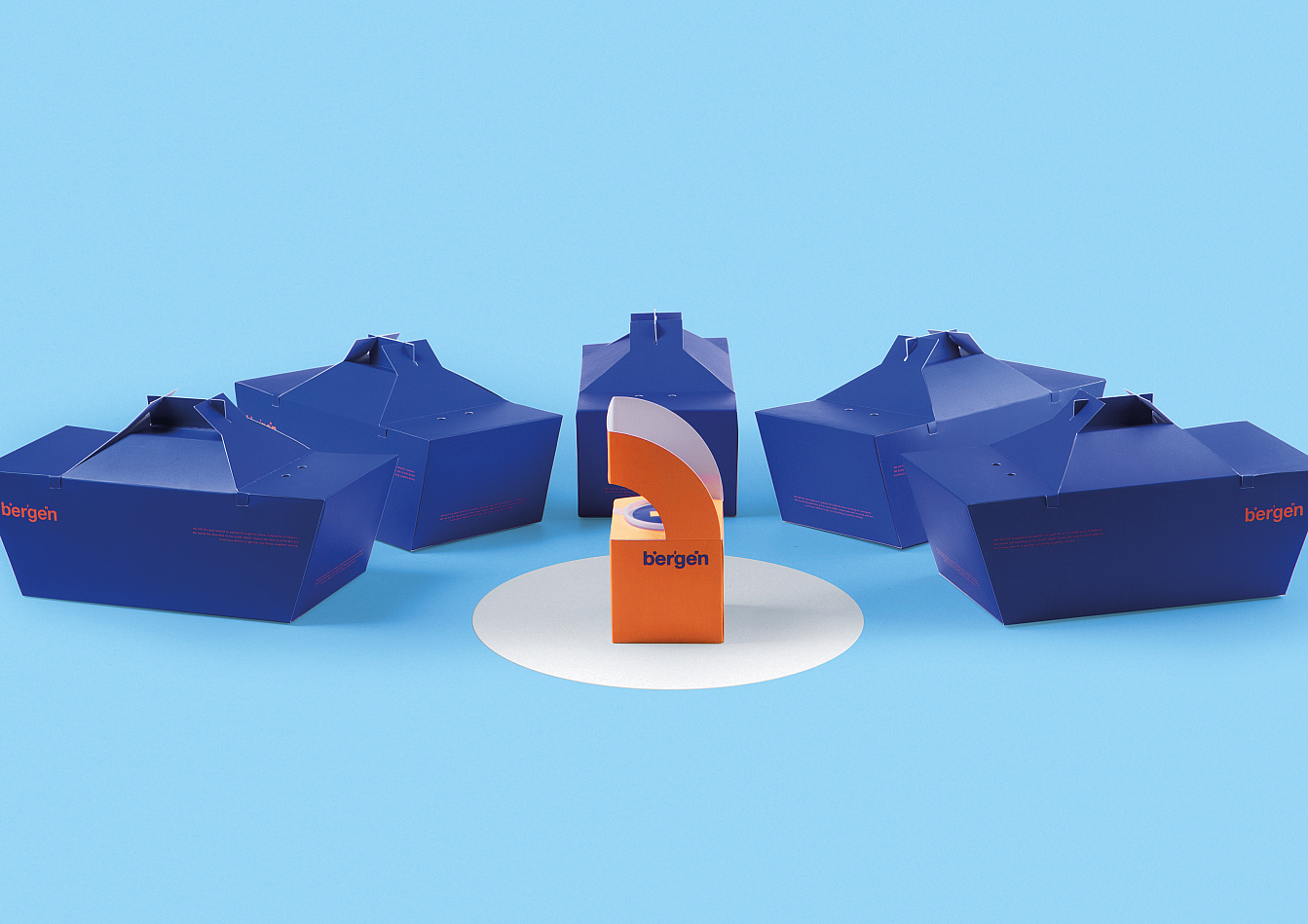
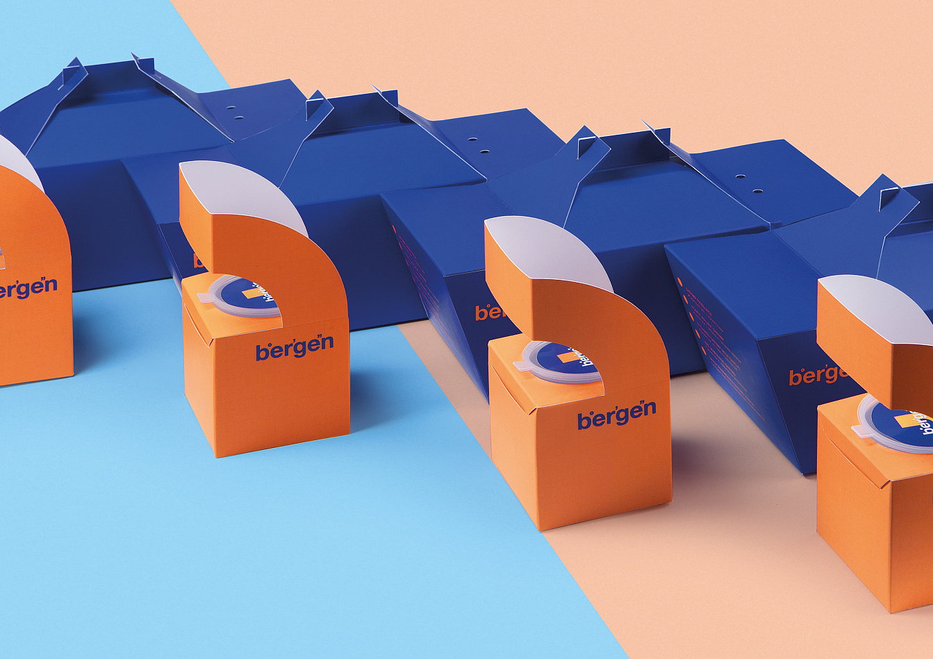
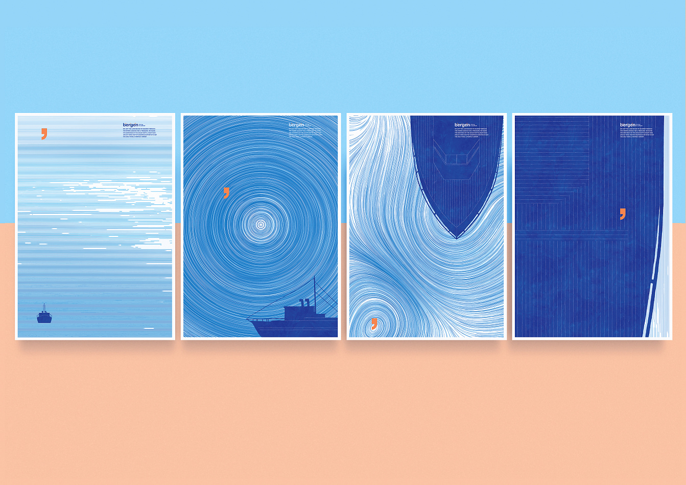
Bergen

Add to Favorites

Bergen - Портфолио Depot

Bergen restaurant cooks their meals with prime Norwegian shrimps at trendy food courts in Moscow. Our brief was to to develope a unique brand identity and packaging design for the restaurant. We have developed a unique brand identity using the geographic coordinates symbols. The packaging design idea was based on the identity.

Bergen - Портфолио Depot

We have reinvented basic packaging shape to stand out from competitors. The shape of the package represents a fearless ship chasing a perfect shrimp in an endless sea. Handdrawn water structures, a neat comma/shrimp sign and minimalistic graphics create a unique style for a streetfood café.

Bergen - Портфолио Depot

A blue ship is a meal box, an orange shrimp is a sauce holder, the cups are wrapped in sleeves with various illustrations. The new packaging shapes have attracted audience attention and have created the unique atmosphere of sea adventures brave sailors take to bring that special shrimp to you.

Bergen - Портфолио Depot

Bergen - Портфолио Depot

Awards:
Dot on Red Dot festival 2019
Gold on White square festival 2019
Silver on Sreda festival 2019
Silver on ADCR festival 2019
Bronze on Dieline festival 2019
Bronze on Pentawards festival 2019
Bronze on White square festival 2019
Bronze on Sreda festival 2019
Bronze on ADCR festival 2019
Shortlist on ADCR festival 2019

Вас заинтересуют эти проекты:

Incorrect information block