


Gloriss
Client:
Services rendered:
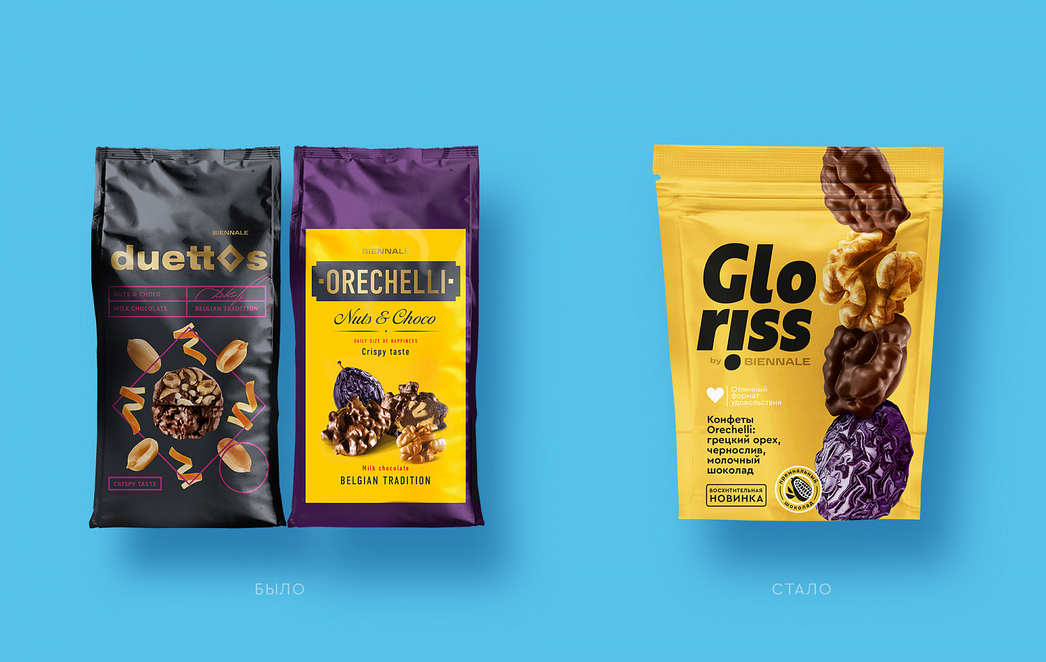
Depot team created the first product line for the Biennale brand. These are bright and sweet snacks. Snacking has become a symbol of modern consumption. Members of the generation Z, Millennials and even older generations replace their eating habits with snacks.


Packing format «on the go» allows everyone to take snacks for a walk or work. Snacks save time and maintain mental processes and emotional balance.
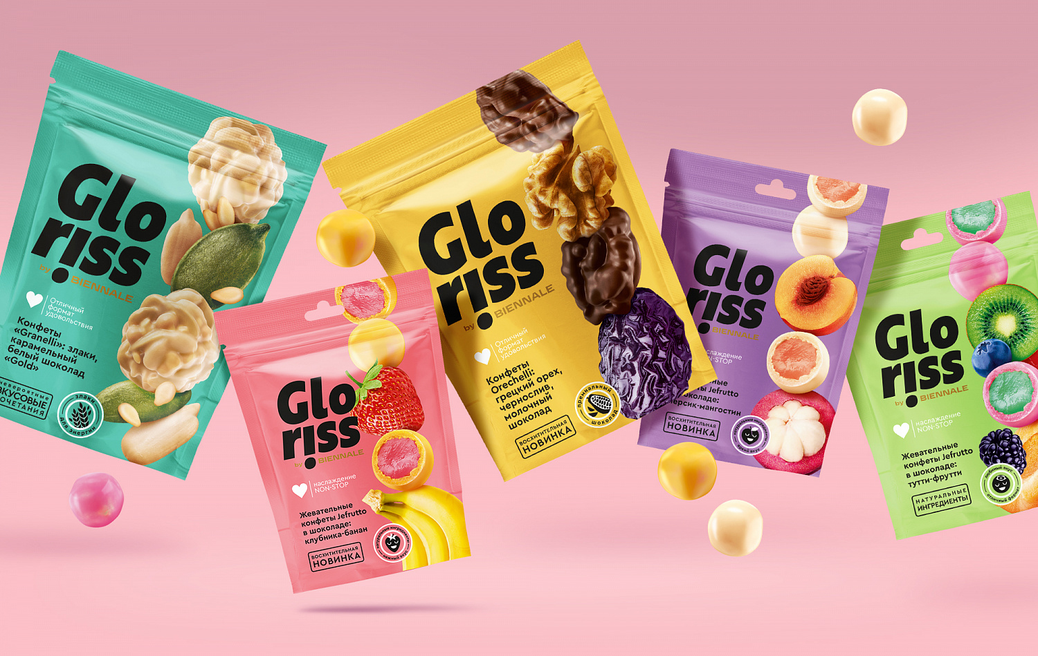
Bright snacking positioning opens the area of pleasure that is achieved by unique products with original tastes and unusual combinations of ingredients.
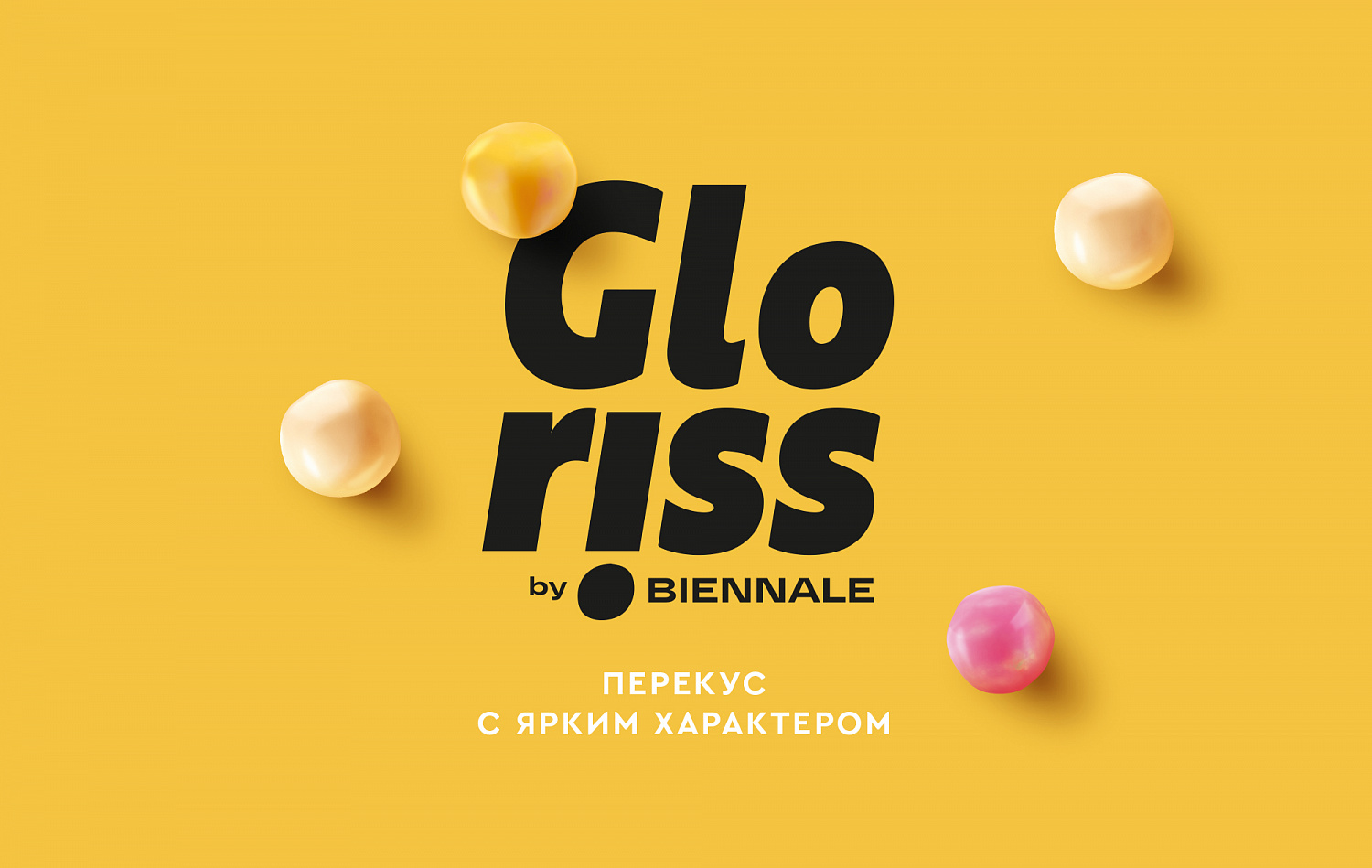
Gloriss is a derivative of English «glory», which means magnificence, beauty, bliss. Naming combines the taste and appearance of the product. The visual style accentuates the prominent character of the brand. The focus of the composition is on the food zone.
Vertical axes in design emphasize the dynamic nature of the brand. Large images of candies and ingredients overlap.
The typographic solution for the logo is a recognizable element that conveys the essence of the brand.
The exclamation mark in the logo highlights the vivid emotions embedded in the product.
Bright snacking positioning opens the area of pleasure that is achieved by unique products with original tastes and unusual combinations of ingredients.
Gloriss is a derivative of English «glory», which means magnificence, beauty, bliss. Naming combines the taste and appearance of the product. The visual style accentuates the prominent character of the brand. The focus of the composition is on the food zone.
Vertical axes in design emphasize the dynamic nature of the brand. Large images of candies and ingredients overlap.
The typographic solution for the logo is a recognizable element that conveys the essence of the brand.
The exclamation mark in the logo highlights the vivid emotions embedded in the product.


End Date:
05/25/2020


