Irsimo
Client:
Activity:
Services rendered:
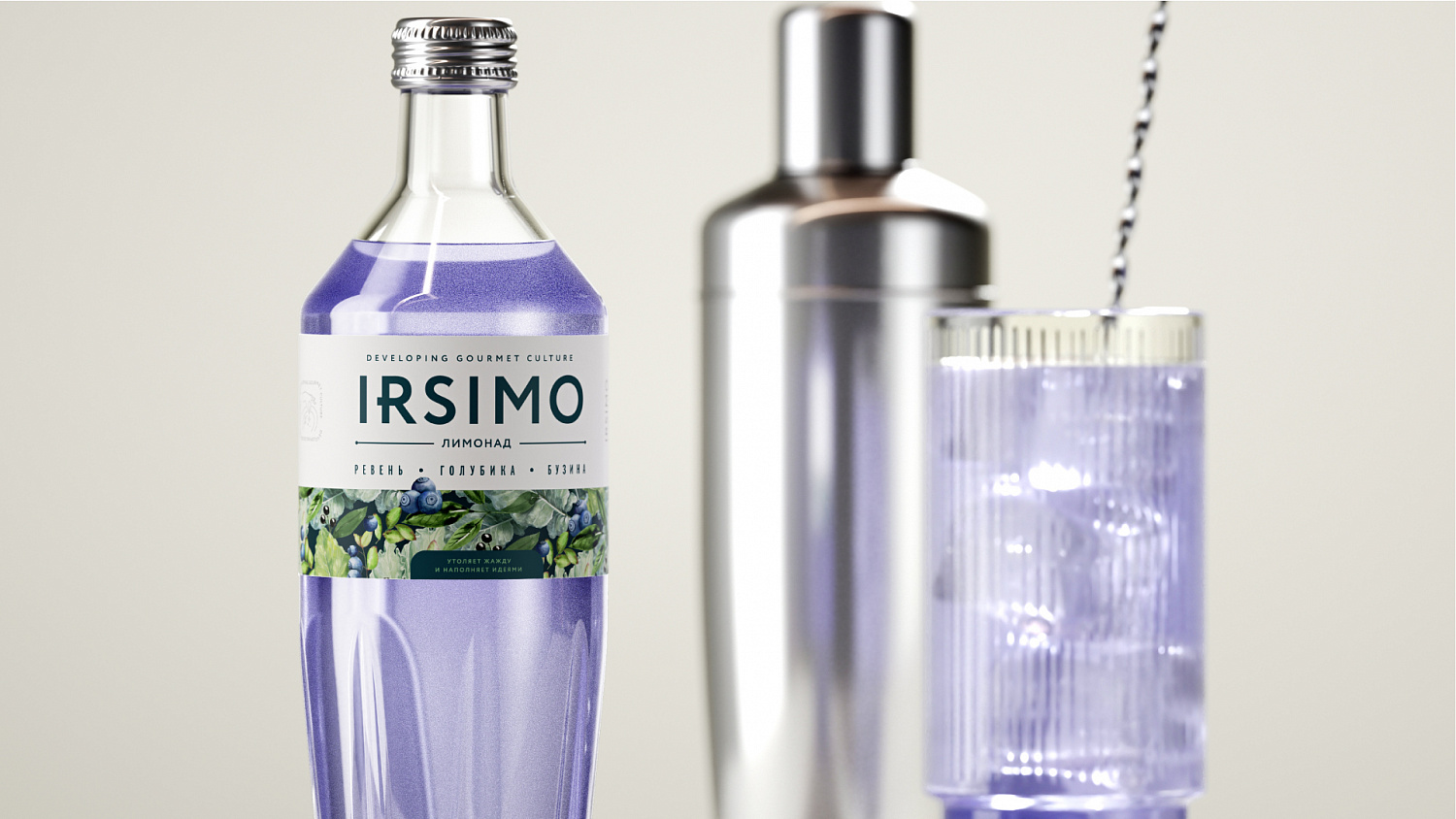
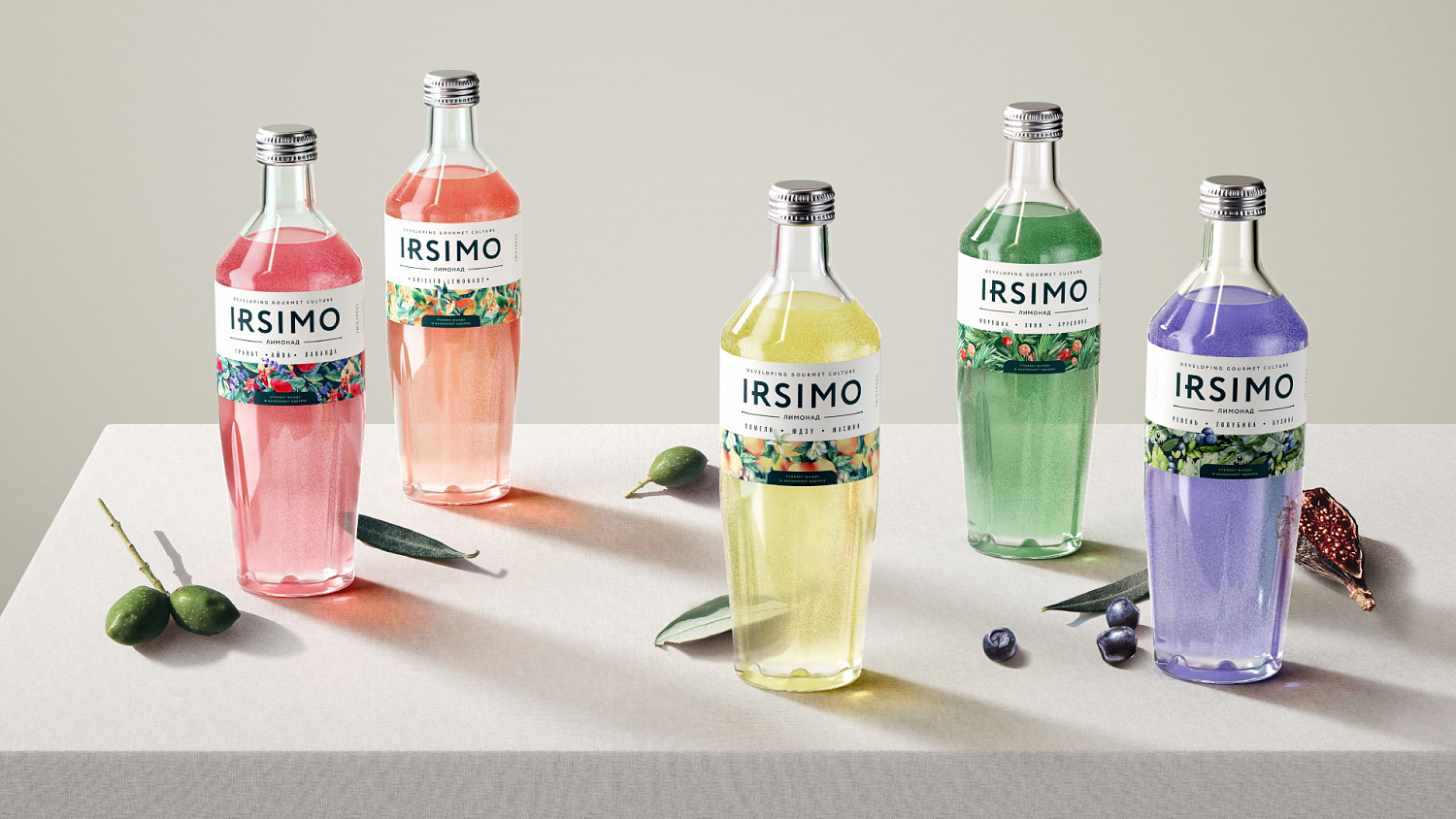
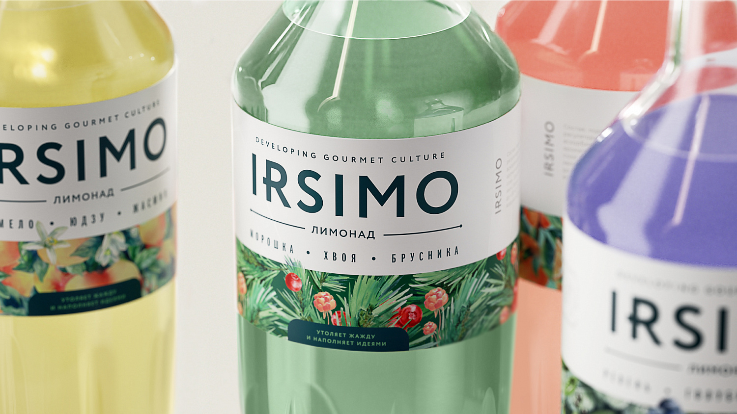
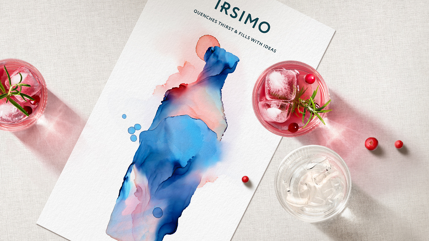
The design concept is based around a cocktail shaker. This image effectively conveys the beverage’s novel taste and its versatile nature. The watercolor illustration is tastefully complemented by the classic layout of the text. A sophisticated blend of undulating shades topped by an airy section create the perfect balance of elegance and sophistication.
The straight cylindrical shape, tapering towards the bottom, resembles a cocktail shaker. Towards the bottom of the bottle there are rays which create a play of light and shadow on the drink itself. A symphony of elegance and classic sophistication.