


Communication on Top
Client:
Activity:
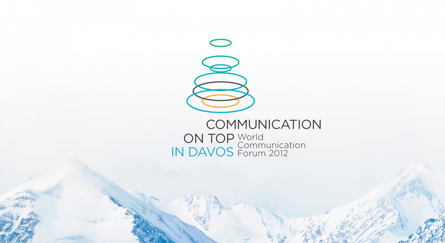
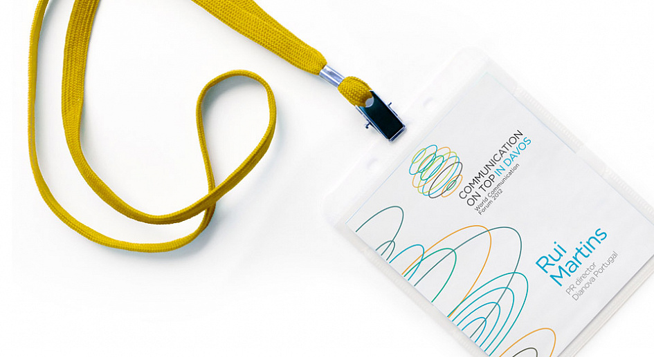
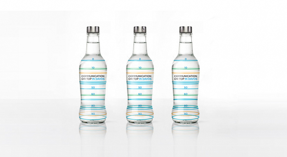
Since the forum’s visual identity exists mainly in digital form, we proposed that the focus be placed on the brand’s dynamism. The basis for the logo was a series of rings that are constantly moving and changing. As they revolve around an invisible axis and form a range of shapes that can be interpreted in different ways, they serve as a metaphor for communication. In exactly the same way, words can acquire an endless number of new meanings depending on the context in which they are uttered.

End Date:
01/10/2012


