SBP
Activity:
Services rendered:
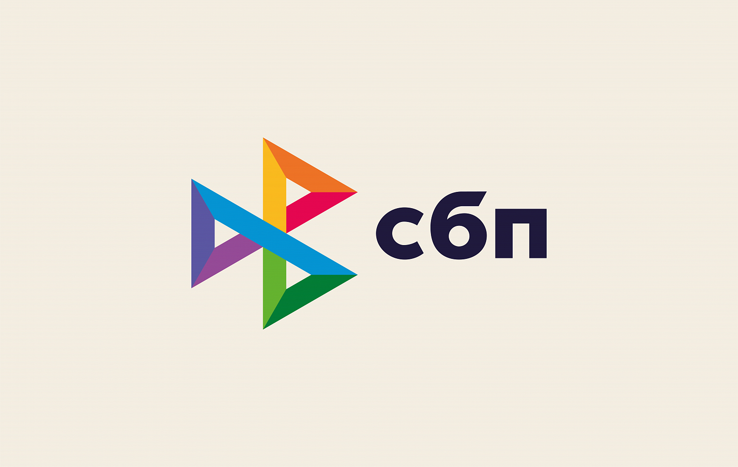
The Fast Payment System (SBP) is the first infrastructure in Russia that allowed payments to be made online, including if the accounts of the sender and recipient are in different banks.
The team of our agency had the following tasks: to develop a positioning hypothesis and a platform for a new brand in the category «payment card system»; to develop a new corporate identity and a brandbook.


Russian banking is at the forefront of digitalization of customer experience. Simplification and alignment of this experience in the field of payments and bank transfers is no longer a novelty, but a «must have» of a successful bank. The pattern of transfers from card to card created several years ago has reached gigantic proportions. It is time to improve the infrastructure of these operations. The banking community, supported by the Central Bank of Russia, is creating an autonomous system that brings the bank transfer pattern to a new level of convenience and security. However, The Fast Payment System goes even further and is ready to change the very idea of paying for goods or services. The simplest identifiers and QR codes are the future that will change the payment habits of Russians and lead them to a new level.
The target audience of the brand are individuals, users of mobile devices; companies working in the field of electronic and mobile commerce; retail companies; services companies; credit organizations, banks.
The brand reflects the following ideas: innovation, modernity, safety, convenience, ease of use, friendliness, technology.
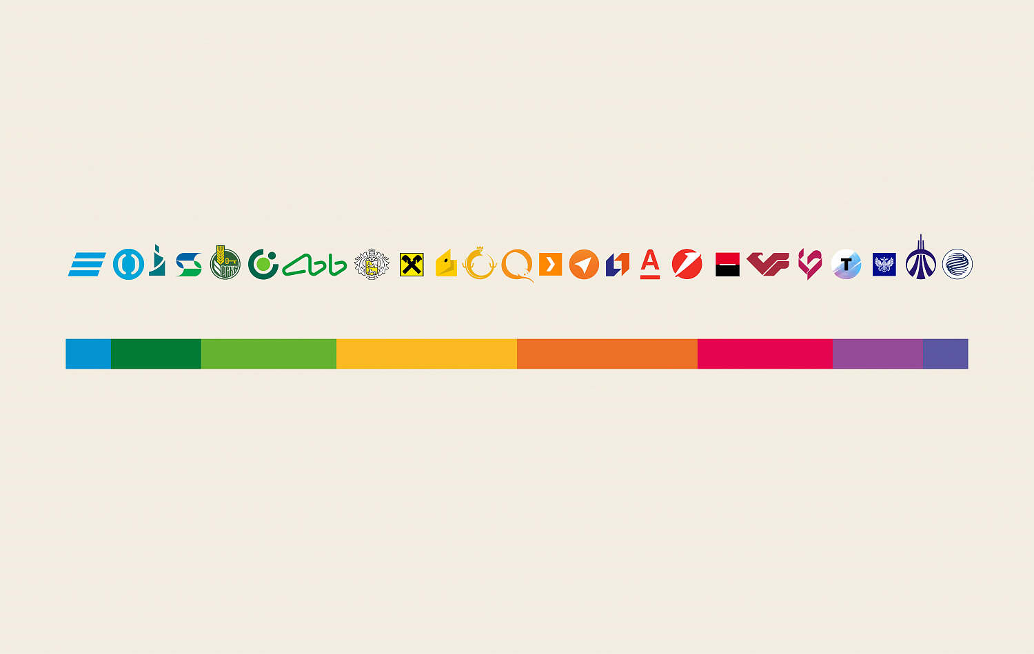


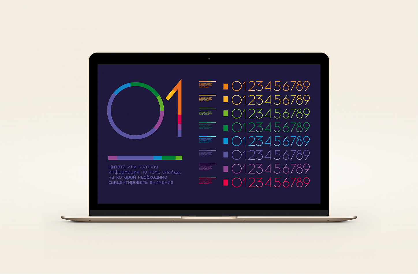
These eight colors from the sign are also used in the graph.
The branded color strip becomes a key element of the style.
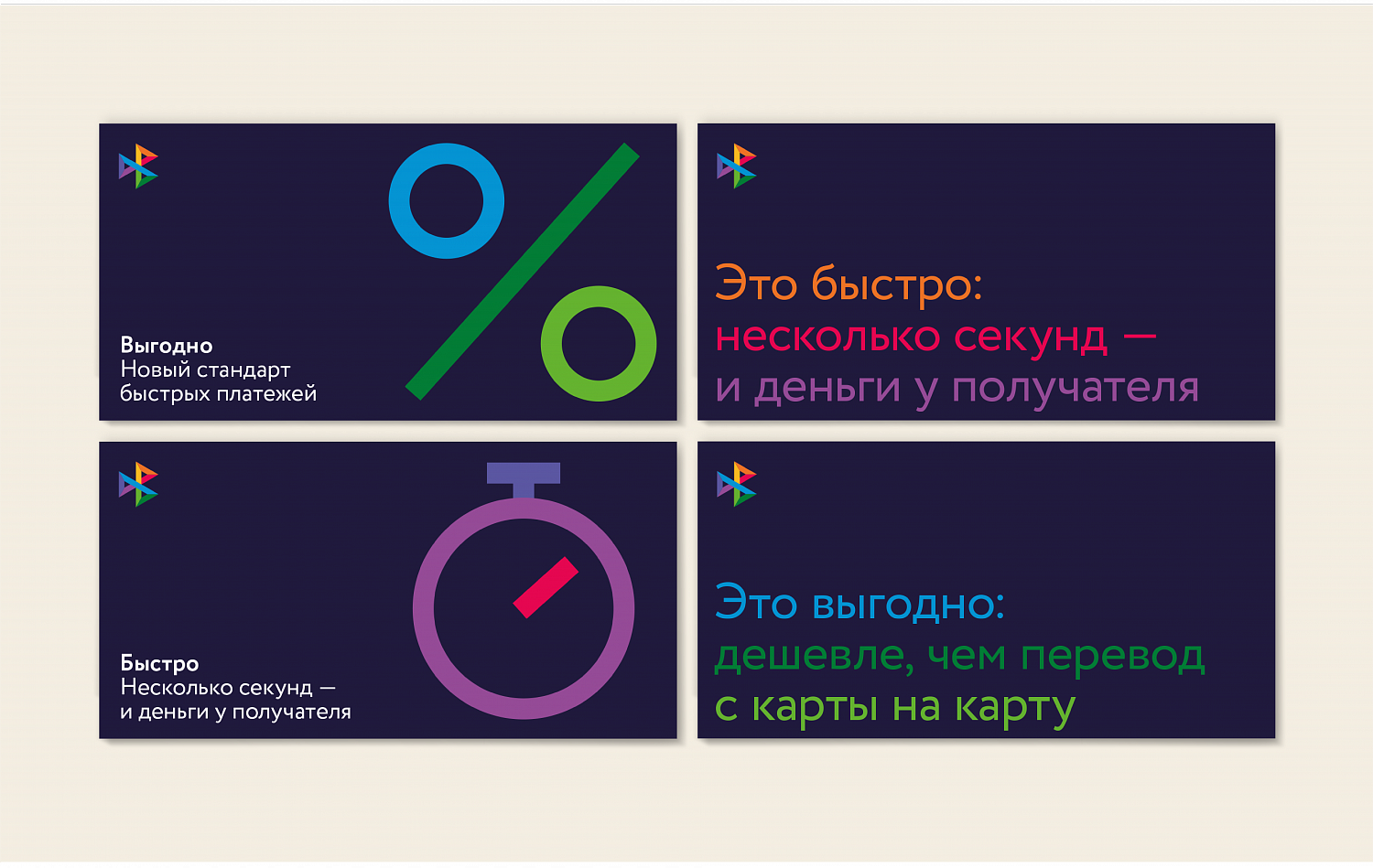
For the design of advertising communications, we offered graphics in the form of pictograms constructed from colored geometric monospaced lines.