Arctica
Client:
Activity:
Services rendered:
In this situation, the company decided to enter new consumer markets, to develop a fresh, bright concept of positioning and unify corporate style at the same time. This would allow the company both to attract a new target audience, and to stand out on the shelves.


The agency was tasked to re-position the brand Arctica, to form various product lines and develop a corporate identity that would make the brand's products recognizable and stand out on the shelf, and on the other hand, differentiate the product lines.<br>
<br>
Raushan Sultanov, Art Director of the project: «We have developed a set of tools through which the team of the Arctica can easily create any brand communication without recourse to specialized agencies.»
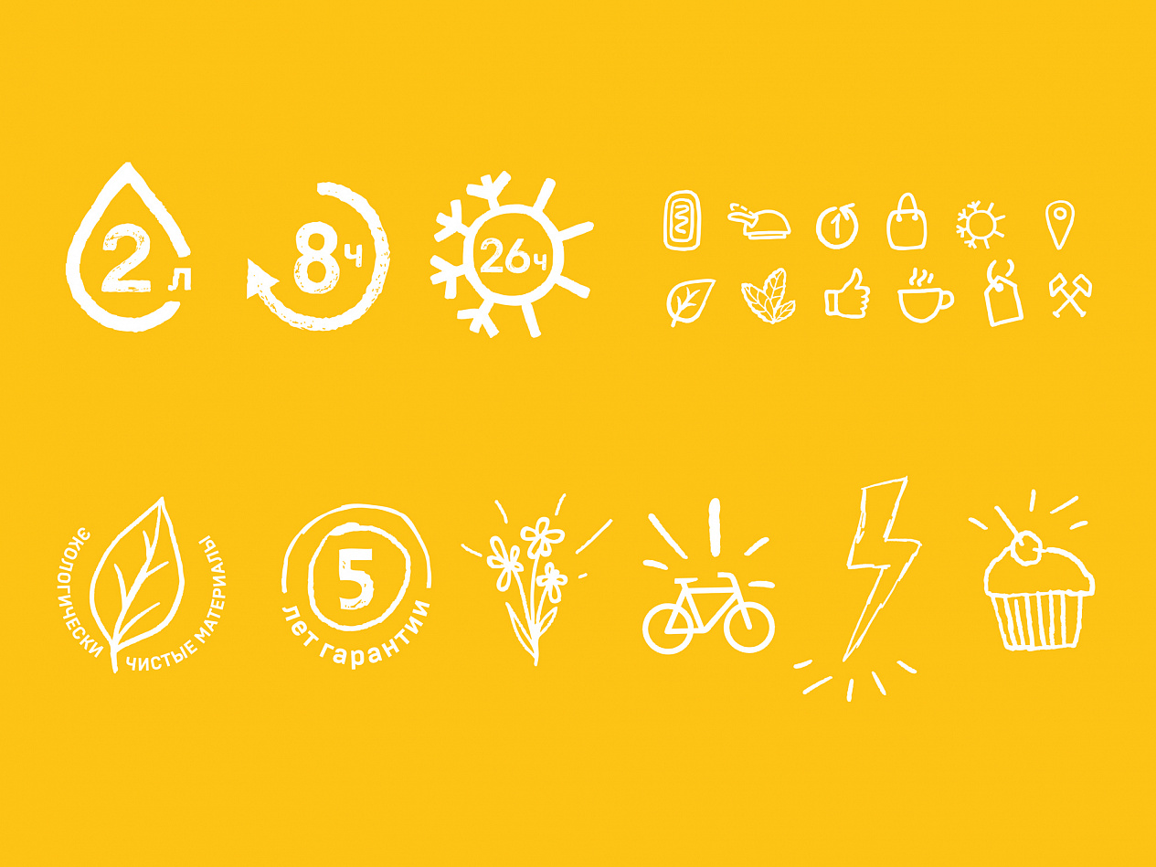


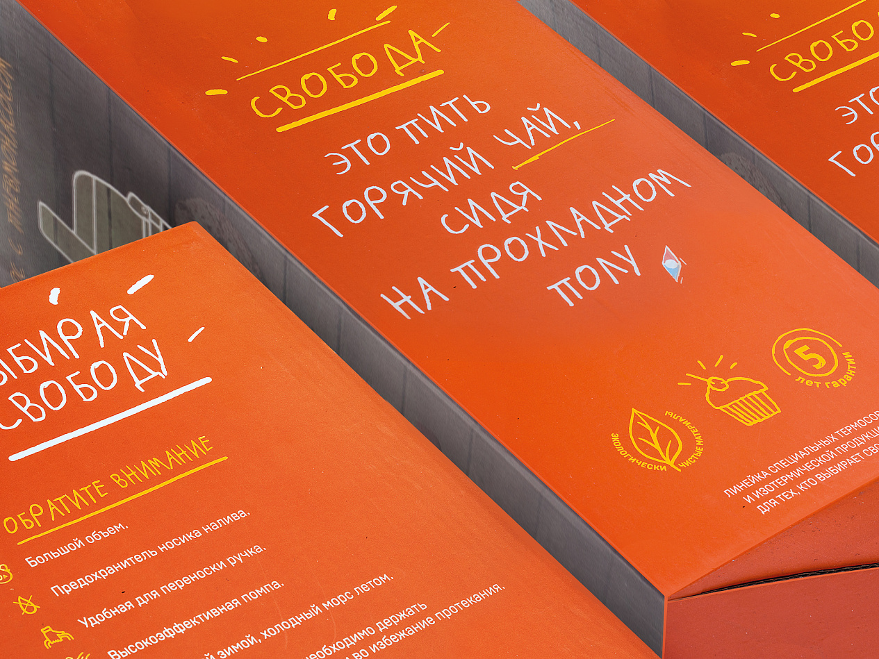
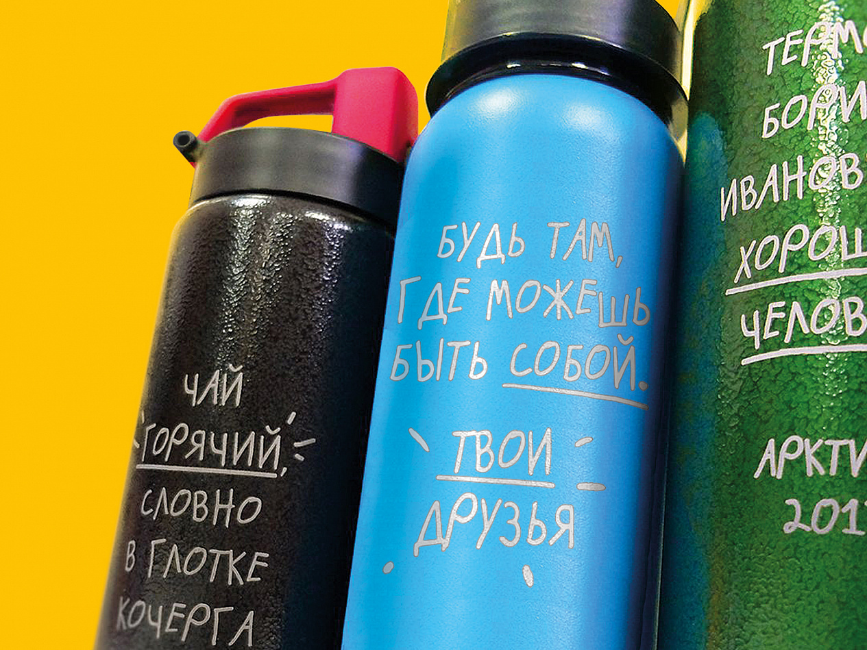
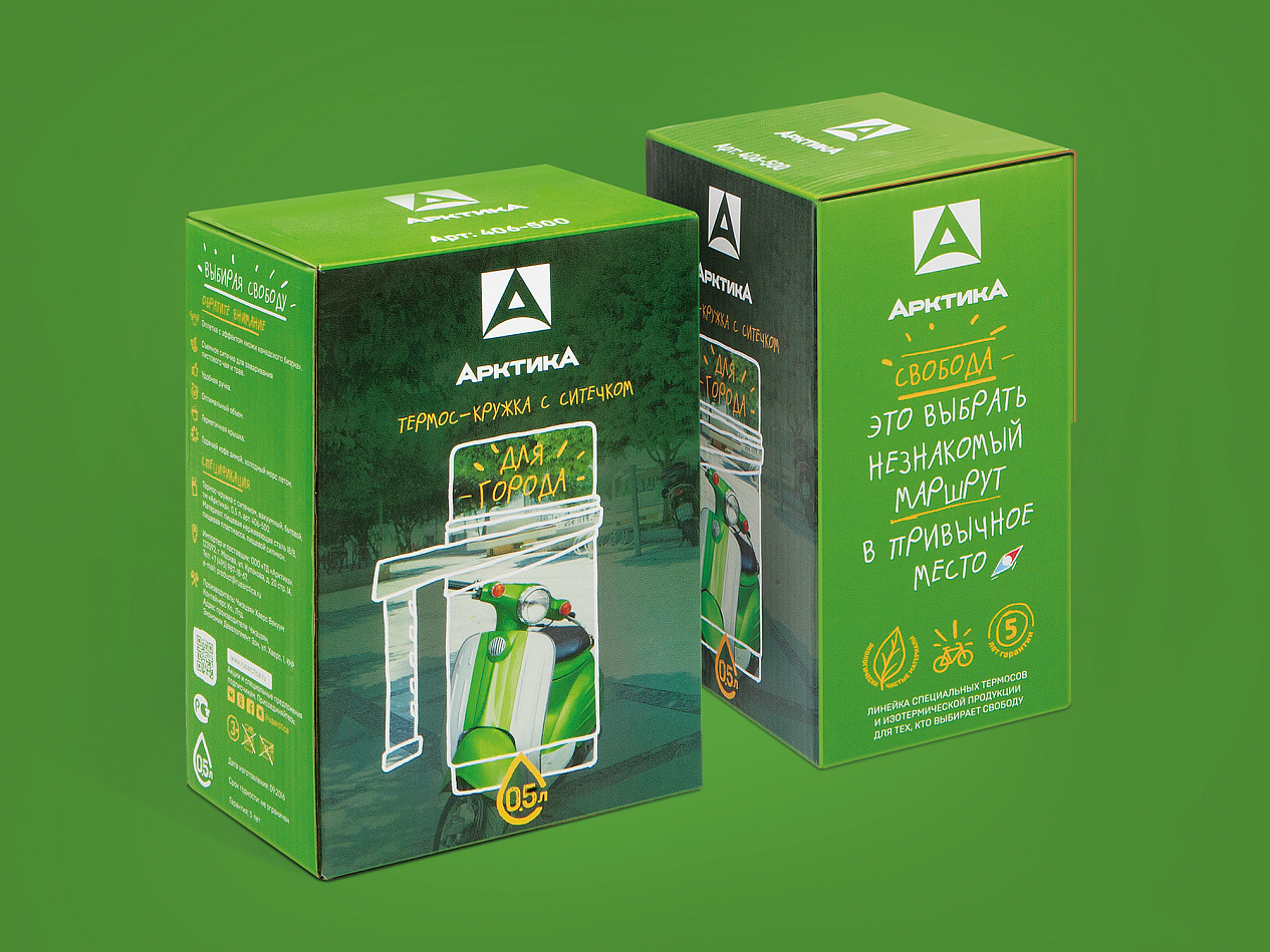
For the three key lines, visual differentiation was created, the packaging underwent radical changes in design, becoming more relevant, easy and simple to perceive, and on the other hand — more emotional, with an emphasis on the key indicators of quality and reliability of the respective products. In addition, it was important to «get away» slightly from the too-speaking name «Arctica» without changing it, because the isothermal products offered by the customer, not only to preserve heat, but also cold, freshness of products, etc. For this, there was developed an icon that attracts more attention, and later has the potential for independent use on products and in communications.


Fara Kuchkarov, Strategic Director of Depot: «This project is interesting in every way. First, it is one of those markets, one of the categories that are usually called «boring» or conservative. Communications in the category were spontaneous, all the codes were aimed at fishermen and hunters, and most of the packages looked like standard goods. And absolutely identical external data of a product (all thermoses look almost the same) did not bound us in terms of brand attributes. The two largest world players (Thermos, Stanley) did not invest in communications and officially do not work in Russia ( all imported by retailers themselves), so the communication field in the category also remained unformed and all players worked in obvious ways — communicating rational product characteristics and complete lack of branding . In fact, we did not try to make a revolutionary project, but the result was appeared this way. Together with the client, we worked on the product design, and on the formation of rulers and assortments, did our best to make the choice of thermos easy and convenient so that the consumer could find the most important in the first place and make an informed choice. We created an image of an assistant, friend and advisor. Now the brand Arctica got free itself from its historical «artifacts», do not need to prove its product superiority or to confirm its «arctic» origin, now it is interesting for a very wide range of consumers, radically stands out on the shelf, attracting relevant customers, communicating relevant for the modern society values, interesting for buyers and retailers.»