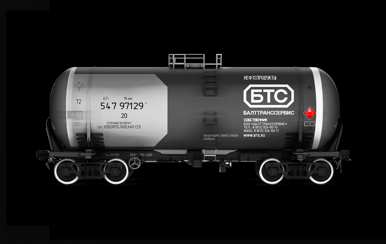
BaltTransService

Add to Favorites

BaltTransService - Портфолио Depot

As part of an independent rebranding, BaltTransService decided to change the external image radically. From the very beginning, we received a number of important entries that needed to be taken into account when implementing the redesign. Here are some of them: turn the long BaltTransService into BTS, create a corporate identity on an emotional platform of reliability and modernity, but take into account that the visual idea should not be too revolutionary, because no one wants to shock high-profile clients.

BaltTransService - Портфолио Depot

BaltTransService - Портфолио Depot

BaltTransService - Портфолио Depot

BaltTransService - Портфолио Depot

So, after the first presentation, the logo in the form of an octagonal frame was chosen. The sign symbolizes a locomotive car, which confidently carries an entire train. Acid green is well integrated into our concept and turned out to be quite unique not only for the category, but for all global brands. Such green colour is definitely not about naturalness, it is technological, harsh and brutal.

BaltTransService - Портфолио Depot

BaltTransService - Портфолио Depot

BaltTransService - Портфолио Depot

BaltTransService - Портфолио Depot

BaltTransService - Портфолио Depot

BaltTransService - Портфолио Depot

BaltTransService - Портфолио Depot

BaltTransService - Портфолио Depot

BaltTransService - Портфолио Depot

BaltTransService - Портфолио Depot


Вас заинтересуют эти проекты:

Incorrect information block