KFC
Client:
Activity:


Fara Kuchkarov, Depot strategy director: «If we look at the history of KFC in Russia, it will be easy to see that the brand developing is active, appropriate and evolutionary. The identity constants do not change, and should not, but it is the content of communication that is changing. That style brought in 2016 answered the particular strategic goals of the brand: raised brand awareness, was “neutral” on purpose, practical, convenient for inner usage and differentiation. Those goals have been achieved in a few years. Market reality demanded refreshing in communications, fine tuning for the audience. With the help of a new style, the usage of Colonel character - creative idea of Wieden+Kennedy Amsterdam — KFC is filling with emotions, that is quite reasoned on the current development stage of the global brand and its local Russian representative.»
Dmitriy Shirshov, marketing director KFC Russia, CIS & CEE: «KFC as a brand has been in Russia for not so long — since 2010. During this time it has achieved widespread popularity, millions of guests know and like our delicious chicken. But not everyone knows that behind KFC world success there was its founder, colonel Sanders: a talented businessman, charismatic, a person in love with his work. We are sure that the character and the values of colonel Sanders will help us to distinguish ourselves on the market, be noticeable, interesting and at the same time to stay honest and loyal to the tasty chicken and beloved guests. We are very lucky: other brands need to hire celebrities to become popular — and we have our own.»
<br>
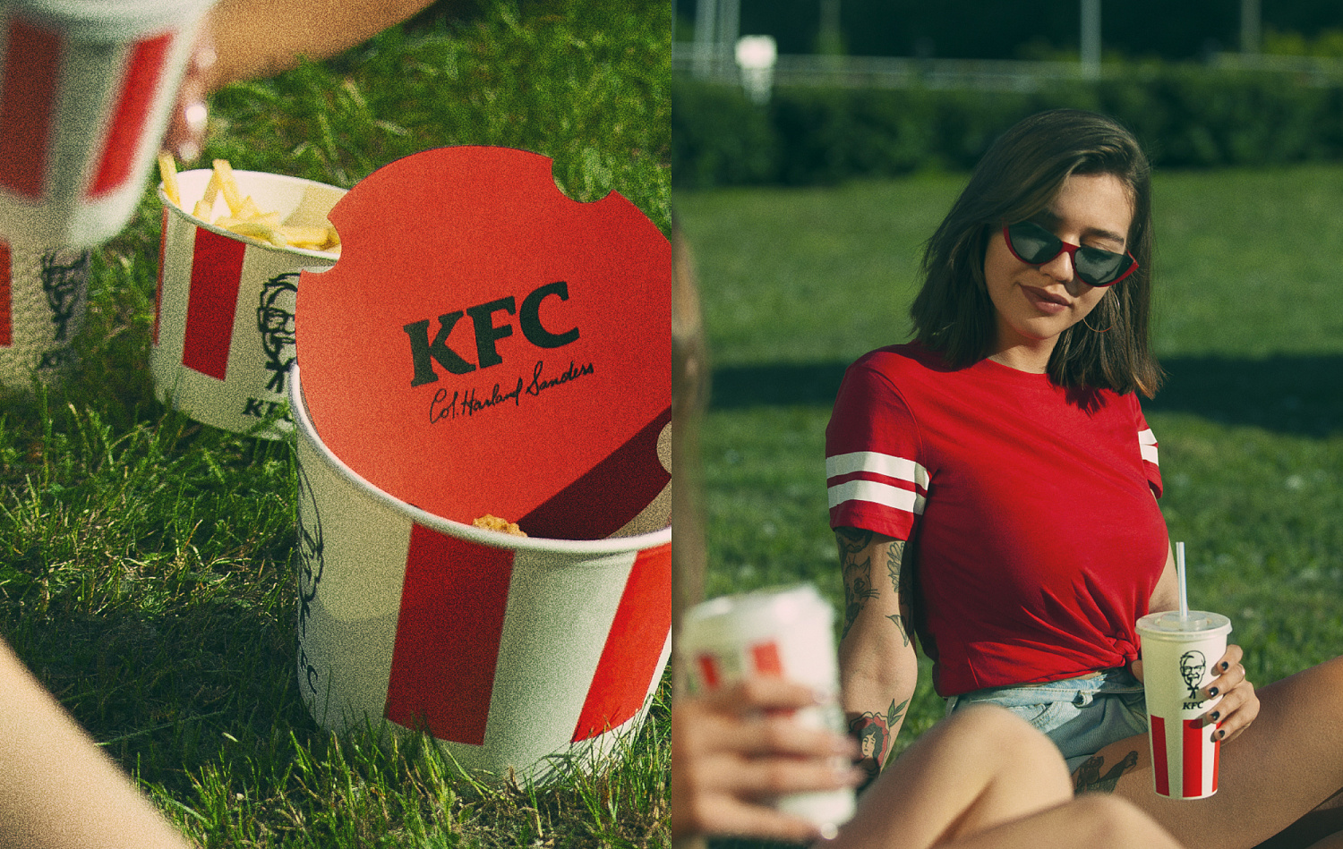
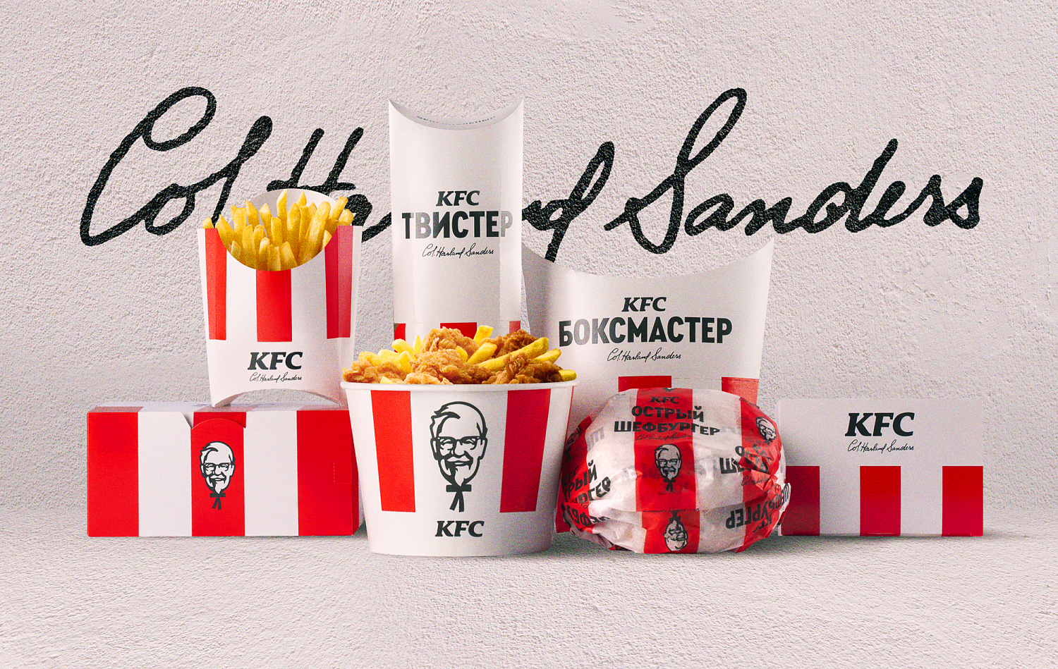
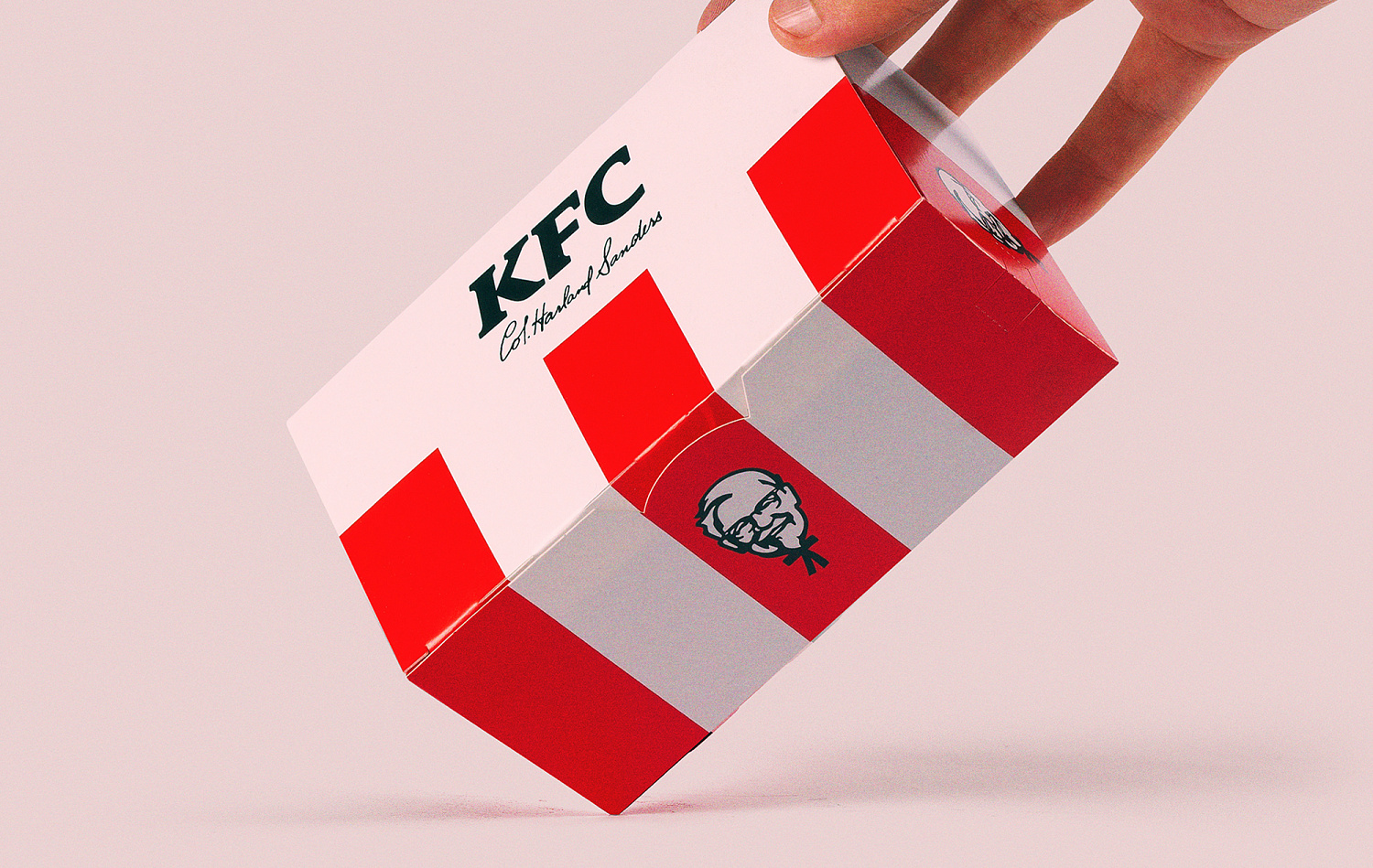
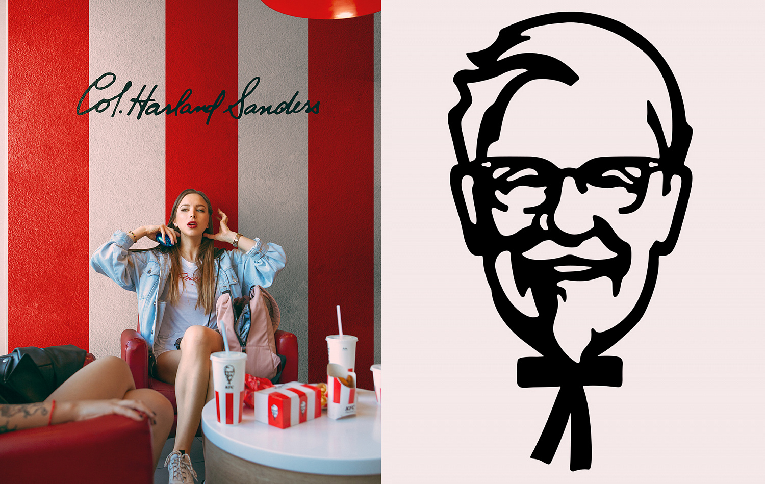
The major brand colors are red, white and black. The one that prevails and molds the brand character is red, but any of three main colors may become background. This is the basis of color-coding: white background — a traditional recipe meal of white meat, black background — meals of dark meat, red background — season meal, new flavor. One more powerful brand identity code — red-white stripes used on every package and in communications. And also there is a special set of «additional» colors that is used for color-coding of the breakfast product line and sauces.<br>
<br>
Most of the packages contain the type composition based on Condensed Black. Product titles are written in upper case, one or two lines. And for exceptional cases and «informal» packages (for ex: sauces) it is possible to use Cera Pro Bold.


Nikita Ivanov, Depot design director: «The primary goal of the agency was to adapt the global brand style for the Russian market. We needed to put all the identity units into one strict system, within which it would be easy to adapt the graphics for different units and package shapes without losing any design element. During the process we have chosen the font style for the Russian market as the “global” company font was not adapted for Cyrillic.»
Aleksey Andreev, Depot managing partner: «Participation of a local contractor in adaptation of the global rebranding for Russia finally becomes a norm. We have been observing the evolution of trust among world brand-teams for the Russian partners for many years. If 20 years ago we were allowed to create communications strictly on the basis of the brand book and head-offices commentaries, now in Depot we work on positioning and design-strategy, naming, identity and creativity, make guides and brand books for the great international brands. Finally!»