Sladkoe Nesladkoe
Add to Favorites
The task of creating a sign was formalized as the elaboration of the font composition of the title, taking into account the additional elements in the existing design of the café and the historical appearance of the building.
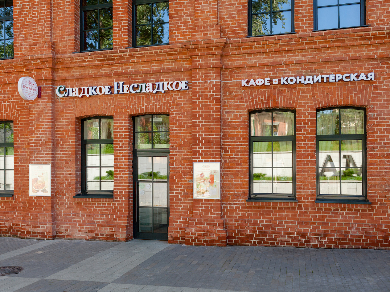
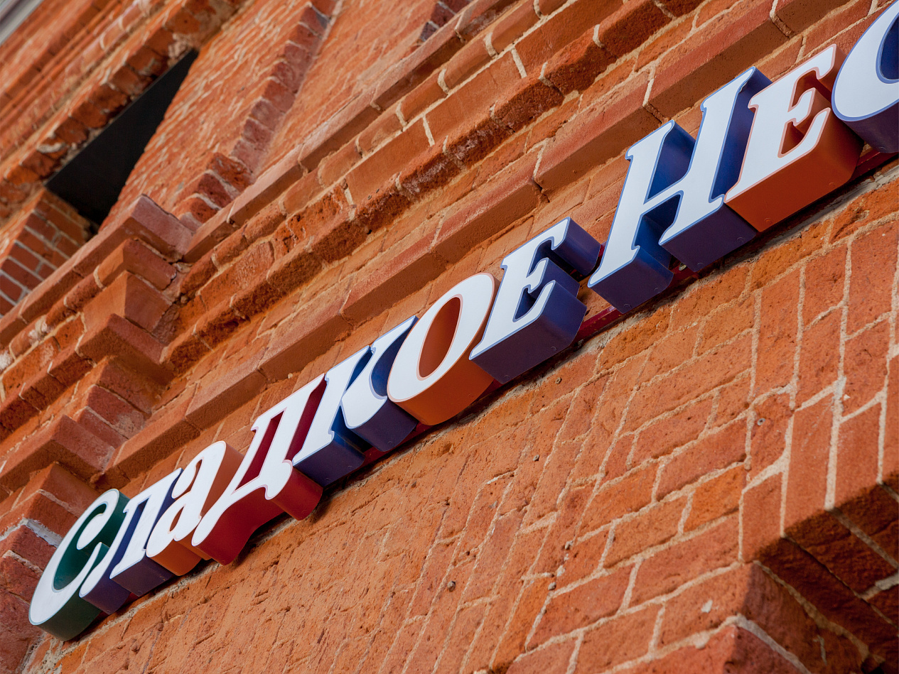
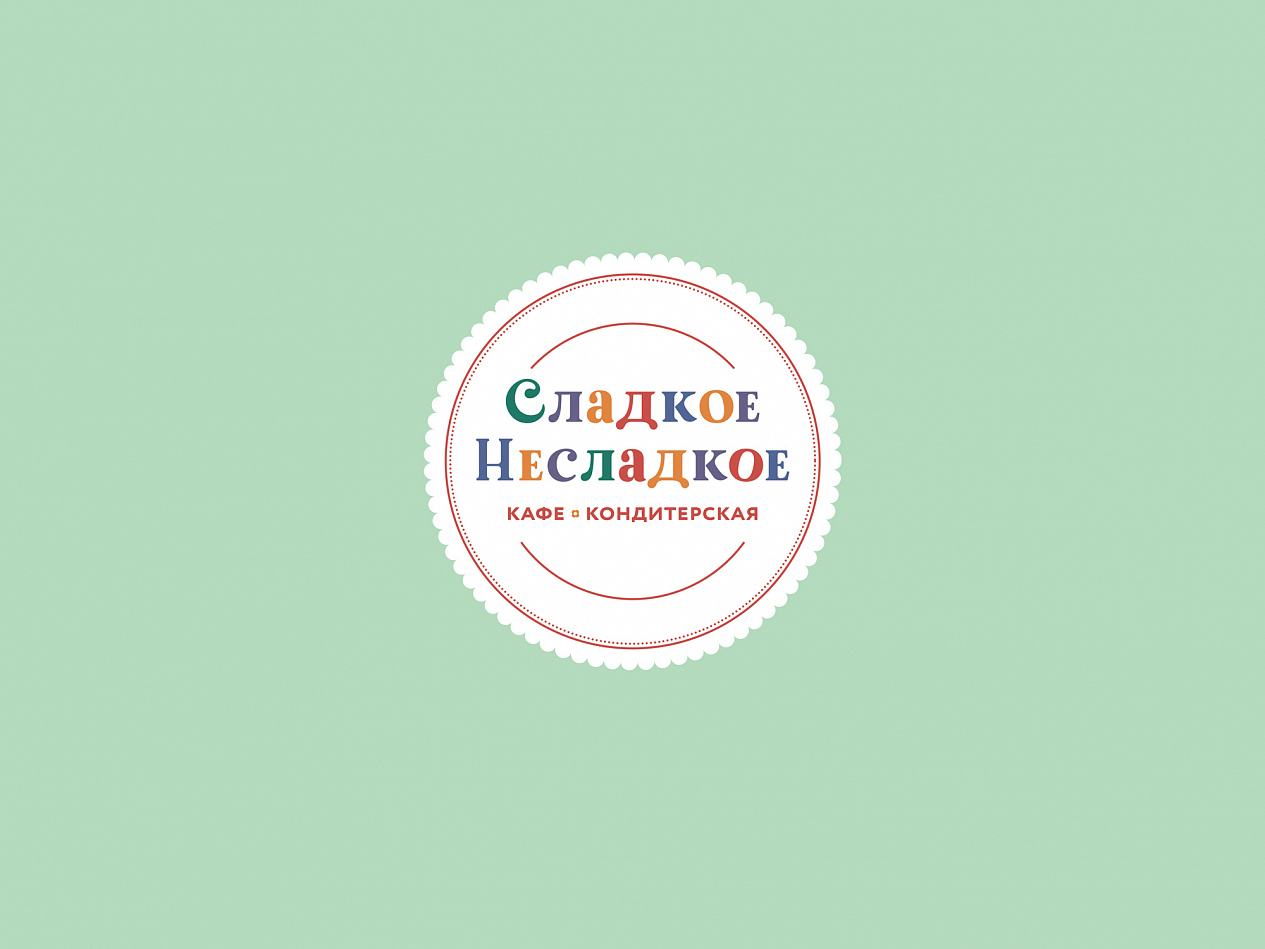
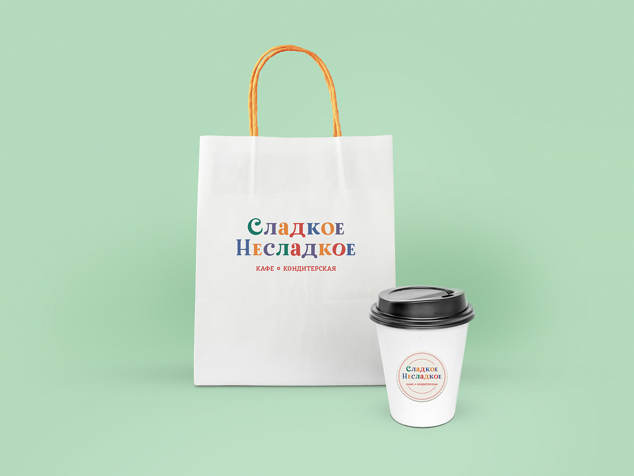
The design was based on the attributes of the brand Sladkoe Nesladkoe: simplicity, transferred at the expense of simple font, lightness and naivety — due to pastel colors of the design of letters and the addition of graphic elements in the design, a variety — due to the design of each of the letters separately. Additionally, on the basis of a signboard, a number of carriers were created for the corporate style of the cafe.
Services rendered:
Design strategy
Visual identity
Environmental graphics and navigation signs design
Brand audit
Client:
Venskiy Tsekh
End Date:
09/08/2017
Activity:
Retail & HoReCa