


Wellar Group
Client:
Activity:
Services rendered:
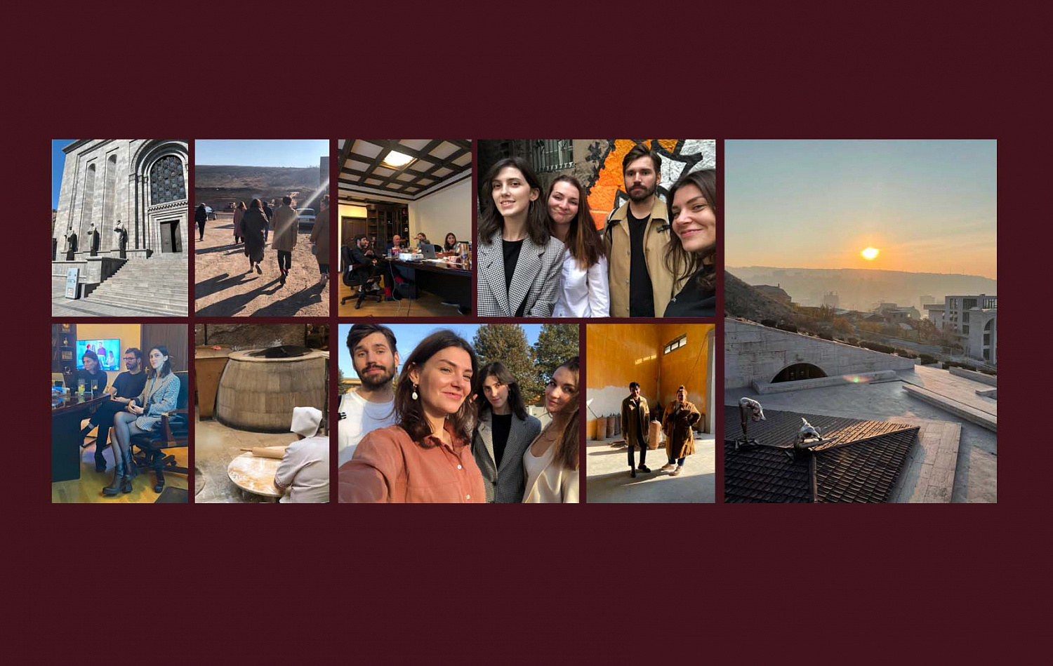
Our team has gone to sunny Yerevan for an installation meeting. We have been told about the factory scale, about production capabilities and planned releases. It turned out that the confectionary factory will release 120 tons of products per day, and deliveries are planned to more than 40 countries.
Aims and goals of the project:
— to develop a new corporate brand competing with the leading international players in the confectionery market,
— to develop a portfolio strategy that will become the basis for product brands formation,
—to develop product brands in accordance with the formed portfolio.
By the time the work started, the client had not yet formed a marketing team, but there was already a production understanding of the case. While the future Wellar was building a factory, selecting equipment, clarifying the production nuances, looking for suppliers of raw materials, the Depot team was building another factory — branding the manufacturer and its products.
Development of corporate brand portfolio
It was important to take the key attributes of the corporate brand into account when developing the portfolio, so they were identified at the beginning of analysis. They were the highest business level, team expertise, premium quality of products and excellent knowledge of its consumer.
We have put the characteristics of our audience and the sweets consumption motivation in the principles of creating a corporate portfolio. We managed to build 6 product brands because of the competent portfolio structure. Each brand has its own target audience, consumption situation, unique advantages, promise and opportunities for further development.

The brand essence was determined while working on the platform. It is the perfection of confectionery craftsmanship. The company treats every its product like art. Calm, solid, inquisitive, meticulous and honest brand character fully embodies the company's approach to creating each product.
Naming development
After the development of portfolio, positioning and platform, our team went to the name choosing part.
It was important to:
— make the name clear and harmonious for the wide audience (different languages markets),
— outline the worldwide character of the brand,
— outline the authoritative large company image excluding the associations with the startups,
— organically embed the name in a row with famous brands, while building up from competitors,
— capture the brand positioning: open up the brand essence, place the meaning accents in accordance to the brand character,
— open up the key idea, the company’s origin uniqueness, its approach to the confectionery products creation.
Based on these points, together with client we have formulated the name choice criteria: perception universality, image authority, conformity to positioning, uniqueness of word formation.
As a result we have chosen the Wellar variant. This is a neologism at the junction of two words (Wellar = Well + Armenia).
The Well morpheme concentrates on the perfection theme. AR makes the light accent on the mark origin. Easy, laconic name with the good transliteration and meanings.
The name translates the reliability through phonetics, and the simplicity through semantics.

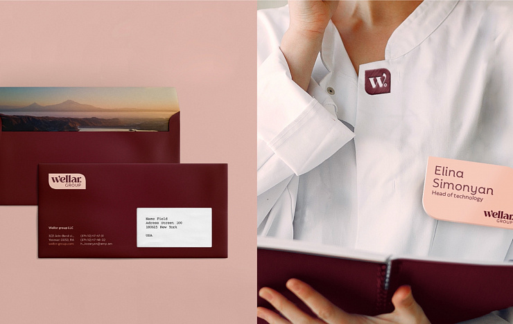

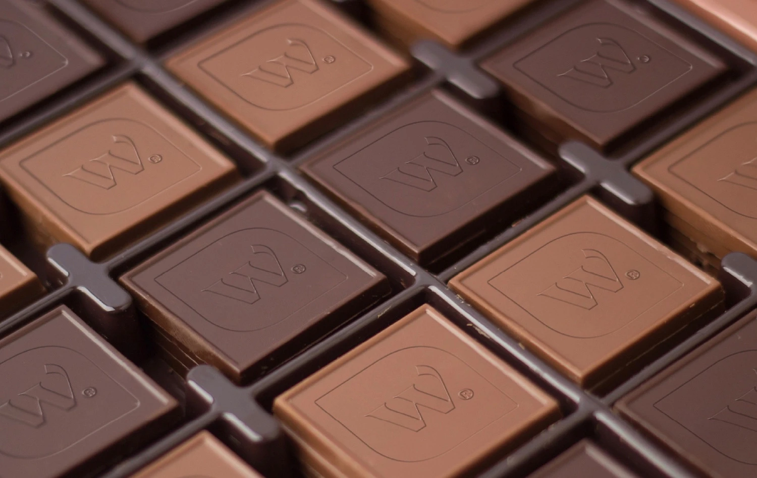
The main attributes of the proposed identity are brand shape with the Weller logo inside, фирменный шейп, внутри которого заключено лого Wellar, brand palette built on the dark-brown, beige and terracotta shades. This combination of warm tonnes gives the chocolate category associations and makes it easy to combine all shades with each other.
For visual identity we have chosen the font with the smooth outline which makes it another recognizable brand element.
The logo is placed on two lines inside the shape: Wellar is more bold with the curved letter W, and group is more light and thin which makes the contrast within the same logo. Bold font associates with a fluid chocolate which makes an emotional connect with the customer.
An abbreviated version of the logo was also provided: a separate letter W with a dot inside the shape-petal.
This variant can be also used right on the chocolate goods as an embossing.
Our team:
Anastasia Tretyakova — executive creative director,
Semyon Shatylo — creative director,
Farkhad Kuchkarov — strategy director,
Anastasia Kharuk — strategist,
Maxim Babakaev — strategist,
Galina Evdokimova — senior copywriter,
Anastasia Plotnikova — designer,
Daria Ivanova — designer,
Tatiana Mikolaevskaya — designer,
Nikolay Nedashkovskiy — designer,
Evgeniy Nikitin — motion designer,
Julia Solovyova — head of project,
Anna Alyaskina — business development manager,
Alexey Andreev — CEO,
Anna Lukanina — CEO,
Ksenia Parkhomenko — executive director,
Daria Vlasova — PR manager,
Anna Kalinicheva — business development director,
Daria Vedernikova — head of communications.


