KFC rebranding in Russia
Client:
Activity:


— If you look at the history of KFC in Russia globally, it will be clearly seen that the brand is developing actively, naturally and evolutionarily, – shares the opinion of Farhad Kuchkarov, Director of Strategy at Depot. — The constants of the corporate identity do not change, and they should not, but the content of communication changes. The style, which was introduced by the network in 2016, met certain strategic objectives facing the brand: increased awareness, was deliberately "neutral", utilitarian, convenient for internal use and differentiation. These tasks were completed in a few years, the market reality required a refreshment of communication, fine-tuning for the audience. And the new style, invented by the creative of Wieden + Kennedy Amsterdam, using the image of a Colonel — KFC fills itself with emotions, which is quite logical at the current stage of development of both the global brand and its local Russian representative office.
— KFC as a brand has been operating in Russia not so long ago — since 2010, – says Dmitry Shirshov, Marketing Director of KFC in Russia, CIS, Central and Eastern Europe. — During this time, he has achieved widespread fame, our delicious chicken is known and loved by millions of guests. But not everyone knows that behind the success of the KFC brand in the world was its founder, Colonel Sanders: a talented businessman, charismatic, in love with his business man. We are confident that the image and values of Colonel Sanders will help us stand out very favorably in the market, be noticeable, interesting, while remaining honest and as loyal as possible to delicious chicken and beloved guests. We are very lucky: other brands need to hire celebrities to become more popular — and we have our own.
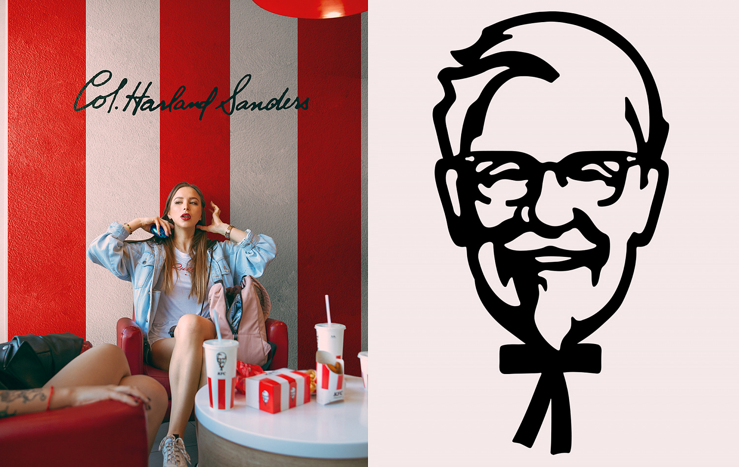
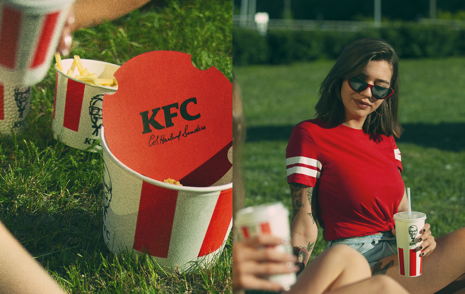
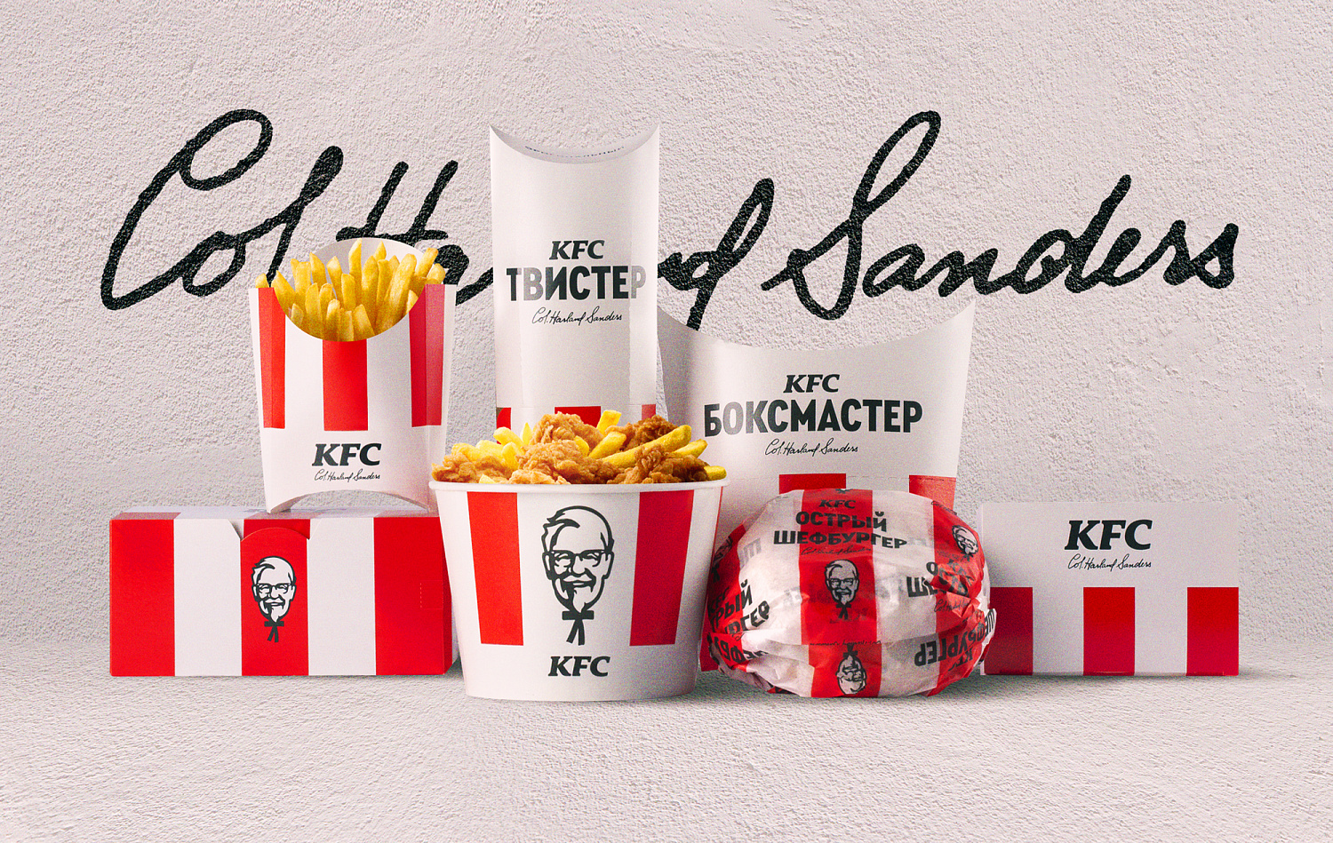
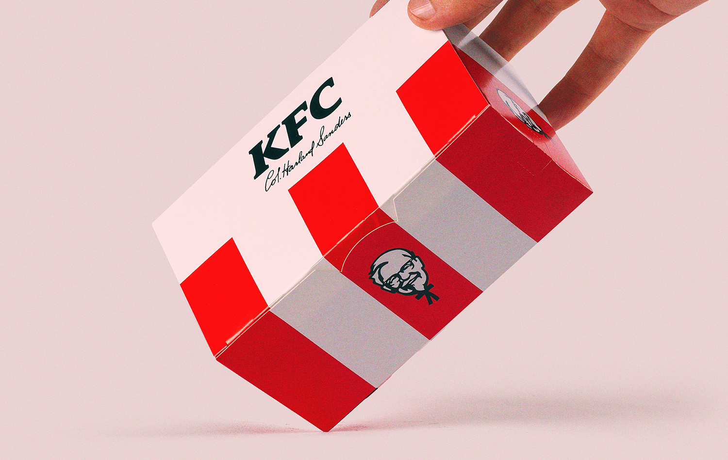
The main colors of the brand are red, white and black. Red dominates and forms the image of the brand, but any of the three main colors can become the background. This technique sets the color coding: white background – a dish with an original recipe of white meat, black background – dishes of dark meat, red background – a seasonal dish, a new taste. Another powerful brand identifier is the red and white stripes used on all packages and in communication. A regulated set of "additional" colors is used for color coding of the line of products offered for breakfast and sauces.
Most packages use font compositions made on the basis of Condensed Black. Product names are typed in capital letters, in one or two lines. And for exceptional cases and "informal" packages (for example, sauces), it is possible to use Cera Pro Bold.


— The main task of the agency was to adapt the global style of the brand to the Russian market – Nikita Ivanov, Depot design director, telling about the work on the project. – It was necessary to bring all the components of the identity into a strict system, within which it would be easy to adapt the graphics to different media and packaging formats without losing any of the design elements. In the process, we selected a typeface for the Russian market, since the "global" corporate font was not adapted to the Cyrillic alphabet.
— The participation of a national contractor in the adaptation of the global rebranding for Russia is finally becoming the norm, - Alexey Andreev, managing partner of the agency, comments on the interaction between Depot and KFC. – We have been observing the evolution of the trust of global brand teams in Russian partners for many years. If 20 years ago we were allowed to design communications strictly guided by the brandbook and dry comments from overseas head offices, today Depot is working on positioning and design strategy, naming, identity and creativity, creating guides and brand books for great international brands.